本文總結:
我們學到了 React Native 的 Flexbox 布局,它讓寫樣式變得更方便啦!😊 Flexbox 就像一個有彈性的盒子,有主軸和交叉軸(行或列)。
在 RN 里寫樣式要用 StyleSheet.create 對象,屬性名是駝峰命名。
文章還介紹了如何用 Platform.select 給不同平臺寫樣式,以及使用 styled-components 這個庫的簡單例子(雖然我們主要還是用 StyleSheet)。
文章還通過三欄布局和橫向布局的例子,展示了 flexDirection, alignItems, justifyContent 和 alignSelf 這些屬性的用法。
特別喜歡 alignSelf: 'stretch' 能讓元素填充空間的技巧!👍
最后,通過抽象出 Row 和 Col 組件,我看到了如何用 Flexbox 實現更復雜的嵌套布局。感覺 Flexbox 真的讓布局變得靈活多了!🚀
1、關于Flexbox
在將flexbox引入css前,構建布局的各種css屬性都比較粗糙,而且很容易出錯。而flexbox通過抽象了很多屬性來解決問題。字如其名flexbox的意思就是一個具有彈性的盒子模型。我們畫個圖:假設你有一個容器和它的子元素,它看起來可以是這樣的。
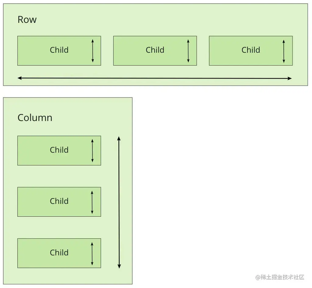
Flexbox容器有二個軸,即列(向上/向下)或行(左/右)。
2、實操
我們直接上代碼吧,這是一個js模塊,而不是css模塊。如果我們要聲明rn的樣式,我們需要去定義一個對象然后調用StyleSheet.create()最后拋出它在你的模塊中。但是我們需要注意的是rn只支持駝峰命名。
import { Platform, StyleSheet, StatusBar } from 'react-native'
export default StyleSheet.create({container: {flex: 1,justifyContent: 'center',alignItems: 'center',backgroundColor: 'ghostwhite',...Platform.select({ios: { paddingTop: 20 },android: { paddingTop: StatusBar.currentHeight },}),},box: {width: 100,height: 100,justifyContent: 'center',alignItems: 'center',backgroundColor: 'lightgray',},boxText: {color: 'darkslategray',fontWeight: 'bold',},
})
然后我們看到剛才我寫了這樣一段代碼,這里其實就是根據你的移動端去選擇樣式。
...Platform.select({ios: { paddingTop: 20 },android: { paddingTop: StatusBar.currentHeight },
}),ok,我們看一下在rn組件中如何使用
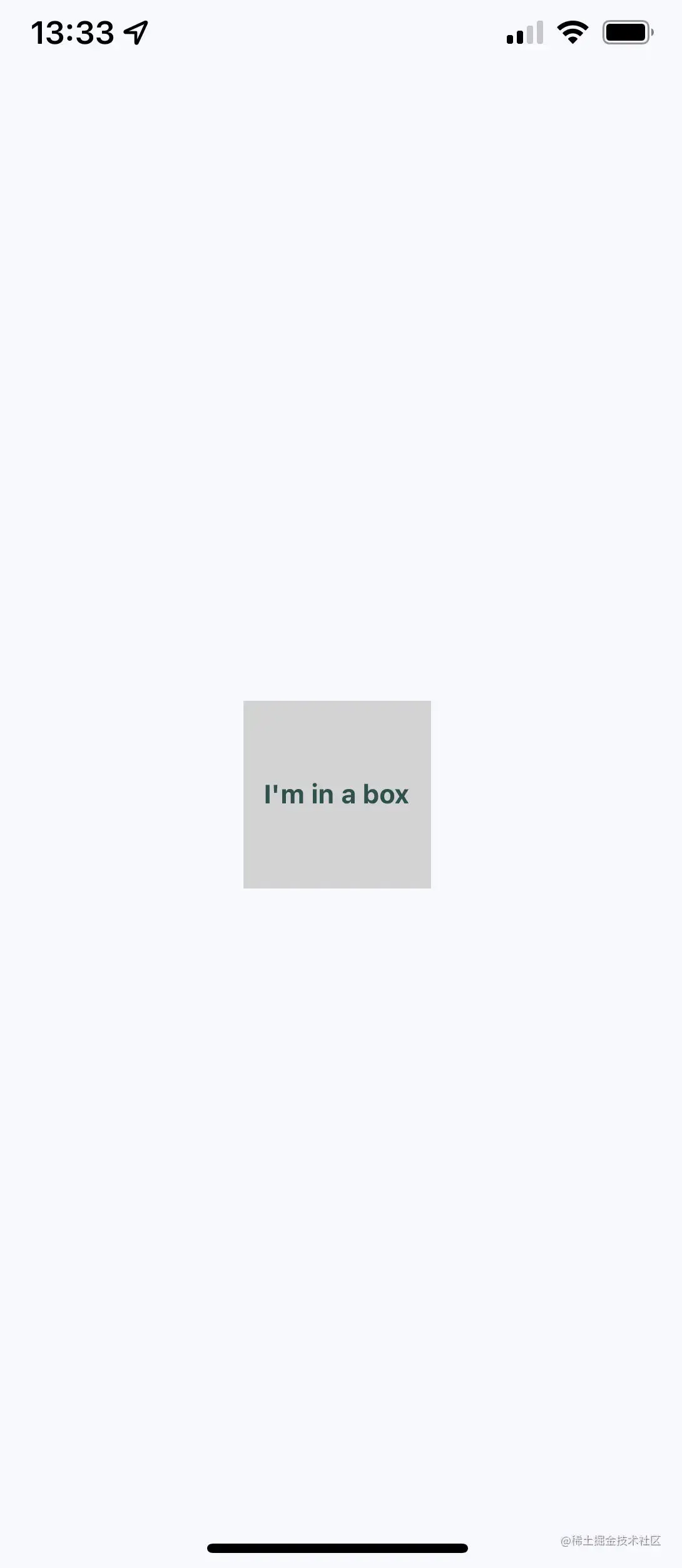
import { Text, View } from 'react-native'
import styles from './styles'
export default function App() {return (<View style={styles.container}><View style={styles.box}><Text style={styles.boxText}>I'm in a box</Text></View></View>)
}
這些樣式將通過樣式屬性分配給每個組件。我們來看看它的表現。
3、Styled-components樣式組件庫使用
Styled-components是一個css-in-js的庫為我們的組件去提供樣式,如我們去直接看看怎么使用吧。當然只是介紹一下,我們還是使用styleSheet。
首先下載依賴
yarn add styled-components然后我們寫點代碼
import styled from "styled-components/native";
const Box = styled.View'width: 100px;height: 100px;justify-content: center;align-items: center;background-color: lightgray;
';
const BoxText = styled.Text'color: darkslategray;font-weight: bold;
';
使用
const App = () => {
return (<Box><BoxText>I'm in a box</BoxText></Box>
);};
4、基礎Flexbox
接下來主要講一下rn中的幾種常見布局和flexbox的實戰
4.1、三欄布局
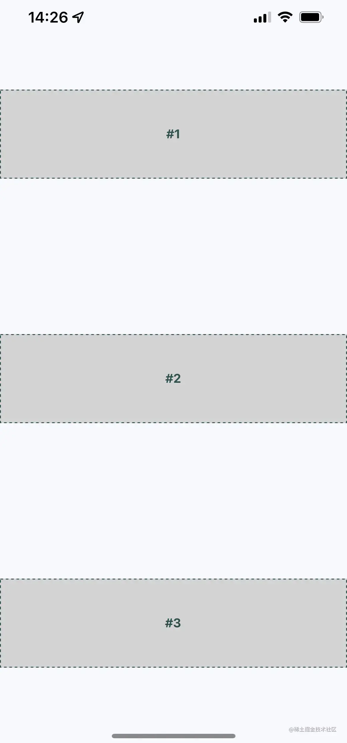
普通的從上到下的三欄布局。

你可以把view理解成div,text理解成p。
import { Text, View } from 'react-native'
import styles from './styles'
export default function App() {return (<View style={styles.container}><View style={styles.box}><Text style={styles.boxText}>#1</Text></View><View style={styles.box}><Text style={styles.boxText}>#2</Text></View><View style={styles.box}><Text style={styles.boxText}>#3</Text></View></View>)
}flexDirection屬性是決定了主軸的方向,上到下或者左到右,而alignItem和justifyContent屬性決定了元素的排列和間隔。
import { Platform, StyleSheet, StatusBar } from 'react-native'
export default StyleSheet.create({container: {flex: 1,flexDirection: 'column',alignItems: 'center',justifyContent: 'space-around',backgroundColor: 'ghostwhite',...Platform.select({ios: { paddingTop: 20 },android: { paddingTop: StatusBar.currentHeight },}),},box: {width: 300,height: 100,justifyContent: 'center',alignItems: 'center',backgroundColor: 'lightgray',borderWidth: 1,borderStyle: 'dashed',borderColor: 'darkslategray',},boxText: {color: 'darkslategray',fontWeight: 'bold',},
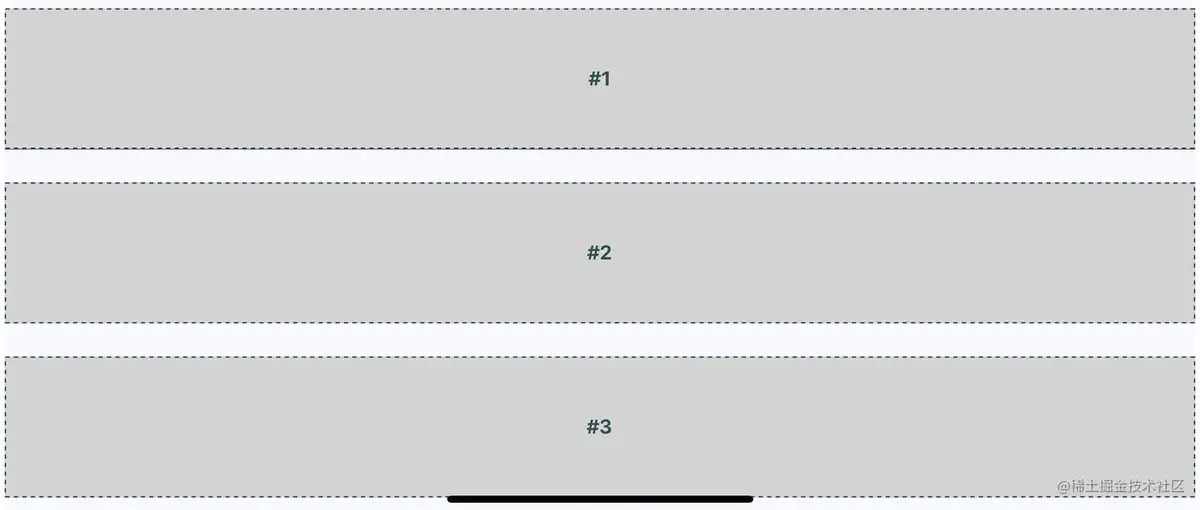
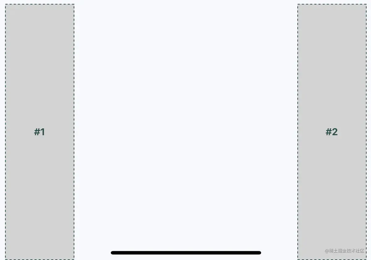
})而如果我們想讓它左右兩邊填滿那?就像這樣
我們可以加入alignSelf這個屬性,這個屬性的意思是根據主軸flexDirection的方向,改變寬度或者高度(column改變的就是寬度,row改變的就是高度)去填充空白,動態計算高度或寬度。像這樣就是會填滿你屏幕的寬度。
box: {height: 100,justifyContent: 'center',// alignSelf: 'stretch',alignItems: 'center',backgroundColor: 'lightgray',borderWidth: 1,borderStyle: 'dashed',borderColor: 'darkslategray',},當我們把手機橫過去
我們稍微優化一下,正好也寫一下橫向的布局,上面的樣式太`抽象`了寫得。
import { Text, View, StatusBar } from 'react-native'
import styles from './styles'
import Box from './Box'
export default function App() {return (<View style={styles.container}><Box>#1</Box><Box>#2</Box></View>)
}
import { PropTypes } from 'prop-types'
import { View, Text } from 'react-native'
import styles from './styles'
export default function Box({ children }) {return (<View style={styles.box}><Text style={styles.boxText}>{children}</Text></View>)
}
Box.propTypes = {children: PropTypes.node.isRequired,
}
這個就是會拉伸至整個屏幕高度的橫向布局
import { Platform, StyleSheet, StatusBar } from 'react-native'
export default StyleSheet.create({container: {flex: 1,flexDirection: 'row',backgroundColor: 'ghostwhite',alignItems: 'center',justifyContent: 'space-around',...Platform.select({ios: { paddingTop: 20 },android: { paddingTop: StatusBar.currentHeight },}),},box: {width: 100,justifyContent: 'center',alignSelf: 'stretch',alignItems: 'center',backgroundColor: 'lightgray',borderWidth: 1,borderStyle: 'dashed',borderColor: 'darkslategray',},boxText: {color: 'darkslategray',fontWeight: 'bold',},
})
我們來看看它的表現

當我們把手機橫過去
5、稍微復雜一點的flexBox
假設我們要實現這樣一個效果,我們該如何實現?
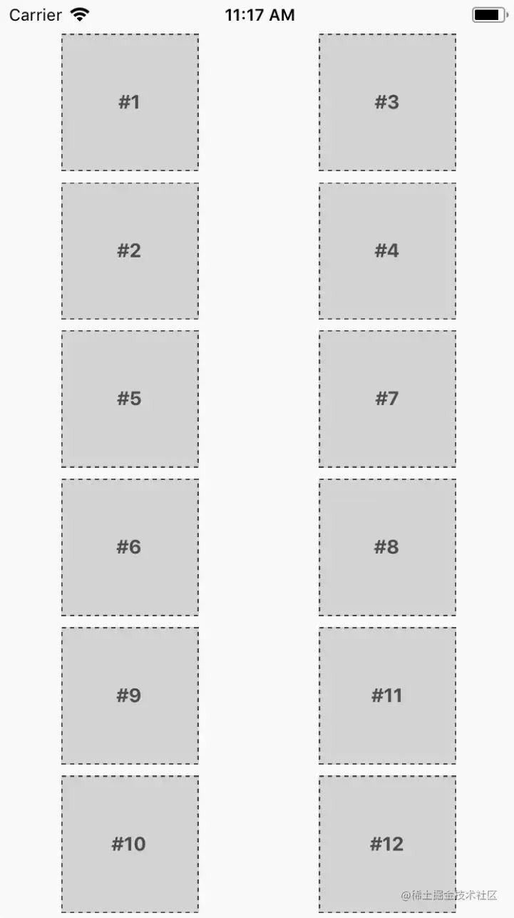
在我們的意識中,整個布局有行、列。那我們同樣也可以抽象出col、row組件分別代表行列。我們直接上代碼吧。
可以看到我們分別確定了col、row的方向和排列。
import { Platform, StyleSheet, StatusBar } from 'react-native'export default StyleSheet.create({container: {flex: 1,flexDirection: 'column',backgroundColor: 'ghostwhite',alignItems: 'center',justifyContent: 'space-around',...Platform.select({ios: { paddingTop: 40 },android: { paddingTop: StatusBar.currentHeight },}),},box: {height: 100,width: 100,justifyContent: 'center',alignItems: 'center',borderWidth: 1,borderStyle: 'dashed',borderColor: 'darkslategray',backgroundColor: 'lightgray',},boxText: {color: 'darkslategray',fontWeight: 'bold',},row: {flex: 1,flexDirection: 'row',justifyContent: 'space-around',alignSelf: 'stretch',},column: {flex: 1,flexDirection: 'column',alignItems: 'center',justifyContent: 'space-around',alignSelf: 'stretch',},
})
組件部分
app
import { View, StatusBar } from 'react-native'
import styles from './styles'
import Row from './Row'
import Col from './Col'
import Box from './Box'
export default function App() {return (<View style={styles.container}><StatusBar hidden={false} /><Row><Col><Box>#1</Box><Box>#2</Box></Col><Col><Box>#3</Box><Box>#4</Box></Col></Row><Row><Col><Box>#5</Box><Box>#6</Box></Col><Col><Box>#7</Box><Box>#8</Box></Col></Row><Row><Col><Box>#9</Box><Box>#10</Box></Col><Col><Box>#11</Box><Box>#12</Box></Col></Row></View>)
}
col
import PropTypes from 'prop-types'
import { View } from 'react-native'
import styles from './styles'
export default function Column({ children }) {return <View style={styles.column}>{children}</View>
}Column.propTypes = {children: PropTypes.node.isRequired,
}
row
import PropTypes from 'prop-types'
import { View } from 'react-native'
import styles from './styles'
export default function Row({ children }) {return <View style={styles.row}>{children}</View>
}Row.propTypes = {children: PropTypes.node.isRequired,
}
import React from 'react'
import PropTypes from 'prop-types'
import { View, Text } from 'react-native'
import styles from './styles'
export default function Box({ children }) {return (<View style={styles.box}><Text style={styles.boxText}>{children}</Text></View>)
}Box.propTypes = {children: PropTypes.node.isRequired,
}
6、總結
歡迎加入群聊,我們一起討論一些更有趣的技術、商業、閑聊。


)

)


Java常用類庫)


如何使用UNSIGNED屬性?)