圖像是我們最直觀的數據表達方式,python的matplotlib庫可以用來畫圖。下面來簡單總結下matplotlib的使用方法。
上篇講matplot畫圖中用到的基礎對象,包括圖像Figure,平面曲線Line2D,坐標軸Axes,圖例Legend, 注解Annotation, 注釋Text
理解這些對象,有利于我們更好的用matplot畫圖。
matplotlib 導入1import matplotlib.pyplot as plt
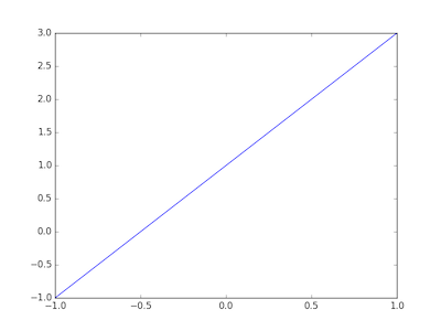
簡單demo1
2
3
4
5
6
7
8x = np.linspace(-1, 1, 50)
y = 2 * x + 1
# 創建圖像
plt.figure()
# plot(x,y)畫(x,y)曲線
plt.plot(x, y)
# 顯示圖像
plt.show()
基礎屬性
圖像Figure
matplot中,圖像對應的定義類是matplotlib.figure.Figure
1
2# num 標識編號,figsize 8英寸*5英寸,dpi圖像的dp密度,facecolor背景色白色,edgecolor背景色白色
plt.figure(num=1, figsize=(8,5), dpi=100, facecolor='w', edgecolor='w')
plt.figure()創建了圖像,并返回matplotlib.figure.Figure對象,這里我們選擇隱式處理返回的對象。
平面曲線Line2D
通過plot()方法創建matplotlib.line.Line2D對象
1
2
3
4# 指定曲線的顏色,線的寬度,線的樣式。
plt.plot(x, y1, color='red', linewidth=1.0, linestyle='--')
# 添加多條曲線
plt.plot(x, y2)
具體的參數可以在matplotlib.pyplot.Line2D的初始化函數里找到:
1
2
3
4
5
6
7
8
9
10
11
12
13
14
15
16
17
18
19
20
21def __init__(self, xdata, ydata,
linewidth=None, # all Nones default to rc
linestyle=None,
color=None,
marker=None,
markersize=None,
markeredgewidth=None,
markeredgecolor=None,
markerfacecolor=None,
markerfacecoloralt='none',
fillstyle=None,
antialiased=None,
dash_capstyle=None,
solid_capstyle=None,
dash_joinstyle=None,
solid_joinstyle=None,
pickradius=5,
drawstyle=None,
markevery=None,
**kwargs
):
坐標軸Axes
坐標軸的定義類是matplotlib.Axes
1
2
3
4
5
6
7
8
9
10
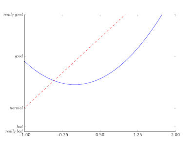
11# xlim()和ylim()設置坐標軸范圍
plt.xlim((-1, 2))
plt.ylim((-2, 3))
# xlabel()和ylabel()設置坐標軸名稱
plt.xlabel('X')
plt.ylabel('Y')
# 借助numpy的linspace()方法,設置更復雜的坐標,-1到2,總共5個坐標點
new_ticks = np.linspace(-1, 2, 5)
plt.xticks(new_ticks)
# 也可以指定具體的點和標簽值
plt.yticks(ticket=[-2, -1.8, -1, 1.22, 3],labels=[r'$really\ bad$', r'$bad$', r'$normal$', r'$good$', r'$really\ good$'])

我們可以看到,這里二維圖像默認的坐標軸有四條(上下左右)
更復雜的坐標軸設置:
1
2
3
4
5# 獲取坐標軸實例
ax = plt.gca()
# 隱藏右邊和上面的坐標軸
ax.spines['right'].set_color('none')
ax.spines['top'].set_color('none')
調整坐標軸上刻度的位置
1
2# 值可以選擇top,bottom,both,default,none
ax.xaxis.set_ticks_position('bottom')
默認的坐標軸之間的連接處類似于矩形,我們可以調整坐標軸之間連接處具體的位置
1
2
3# spines指定修改的是哪一條坐標軸,set_position()有好幾個重載方法,這里用到的是set_position(self, position),,其中position參數是一個二維tuple。
# 第一個值是type,可選的type有"outward","axes","data".
ax.spines['bottom'].set_position(('outward', 10))
『outward』數組的第二個值是個數值,0的話,x軸與y軸的焦點正好在y軸最底部,如果n>0,相當于向y軸負方向移動距離n。
『axes』 數組的第二個值取值范圍0.0-1.0,表示將端點放在坐標軸的指定比例的位置
『data』 數組的第二個值就是坐標軸上具體的位置
圖例Legend
圖例對應著的是 matplot.legend類
1
2
3
4
5
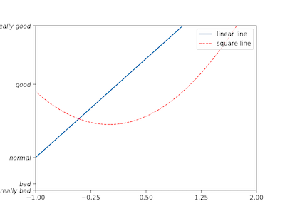
6# 圖例的話,需要先通過plot()方法創建Line2D對象
l1, = plt.plot(x, y1, label='linear line')
l2, = plt.plot(x, y2, color='red', linewidth=1.0, linestyle='--', label='square line')
# loc指定位置,如圖例放在右上角就是loc='upper right', 'best'表示自動分配最佳位置,label表示圖例的名稱
plt.legend(handles=[l1, l2], labels=['up', 'down'], loc='best')
注解Annotation
注解對應著的是 matplot.text.Annotation
1
2
3
4
5
6
7
8
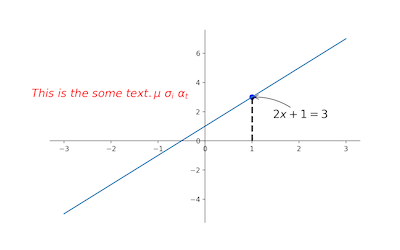
9plt.annotate(r'$2x+1=%s$' % y0,
xy=(x0, y0), # 對(1,3)這個點的描述
xycoords='data', # 基于數據的值來選位置
xytext=(+30, -30), # xytext=(+30, -30)表示xy偏差值,
textcoords='offset points',# 對標注位置的描述
fontsize=16,
arrowprops=dict( # 對箭頭類型的設置
arrowstyle='->',
connectionstyle="arc3,rad=.2")
注釋Text
注釋對應的定義類是 matplot.text.Text
1
2
3
4
5
6
7
8plt.text(x=-3.7,
y=3,
s=r'$This\ is\ the\ some\ text. \mu\ \sigma_i\ \alpha_t$',
fontdict={
'size': 16,
'color': 'r'
}
)
通過上面的注釋和注解,我們再補充一條線段,一個點
1
2
3
4
5# 畫虛線
plt.plot([x0, x0, ], [0, y0, ], 'k--', linewidth=2.5)
# 畫點
plt.scatter([x0, ], [y0, ], s=50, color='b')
plt.show()


轉賬代碼)
)


