在這篇文章中,我們為您呈現了一組優秀的網格工具清單。如果網頁設計和開人員采用了正確的工具集,并基于一個靈活的網格架構,以及能夠把響應圖像應用到到設計之中,那么創建一個具備響應式的網站并不一定是一項艱巨的任務。enjoy!
- Web 前端開發人員和設計師必讀文章集錦
- 十個擁有豐富 UI 組件的 JavaScript 框架
- 十款精心挑選的在線 CSS3 代碼生成工具
- 開發者必備的八個最佳云端集成開發環境
- 2012年度最佳 Web 前端開發工具和框架
?
Susy
Susy is a responsive grid system for Compass. It lets you quick add new media-query breakpoints to your layouts, using their math or your own (with helpers).
?
GridSet

Designing grids with Gridset is as easy as dragging guides in Photoshop or Fireworks. Gridset provides whatever you need: PNGs, a comprehensive cheat sheet and CSS.
?
Grid
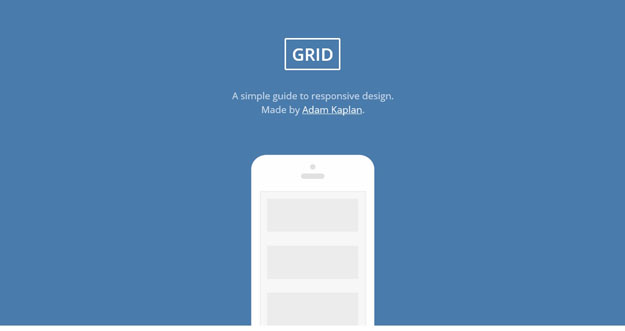
Grid is a simple guide to responsive design. By following those simple steps, you are on the path to responsive web design mastery. Keep practicing and help make the web a better, more useable place.
?
Grid Designer
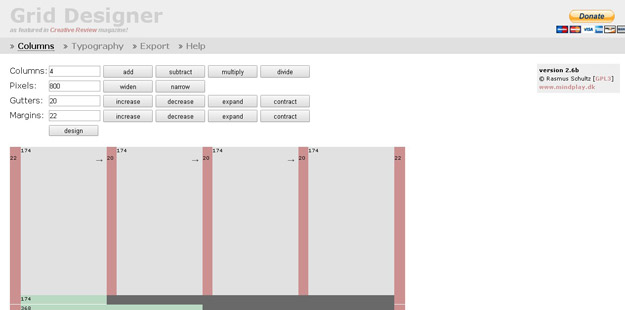
This tool enables you to create a CSS Grid by specifying the number of columns and the widths of the columns, gutters and margins.
?
Blueprint Grid CSS Generator
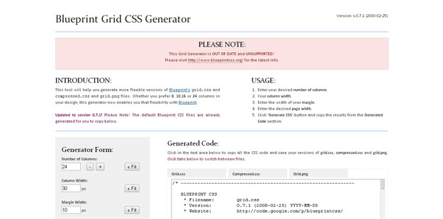
This tool will help you generate more flexible versions of Blueprint’s grid.css andcompressed.css and grid.png files. Whether you prefer 8, 10,16 or 24 columns in your design, this generator now enables you that flexibility with Blueprint.
?
The Grid System
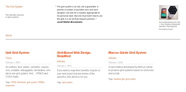
The Grid System is an exceptional tool for creating responsive layouts.
?
Grid Displayer
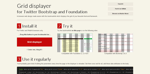
Grid Displayer is a boomarklet that displays the grid of both Twitter Bootstrap (fixed and fluid grid) and Foundation (2.0 and 3.0). It works with Firefox and WebKit browsers.
?
The Grid
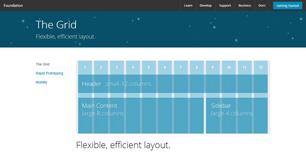
It’s a 12-column flexible grid that can scale out to an arbitrary size (defined by the max-width of the row) that’s also easily nested, so you can build out complicated layouts without creating a lot of custom elements.
?
您可能感興趣的相關文章
- 10套精美的免費網站后臺管理系統模板
- 14個支持響應式設計的流行前端開發框架
- 60款很酷的 jQuery 幻燈片演示和下載
- 8個驚艷的 HTML5 和 JavaScript 特效
- 35款精致的 CSS3 和 HTML5 網頁模板
?
英文鏈接:50 Grid Tools for Responsive Web Designs
編譯來源:夢想天空 ◆ 關注前端開發技術 ◆ 分享網頁設計資源
)


![[國家集訓隊] 特技飛行](http://pic.xiahunao.cn/[國家集訓隊] 特技飛行)


![[Swift通天遁地]一、超級工具-(2)制作美觀大方的環形進度條](http://pic.xiahunao.cn/[Swift通天遁地]一、超級工具-(2)制作美觀大方的環形進度條)


![[HNOI2011]XOR和路徑](http://pic.xiahunao.cn/[HNOI2011]XOR和路徑)
)
