For many people, the idea of ??staying home actually sounded good at first. This process was really efficient for Netflix and Amazon. But then sad truths awaited us. What was boring was the number of dead and intubated patients one after the other. We all know the aftermath well.
對于很多人來說,居家的想法一開始聽起來確實不錯。 對于Netflix和Amazon,此過程確實非常有效。 但是可悲的事實等待著我們。 無聊的是死者和插管者的數量接連不斷增加。 我們都知道后果。
In this article, we will try to examine the covid-19 virus, which can affect all countries in the world, and the relationship between it and the countries explained in the happiness report.
在本文中,我們將嘗試檢查可能影響世界所有國家的covid-19病毒,以及它與幸福報告中解釋的國家之間的關系。
Before we start, let’s get to know our datasets:
在開始之前,讓我們了解我們的數據集:
- ‘covid19_Confirmed_dataset.csv’ (Data include 96 days from the first case) 'covid19_Confirmed_dataset.csv'(數據包括自第一種情況起的96天)
- ‘worldwide_happiness_report.csv’ 'worldwide_happiness_report.csv'
And of course the libraries we will use:
當然,我們將使用的庫:
import pandas as pd
import numpy as np
import seaborn as sns
import matplotlib.pyplot as plt
First of all, we will need a small clearing of our data. We will follow the following procedures to obtain our data frame, where ‘Lat’ and ‘Long’ are removed from the columns:
首先,我們將需要少量清除數據。 我們將按照以下過程獲取數據框,其中從列中刪除了“ Lat”和“ Long”:
corona_dataset_csv.drop(["Lat", "Long"],axis=1,inplace=True)And only the country names and the number of cases are shown day by day:
每天僅顯示國家名稱和案件數:
corona_dataset_aggregated = corona_dataset_csv.groupby("Country/Region").sum()
For 3 countries to be shown in the same graphic:
在同一圖形中顯示3個國家/地區:
corona_dataset_aggregated.loc["China"].plot()
corona_dataset_aggregated.loc["Italy"].plot()
corona_dataset_aggregated.loc["Spain"].plot()plt.legend()
We will use the derivative function in order to better observe which periods stand out and the prominent trend points in infected numbers. Of course for this: diff ()
我們將使用導數函數,以便更好地觀察哪些時期脫穎而出以及感染人數中的顯著趨勢點。 當然要這樣做:diff()
corona_dataset_aggregated.loc["China"].diff().plot()
We add ‘max_infection_rate’ as a new column and refresh our data frame.
我們將“ max_infection_rate”添加為新列,并刷新我們的數據框。
countries = list(corona_dataset_aggregated.index)
max_infection_rates = []
for c in countries :            max_infection_rates.append(corona_dataset_aggregated.loc[c].diff().max())max_infection_rates
Meanwhile, we are starting to process our data from the happiness report.To import:
同時,我們開始處理幸福報告中的數據。要導入:
happiness_report_csv = pd.read_csv("worldwide_happiness_report.csv")
We extract “Overall rank”, “Score”, “Generosity”, “Perceptions of corruption” from among the columns.
我們從各列中提取“總體排名”,“得分”,“慷慨”,“腐敗感”。
useless_cols = ["Overall rank","Score","Generosity","Perceptions of corruption"]Now we are including “max_infection_rate” in this framework and we are making countries fits for themselves.
現在,我們將“ max_infection_rate”包含在此框架中,并且正在使國家適合自己。
data = corona_data.join(happiness_report_csv,how="inner")
data.head()
We will use the corr () function for the correlation matrix:
我們將對相關矩陣使用corr()函數:
data.corr()
As you can see this matrix consists of correlation coefficcients off every two columns in our data set.
如您所見,此矩陣由數據集中每兩列的相關系數組成。
We have ‘max infection rate’ and ‘GDP per capita’ and this data frame is the correlation coefficient between these two variables. As this value gets higher, it means the correlation between these two variables is also higher.
我們有“最大感染率”和“人均GDP”,并且此數據框是這兩個變量之間的相關系數。 隨著該值變高,這意味著這兩個變量之間的相關性也變高。
If you look at other of life factors, for example social support has the life expectancy and freedom to make life choices is also we can see that we have positive correlations betwen all off other life factors.
如果您查看其他生活因素,例如社會支持具有預期壽命和自由選擇生活的機會,那么我們也可以看到我們與其他生活因素之間存在正相關關系。
But our work is not done yet. We know that our Analysis is not finished unless we visualize the results in terms figures and graphs so that everyone can understand what you get out of our analysis.
但是我們的工作還沒有完成。 我們知道,除非我們用術語圖和圖形將結果可視化,以便每個人都可以理解您從分析中得到的結果,否則分析尚未完成。
We found out that there are positive correlation between the max inf rate and all off the life factors that we have in our data set.
我們發現,最大INF比率與數據集中所有壽命因素之間存在正相關。
In this task, i am going to use seaborn module, which is a very handed tool for regionalisation. What we want to do is to plot every each of these columns.
在此任務中,我將使用seaborn模塊,這是用于區域化的非常有用的工具。 我們要做的是繪制每個這些列。
x = data["GDP per capita"]
y = data["max_infection_rate"]
sns.scatterplot(x,y)
However, it is not possible to examine the graph in detail. So this difference between in X axis and Y access has caused the problem that we cannot enough details in our data. So for so to solve this problem, what we can do is to use log scaling:
但是,無法詳細檢查圖表。 因此,X軸訪問和Y軸訪問之間的差異導致了問題,即我們的數據中沒有足夠的細節。 因此,要解決此問題,我們可以做的是使用日志縮放:
x = data["GDP per capita"]
y = data["max_infection_rate"]
sns.scatterplot(x, np.log(y))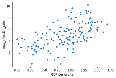
This is completely shows us as it goes. So this slope, as you can see there is increase. There is a correlation positive.
這完全向我們展示了一切。 如您所見,這個斜率在增加。 存在正相關。
sns.regplot(x, np.log(y))
Very clearly there is a positive slope between these two variables (“max inf rate” & “GDP per capita”)
很明顯,這兩個變量之間存在正斜率(“最大通脹率”和“人均GDP”)
所以 (Consequently)
We have found very interestingresult in this analysis. This result shows that people who are living in developed countries are more prone to getting the infection off Covid-19 with compare off with compared to less developed countries.Can be said that this result is because off lack of corona test kits in less developed countries, in order to prove that this is not the case.
我們在這項分析中發現了非常有趣的結果。 該結果表明,與欠發達國家相比,生活在發達國家的人更容易感染Covid-19,這可以說是因為欠發達國家缺少電暈測試儀,以證明事實并非如此。
Even so i recommend to do the similar analysis on the data said related to cumulative number of the deaths.
即便如此,我還是建議對與死亡總數相關的數據進行類似分析。
See here for more: https://github.com/fk-pixel/Coursera-Project-Network/blob/master/Covid19_DataAnalysis%20.ipynb
有關更多信息,請參見此處: https : //github.com/fk-pixel/Coursera-Project-Network/blob/master/Covid19_DataAnalysis%20.ipynb
翻譯自: https://medium.com/think-make/what-does-covid-19-and-world-happiness-report-data-tell-us-c76bdd44b7ac
本文來自互聯網用戶投稿,該文觀點僅代表作者本人,不代表本站立場。本站僅提供信息存儲空間服務,不擁有所有權,不承擔相關法律責任。 如若轉載,請注明出處:http://www.pswp.cn/news/391266.shtml 繁體地址,請注明出處:http://hk.pswp.cn/news/391266.shtml 英文地址,請注明出處:http://en.pswp.cn/news/391266.shtml
如若內容造成侵權/違法違規/事實不符,請聯系多彩編程網進行投訴反饋email:809451989@qq.com,一經查實,立即刪除!相關文章

Python:self理解
)
leetcode 633. 平方數之和(雙指針)
![洛谷 P2919 [USACO08NOV]守護農場Guarding the Farm](http://pic.xiahunao.cn/洛谷 P2919 [USACO08NOV]守護農場Guarding the Farm)
洛谷 P2919 [USACO08NOV]守護農場Guarding the Farm
)
iOS 開發一定要嘗試的 Texture(ASDK)

lisp語言是最好的語言_Lisp可能不是數據科學的最佳語言,但是我們仍然可以從中學到什么呢?...
)
鏈接訪問后刷新顏色回到初始_如何使鏈接可訪問(提示:顏色不夠)

)
leetcode 403. 青蛙過河(dp)

static、volatile、synchronize

tensorflow基本教程

1.10-linux三劍客之sed命令詳解及用法
應用于使用Python的時間序列...)
python pca主成分_超越“經典” PCA:功能主成分分析(FPCA)應用于使用Python的時間序列...

blender視圖縮放_如何使用主視圖類型縮放Elm視圖
-常量和命名規范)
初探Golang(2)-常量和命名規范

函數)
sql的split()函數

大數據平臺構建_如何像產品一樣構建數據平臺
-數據類型)
初探Golang(3)-數據類型

freecodecamp_freeCodeCamp的服務器到底發生了什么?
