Problem statement: Using matplotlib.pyplot library in python draw a bar graph with two values for comparison, using different colors.
問題陳述:在python中使用matplotlib.pyplot庫使用不同的顏色繪制帶有兩個值的條形圖以進行比較。
Program:
程序:
import matplotlib.pyplot as plt
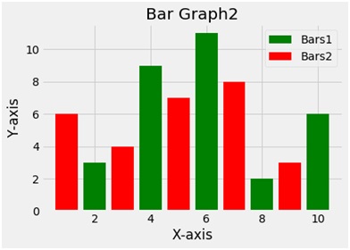
x1 = [2,4,6,8,10]
y1=[3,9,11,2,6]
x2=[1,3,5,7,9]
y2=[6,4,7,8,3]
plt.bar(x1,y1,label ='Bars1', color='g')
plt.bar(x2,y2,label = 'Bars2', color='r')
plt.xlabel('X-axis')
plt.ylabel('Y-axis')
plt.title('Bar Graph2')
plt.legend()
plt.show()
Output
輸出量
Explanation:
說明:
Python library matplotlib.pyplot is used to draw the above chart. Four random variables x1 y1 and x2 y2 are taken with random values. The bar function plots a bar plot. The second bar function used draws another bar plot in the same frame. The bar function takes 2 arguments i.e. x and y and a label variable gives the label to the plot. To give the title to the plot the title function is used. To show the legend the legend function is used and finally to show the plot the show function.
Python庫matplotlib.pyplot用于繪制以上圖表。 四個隨機變量x1 y1和x2 y2帶有隨機值。 條形函數繪制條形圖。 使用的第二個條形圖函數在同一幀中繪制另一個條形圖。 bar函數采用2個參數,即x和y,以及一個label變量為該圖提供標簽。 為了給繪圖賦予標題,使用了標題功能。 為了顯示圖例,使用了圖例功能,最后使用show函數顯示了情節。
翻譯自: https://www.includehelp.com/python/create-a-bar-graph-with-using-matplotlib-pyplot.aspx

)
-SpookFlare免殺)


)
-SharpShooter免殺)

讀取整數時跳過字符)
)
-CACTUSTORCH免殺)

)
方法和示例)
)


--- 獲取立足點)
![[轉]sql,N/$/#/@的含義和作用](http://pic.xiahunao.cn/[轉]sql,N/$/#/@的含義和作用)