使用Python的matplotlib模塊可以很方便的將數據處理成圖表,使數據更加形象、直觀。
#!/usr/bin/env pythonimport matplotlib.pyplot as plt
import numpy as np
from mpl_toolkits.axes_grid.anchored_artists import AnchoredTexty1=np.loadtxt('ReadDataCostTime.txt')
y2=np.sort(y1)x=np.arange(0, y1.size)fig=plt.figure(figsize=(30, 12))left,bottom,width,height=0.05, 0.05, 0.9, 0.9ax1=fig.add_axes([left,bottom,width,height])
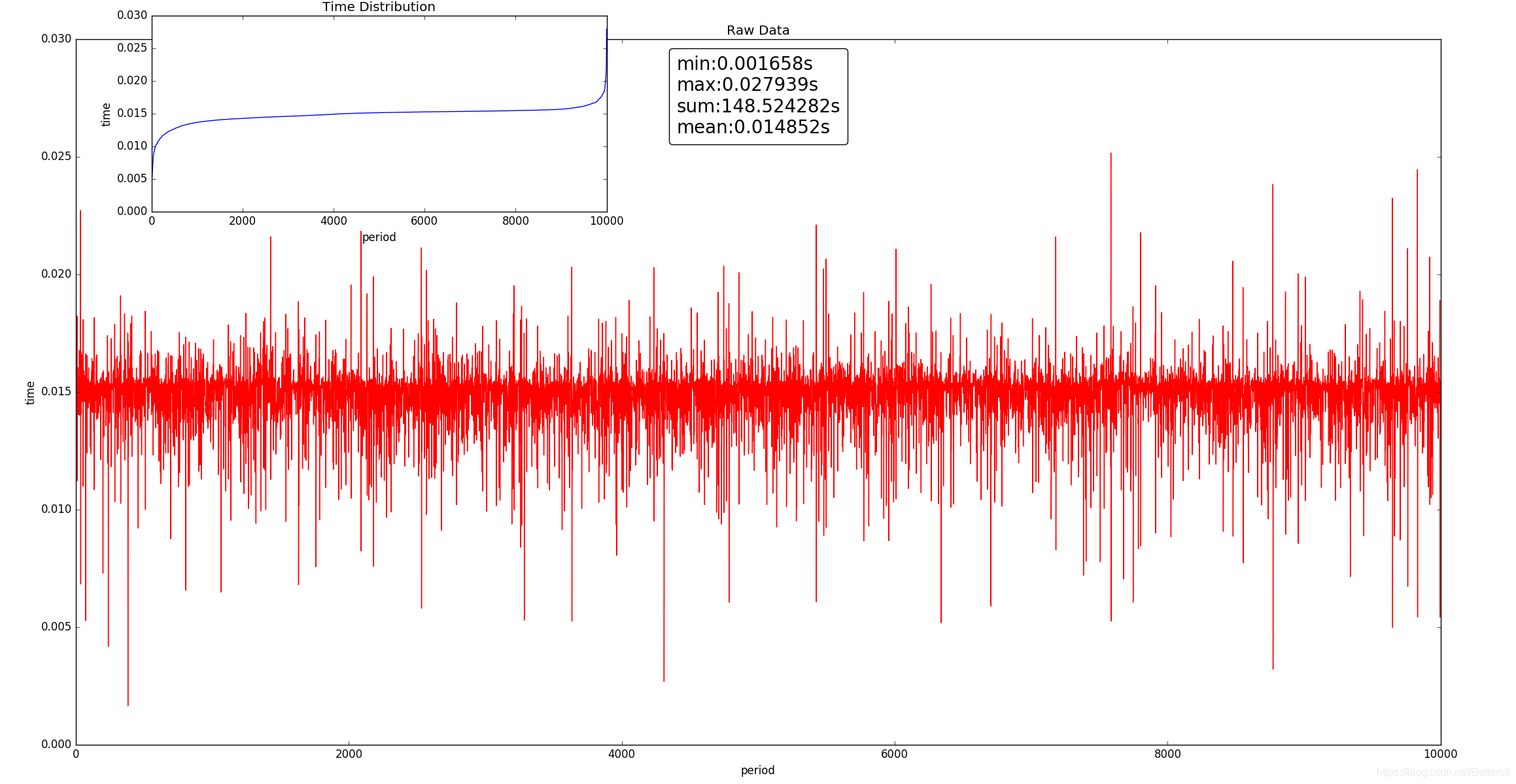
ax1.plot(x,y1,'r')
ax1.set_xlabel('period')
ax1.set_ylabel('time')
ax1.set_title('Raw Data')at = AnchoredText("min:%.6fs\nmax:%.6fs\nsum:%.6fs\nmean:%.6fs"%(y1.min(),y1.max(),y1.sum(),y1.mean()),prop=dict(size=20), frameon=True,loc=9,)
at.patch.set_boxstyle("round,pad=0.,rounding_size=0.2")
ax1.add_artist(at)left,bottom,width,height=0.1, 0.73, 0.3, 0.25
ax2=fig.add_axes([left,bottom,width,height])
ax2.plot(x,y2,'b')
ax2.set_xlabel('period')
ax2.set_ylabel('time')
ax2.set_title('Time Distribution')plt.legend()
plt.show()
處理結果圖:
數據在此:[https://github.com/LinGeLin/data]


)
)


)
)


)
