這是我的教程的第二部分,有關使用SmartGWT快速進行UI開發。 在本教程的第一部分中 ,我們創建了基本的界面布局并添加了一些基本組件。 現在是時候解決這個問題,并使用SmartGWT的真正功能了。
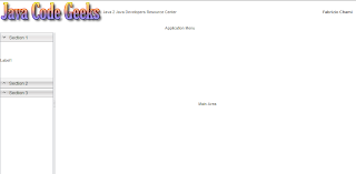
在繼續之前,讓我們記住到目前為止我們創建的UI的樣子:
完成本教程后,UI將會變成以下內容:
為了重新定義它們的功能,我們將不得不重新訪問一些現有的類。 讓我們從NavigationArea類開始。 在那里,我們使用SectionStack類創建了手風琴。 但是,每個堆棧部分僅包含一個普通標簽。 我們將在導航方面添加一些更有用的東西。 我們將在導航窗格中使用一棵樹,其中每個葉子實際上將代表一個動作。 為此,我們將通過定義out實現的特定特征來擴展TreeGrid類。 因此,這是“ NavigationTreeGrid”類:
package com.javacodegeeks.smartgwt.appui.client.ui.widgets;import com.smartgwt.client.types.SelectionStyle;
import com.smartgwt.client.types.TreeModelType;
import com.smartgwt.client.util.SC;
import com.smartgwt.client.widgets.tree.Tree;
import com.smartgwt.client.widgets.tree.TreeGrid;
import com.smartgwt.client.widgets.tree.TreeNode;
import com.smartgwt.client.widgets.tree.events.NodeClickEvent;
import com.smartgwt.client.widgets.tree.events.NodeClickHandler;public class NavigationTreeGrid extends TreeGrid {public NavigationTreeGrid() {setNodeIcon("arrow_down.png");  setFolderIcon("arrow_up.png");  setShowOpenIcons(false);setShowDropIcons(false);setShowSelectedStyle(true);  setShowPartialSelection(true);  setCascadeSelection(false);setCanSort(false);setShowConnectors(true);setShowHeader(false);setLoadDataOnDemand(false);setSelectionType(SelectionStyle.SINGLE);Tree data = new Tree();data.setModelType(TreeModelType.CHILDREN);data.setRoot(new TreeNode("root", new TreeNode("File",new TreeNode("FileChild")), new TreeNode("Edit",new TreeNode("EditChild",new TreeNode("EditGrandChild"))), new TreeNode("Window")));setData(data);addNodeClickHandler(new NodeClickHandler() {            @Overridepublic void onNodeClick(NodeClickEvent event) {String name = event.getNode().getName();SC.say("Node Clicked: " + name);}});}}
我們首先為樹定義一些屬性,更重要的是:
- setShowConnectors :定義是否應顯示連接器線,以說明樹的層次結構。
- setClosedIconSuffix :此后綴附加在提供的圖標名稱后,默認為“ closed”,因此您最好使用自定義值并覆蓋該值。
- setSelectionType :定義網格的可單擊選擇行為,即,是否可以在給定時間選擇多個項目。
此外, setNodeIcon和setFolderIcon方法用于為每個節點設置適當的圖標,具體取決于它是父節點還是葉節點。
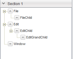
接下來,我們創建一個Tree實例,該實例本質上是一個數據模型,它代表鏈接到層次結構中的一組對象。 每個樹節點都是通過TreeNode類實現的,我們使用setRoot方法設置根節點。 請注意,可以通過使用名稱和對象數組來構造每個節點,因此,通過采用遞歸方法,我們可以在一行中創建整個樹。 然后,我們使用setData方法將Tree中的數據提供給TreeGrid 。 最后,我們為節點單擊事件注冊一個處理程序,并通過創建一個顯示節點名稱的彈出窗口來實現NodeClickHandler接口。
為了使用我們新創建的樹,我們返回“ NavigationArea”類并更改以下幾行:
...
SectionStackSection section1 = new SectionStackSection("Section 1");
section1.setExpanded(true);
final NavigationTreeGrid navigationTreeGrid = new NavigationTreeGrid();
navigationTreeGrid.setHeight100();
section1.addItem(navigationTreeGrid);
...
讓我們看看這是如何改變導航區域中的界面的:
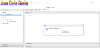
單擊其中一個節點后,將出現一個具有相關名稱的窗口:

下一步是填充現在幾乎是空的主要區域。 我們將為此使用標簽。 使用選項卡是高度首選的,因為它在屏幕空間方面非常有效。 通過堆疊選項卡,用戶可以同時打開許多面板,只需單擊即可導航到首選面板。
在SmartGWT中,選項卡的使用由Tab類提供。 但是,為了呈現選項卡,必須將這些選項卡分組在TabSet中 ,該選項卡允許多個窗格上的組件共享同一空間。 用戶可以選擇頂部的選項卡以顯示每個窗格。
現在,我們將重新訪問“ MainArea”類,并在其中添加三個不同的選項卡窗格。 第一個將僅包含任意HTML元素,第二個將具有連接的菜單,第三個將包含自定義垂直手風琴。 讓我們看看如何做到這一點:
package com.javacodegeeks.smartgwt.appui.client.ui;import com.javacodegeeks.smartgwt.appui.client.ui.widgets.CustomAccordion;
import com.smartgwt.client.types.Overflow;
import com.smartgwt.client.types.Side;
import com.smartgwt.client.widgets.Canvas;
import com.smartgwt.client.widgets.HTMLFlow;
import com.smartgwt.client.widgets.layout.VLayout;
import com.smartgwt.client.widgets.menu.Menu;
import com.smartgwt.client.widgets.menu.MenuItem;
import com.smartgwt.client.widgets.tab.Tab;
import com.smartgwt.client.widgets.tab.TabSet;
import com.smartgwt.client.widgets.toolbar.ToolStrip;
import com.smartgwt.client.widgets.toolbar.ToolStripButton;
import com.smartgwt.client.widgets.toolbar.ToolStripMenuButton;public class MainArea extends VLayout {final TabSet topTabSet = new TabSet();public MainArea() {super();this.setOverflow(Overflow.HIDDEN);topTabSet.setTabBarPosition(Side.TOP);  topTabSet.setTabBarAlign(Side.LEFT);ToolStrip toolStrip = new ToolStrip();toolStrip.setWidth100();ToolStripButton iconButton = new ToolStripButton();iconButton.setTitle("MyButton");toolStrip.addButton(iconButton);        MenuItem[] itemArray = new MenuItem[4];itemArray[0] = new MenuItem("MenuItem1");Menu menu1 = new Menu();menu1.setData(new MenuItem("SubMenuItem11"), new MenuItem("SubMenuItem12"));itemArray[0].setSubmenu(menu1);itemArray[1] = new MenuItem("MenuItem2");Menu menu2 = new Menu();menu2.setData(new MenuItem("SubMenuItem21"), new MenuItem("SubMenuItem22"));itemArray[1].setSubmenu(menu2);Menu parentMenu = new Menu();  parentMenu.setCanSelectParentItems(true);  parentMenu.setData(itemArray);ToolStripMenuButton menuButton = new ToolStripMenuButton("Menu", parentMenu);toolStrip.addMenuButton(menuButton);VLayout hlayout = new VLayout();hlayout.addMember(toolStrip);hlayout.addMember(new HTMLFlow("Tab3"));addTabToTopTabset("Tab1", new HTMLFlow("Tab1"), true);addTabToTopTabset("Tab2", hlayout, true);        addTabToTopTabset("Tab3", new CustomAccordion(), true);this.addMember(topTabSet);}private void addTabToTopTabset(String title, Canvas pane, boolean closable) {Tab tab = createTab(title, pane, closable);topTabSet.addTab(tab);topTabSet.selectTab(tab);}private Tab createTab(String title, Canvas pane, boolean closable) {Tab tab = new Tab(title);tab.setCanClose(closable);tab.setPane(pane);return tab;}}
這里要注意的事情。 首先,我們使用ToolStrip ,它實際上是可以附加各種小部件(按鈕,菜單等)的條。 特定的類只能添加到工具條中。 例如,如果要添加按鈕,則必須創建一個ToolStripButton實例。 同樣,可以將整個菜單附加到該菜單上。 創建菜單類的實例后,我們使用MenuItem類向其添加組件。 最后,菜單被封裝到ToolStripMenuButton中 ,然后最終被添加到工具條中。
關于標簽,API非常簡單。 我們使用TabSet類的addTab方法添加新的標簽,并使用selectTab方法選擇特定的標簽。 在選項卡本身上,我們可以使用setPane方法來指定與特定選項卡關聯的窗格。 要確定選項卡是否應提供用于關閉自身的圖標,請使用setCanClose方法。
最后,讓我們看一下“ CustomAccordion”類,它基本上是一種垂直手風琴。
package com.javacodegeeks.smartgwt.appui.client.ui.widgets;import com.smartgwt.client.types.Overflow;
import com.smartgwt.client.types.VisibilityMode;
import com.smartgwt.client.widgets.HTMLFlow;
import com.smartgwt.client.widgets.layout.SectionStack;
import com.smartgwt.client.widgets.layout.SectionStackSection;public class CustomAccordion extends SectionStack {public CustomAccordion() {this.setWidth100();this.setVisibilityMode(VisibilityMode.MUTEX);this.setShowExpandControls(false);this.setAnimateSections(true);SectionStackSection section1 = new SectionStackSection("TabSection1"); section1.setExpanded(true); HTMLFlow htmlFlow1 = new HTMLFlow();  htmlFlow1.setOverflow(Overflow.AUTO);  htmlFlow1.setPadding(10);  htmlFlow1.setContents("TabSection1");     section1.addItem(htmlFlow1);SectionStackSection section2 = new SectionStackSection("TabSection2");  section2.setExpanded(false);  HTMLFlow htmlFlow2 = new HTMLFlow();  htmlFlow2.setOverflow(Overflow.AUTO);  htmlFlow2.setPadding(10);  htmlFlow2.setContents("TabSection2");  section2.addItem(htmlFlow2);SectionStackSection section3 = new SectionStackSection("TabSection3");  section3.setExpanded(false);HTMLFlow htmlFlow3 = new HTMLFlow();  htmlFlow3.setOverflow(Overflow.AUTO);  htmlFlow3.setPadding(10);  htmlFlow3.setContents("TabSection3");    section3.addItem(htmlFlow3);this.addSection(section1);  this.addSection(section2);  this.addSection(section3);}}
我們以前沒見過什么,我們使用SectionStack類創建手風琴并向其添加SectionStackSection 。 HTMLFlow類用于顯示應擴展到其自然大小而無需滾動HTML內容。
啟動Eclipse配置,然后將瀏覽器指向提供的URL:
http://127.0.0.1:8888/AwesomeSmartGWTUIProject.html?gwt.codesvr=127.0.0.1:9997
現在讓我們看一下每個選項卡的外觀:
* Tab1:非常簡單明了。

* Tab2:此選項卡包含一個工具條,上面帶有一個按鈕和一個菜單。
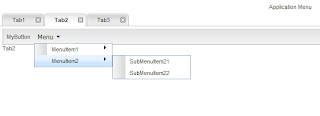
* Tab3:此選項卡將垂直手風琴圍成三個獨立的部分。

這就是整個用戶界面的樣子:

我們已經到了本教程的結尾,所以讓我們重新回顧一下已經完成的工作。 首先,我們通過定義特定區域并添加相應的子布局來創建UI的主布局。 每個子布局都是單獨處理的。 對于標題區域,我們在左側添加了應用程序的徽標,在右側添加了已登錄用戶的名稱。 對于導航區域,我們使用了一個手風琴,該手風琴將一棵樹封閉在其中的一部分中。 這棵樹可以有任意數量的子代,孫代等,但是您不可以一味地接受它。 最后,對于主布局,我們使用了選項卡,以便最大程度地利用屏幕區域。 創建了三個預定義的選項卡,每個選項卡包含各種小部件。 請注意,導航窗格應鏈接到主區域。 每當用戶單擊其中一個葉子時,都可以通過創建一個新選項卡來實現。
伙計們。 您可以在這里找到創建的最終Eclipse項目。 如果您喜歡這個,別忘了分享! 干杯!
- 高級SmartGWT教程,第1部分
- SmartGWT入門,提供出色的GWT界面
- 將JSON功能添加到您的GWT應用程序中
- 建立自己的GWT Spring Maven原型
- 將CAPTCHA添加到您的GWT應用程序
- GWT Spring和Hibernate進入數據網格世界
翻譯自: https://www.javacodegeeks.com/2011/01/advanced-smartgwt-tutorial-part-2.html


)


