美學設計評價
In the popular anime series, Soul Eater, Death the Kid is a Shinigami (Japanese death god) who vanquishes evil with his dual pistols, Liz and Patty. Although he’s strikingly powerful, his battles are often hindered by his obsessive-compulsive need for symmetry; Kid is unable to hurt perfectly symmetrical enemies, unable to focus on a chase when passing beautiful symmetrical objects, and is paralyzed in disgust by the sight of extreme asymmetry.
在流行的動漫系列《噬魂師》中,“小孩子的死神”是Shinigami(日本死神),他用雙手槍Liz和Patty戰勝了邪惡。 盡管他非常強大,但他的戰斗常常因他對對稱性的強迫性需求而受阻。 Kid無法傷害完全對稱的敵人,無法通過漂亮的對稱物體時專注于追趕,并且由于極度不對稱而厭惡地癱瘓。
This obsessive-compulsive tendency actually exists in all of us. Something in our brain tells us “Symmetry is good and we must always strive for it!”
這種強迫癥傾向實際上存在于我們所有人中。 我們大腦中的某些事情告訴我們“對稱性很好,我們必須始終為此努力!”
Throughout my work as a UX designer, I see this over and over again. Without thinking about it, people around me (clients, PMs, developers, etc.) instinctually ask for it in my designs.
在我作為UX設計師的整個工作中,我一遍又一遍地看到這一點。 不用考慮,周圍的人(客戶,PM,開發人員等)本能地在我的設計中提出要求。
“Can you center align that paragraph?”
“您可以將該段居中對齊嗎?”
“Can you expand those input fields to fit the screen?”
“您可以擴展這些輸入字段以適合屏幕嗎?”
“Can you move this table header to the right to align with the section above?”
“您可以將此表格標題向右移動以與上面的部分對齊嗎?”
However, symmetry often makes a poor user experience because our brains expect to scan content in a side-aligned (left-aligned for English readers) manner, like reading a book.
但是,對稱通常會帶來糟糕的用戶體驗,因為我們的大腦希望以側對齊(對于英語閱讀者為左對齊)的方式掃描內容,例如看書。
中心對齊與左對齊 (Center alignment vs. left alignment)
Center aligned text is often more visually appealing, but it can make the content difficult to read if there is more than a sentence or two.
居中對齊的文本通常在視覺上更具吸引力,但是如果多于一兩個句子,則可能使內容難以閱讀。

As represented by the purple arrows above, a user’s vision tends to search for the start of the next line based on the previous starting point.
如上方的紫色箭頭所示,用戶的視線傾向于基于前一個起點來搜索下一行的起點。
In the center aligned example, the user needs to find and process the start point of the next line. This extra subconscious step not only adds to the cognitive workload, but also feels unnatural.
在居中對齊的示例中,用戶需要查找并處理下一行的起點。 這種額外的潛意識步驟不僅增加了認知工作量,而且感覺不自然。
對稱與F形 (Symmetry vs. F-shaped)
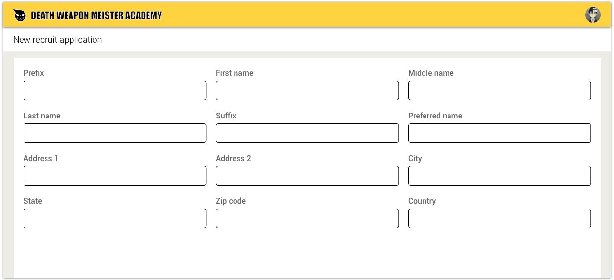
More often than not, forms and tables developed for corporate enterprise software tend to be immensely complicated and long. By default, many enterprise software platforms (ex. Salesforce or Pegasystems) treat these behemoth piles of data with symmetrical multi-column layouts that stretch across the page to “make use of the white space” and to “avoid too much vertical scrolling.”
通常,為公司企業軟件開發的表格和表格往往非常復雜且冗長。 默認情況下,許多企業軟件平臺(例如Salesforce或Pegasystems)使用對稱的多列布局處理這些龐然大物的數據,這些布局跨頁面延伸以“利用空白”并“避免過多的垂直滾動”。
There is an abundance of research that shows that single column forms are much more usable than multi-column ones mainly because:
有大量研究表明,單列表單比多列表單更有用,主要是因為:
- Multi-column layouts lack a clear sense of direction to lead users. This makes it harder to pick up momentum and adds to the cognitive load to determine the flow of information. 多列布局缺乏明確的引導用戶的方向感。 這使得更難獲得動量,并增加了確定信息流的認知負擔。
- The lack of clear direction also causes users to skip fields. 缺乏明確的方向還會導致用戶跳過字段。
- Users generally do not mind vertical scrolling. 用戶通常不介意垂直滾動。

Stretching out forms and tables to fit the width of the screen is another common habit.
伸展表格和表格以適合屏幕寬度是另一個常見的習慣。

Although it aesthetically makes sense to add this symmetrical balance to pictures, it forces users to scan more real estate, which wastes time and, again, adds to the cognitive workload.
盡管在圖片上添加這種對稱的平衡在美學上是有意義的,但它迫使用戶掃描更多的不動產,這既浪費時間,又增加了認知工作量。
A more user-friendly design would be to size the input fields according to the amount of data expected (rather than keeping the same size for symmetry’s sake) and to follow the F-shaped reading pattern, which is more similar to reading a book (left-right, up-down).
一種更人性化的設計是根據預期的數據量來調整輸入字段的大小(而不是為了對稱而保持相同的大小),并遵循F形閱讀模式,這與閱讀書籍更相似(左右-上下)。

There are many advantages to laying out data this way:
通過這種方式布置數據有很多優點:
- It drives the user’s attention in a clear direction, making it faster and easier to scan. 它可以沿清晰的方向吸引用戶的注意力,使其掃描更快,更容易。
- The extra white space makes the screen feel less cluttered. 多余的白色空間使屏幕顯得更整潔。
- Since the data is closer in proximity, there is less distance to scan, which makes less work for the user. 由于數據更接近,因此掃描距離更短,這對用戶減少了工作量。
強迫癥:強迫癥設計 (OCD: Obsessive-compulsive design)
By instinct, most people will continue to believe that symmetry feels more correct unless they are asked to actually do side-by-side usability comparisons. Despite successfully convincing clients to change their designs to be less symmetrical and more usable, I find that they have a hard time internalizing this logic.
出于本能,大多數人會繼續相信對稱性會更正確, 除非要求他們實際進行并行的可用性比較 。 盡管成功說服客戶將其設計更改為不太對稱且更易用,但我發現他們很難理解這種邏輯。
In conclusion, the obsession with symmetry is an overrated aesthetic that is harmful to both usability and Shinigamis.
總之,對對稱性的癡迷是一種高估的美學,對可用性和Shinigamis都有害。
Please don’t harvest my soul, Kid.
小子,請不要收獲我的靈魂。
翻譯自: https://uxdesign.cc/death-the-kids-unusable-design-aesthetic-260dcc81273e
美學設計評價
本文來自互聯網用戶投稿,該文觀點僅代表作者本人,不代表本站立場。本站僅提供信息存儲空間服務,不擁有所有權,不承擔相關法律責任。 如若轉載,請注明出處:http://www.pswp.cn/news/275680.shtml 繁體地址,請注明出處:http://hk.pswp.cn/news/275680.shtml 英文地址,請注明出處:http://en.pswp.cn/news/275680.shtml
如若內容造成侵權/違法違規/事實不符,請聯系多彩編程網進行投訴反饋email:809451989@qq.com,一經查實,立即刪除!相關文章

iis php網站500錯誤原因_因為曾經錯誤安裝過PHP5.2而導致IIS7無法正常工作,顯示500錯誤提示,大家幫忙看看!...
)
【送書】2021年哪些好書值得讀(小姐姐配音)

Flash獲取html參數的方法


php strtoup,PHP 7 的幾處函數安全小變化

Node.js 框架設計及企業 Node.js 基礎建設相關討論

DAS、NAS、SAN、iSCSI 存儲方案概述

同態加法_同態—當舊趨勢突然變酷時

網頁標題設置,為什么在SERP中,顯示結果不一致?

阿里專有釘釘前端面試指南

安全態勢感知產品對比_設計中的對比和人的感知

在字節做前端一年后,有啥收獲~

app用戶隱私協議相關法律_隱私圖標和法律設計

HTTP referer
![ecshop模板支持php,[老楊原創]關于ECSHOP模板架設的服務器php版本過高報錯的解決方法集合...](http://pic.xiahunao.cn/ecshop模板支持php,[老楊原創]關于ECSHOP模板架設的服務器php版本過高報錯的解決方法集合...)
ecshop模板支持php,[老楊原創]關于ECSHOP模板架設的服務器php版本過高報錯的解決方法集合...

35 點擊全圖后發現地圖“不見了”

成為優秀溝通者的要素_如果您想成為更好的設計師,請成為更好的溝通者


DEDECMS 5.6整合Discuz_X1.5的方法
