In late October of 2019 me and our CRO lead Lucas, set up a project at Videoland to redesign our main landing page for prospect customers (if they already have a subscription, they will go to the actual streaming product).
在2019年10月下旬,我和我們的CRO負責人Lucas在Videoland設立了一個項目,為潛在客戶重新設計我們的主要登陸頁面(如果他們已經訂閱,則將使用實際的流媒體產品)。
📱 產品背景 (📱 Product background)
Videoland is a Dutch SVOD-product, much like Netflix or more recently, Disney+. The company was founded in 1984 as a chain of video rental stores, before exclusively becoming an online platform back in 2010. In 2013 it was acquired by RTL Nederland. It now has over 600,000 monthly paying subscribers, with an average monthly visitor rate on the landing page of more than 1,000,000.
Videoland是荷蘭的SVOD產品,很像Netflix或最近的Disney +。 該公司成立于1984年,當時是連鎖視頻租賃商店,之后在2010年成為獨家在線平臺。2013年,該公司被RTL Nederland收購。 現在,它有超過600,000個按月付費用戶,著陸頁上的平均每月訪問者人數超過1,000,000。
🖌為什么要重新設計? (🖌 Why a redesign?)
The, at the time, current landing page was becoming outdated, iterated on desktop-first, legacy designs and copy. We had been running a plethora of different A/B tests, all of which had a mere incremental impact on metrics like conversion rate. With the rise of new competitors and our recent rebrand, this was the time to take a good hard look at what the landing page was meant to be, and most importantly, how we could improve it from a user perspective. We needed a research backed, mobile-first designed landing page with to-the-point copy that highlights the value proposition of the product and speaks to our target audience.
當時的當前登錄頁面已過時,在桌面優先,舊版設計和副本上進行了迭代。 我們一直在運行大量不同的A / B測試,所有這些測試僅對轉化率等指標產生增量影響。 隨著新競爭對手的崛起以及我們最近的品牌重塑 ,現在是時候認真思考著陸頁的含義了,最重要的是,我們應該從用戶的角度來改進它。 我們需要一個研究支持的,移動優先的著陸頁,并帶有針對性的副本,以突出產品的價值主張并與目標受眾對話。
“Revolutions don’t come out of A/B tests. A revolution — an experience for your customer that’s exponentially, not incrementally, better — you’re not going to find them there, even if you run 100 at a time.” - Abigail Hart Gray, Director of UX at Google
“革命并非來自A / B測試。 一場革命-一種成倍地,而不是漸進地,更好地為您的客戶提供的體驗-即使您一次運行100次,也不會在那里找到它們。” -Google用戶體驗總監Abigail Hart Gray

Together with our UX researcher Natascha, we looked at the goals of people visiting the page. Using tools called Usabilla and Hotjar, we set up surveys asking users what they were looking for on the landing page, collected heatmaps and other material to get insights into the behaviour of our customers on this page. We came to several insights that sparked the next steps of the redesign process.
我們與UX研究人員Natascha一起,研究了訪問該頁面的人的目標。 使用名為Usabilla和Hotjar的工具,我們進行了調查,詢問用戶他們在著陸頁上正在尋找什么,收集了熱圖和其他材料,以便在此頁面上深入了解客戶的行為。 我們得出了一些見解,這些見解激發了重新設計過程的后續步驟。
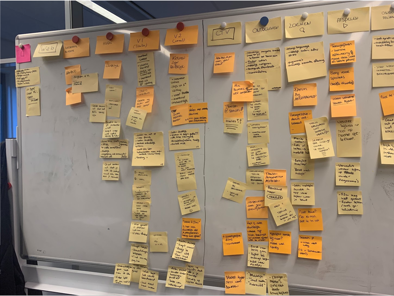
👥共創課程 (👥 Co-creation sessions)
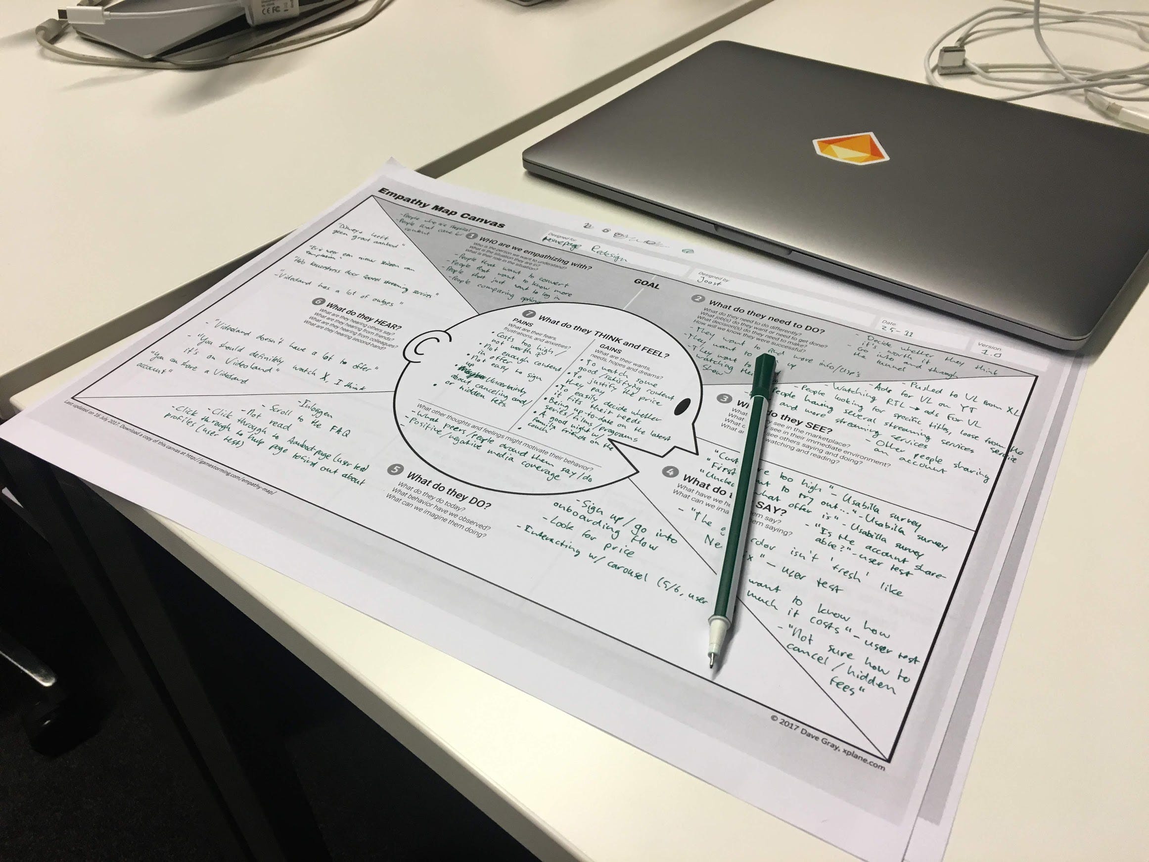
The start was to host co-creation sessions with several stakeholders to get them to draw up their ideas of what the landing page should entail and achieve. Combined with the outcomes of empathy mapping and user journeys, there was a greater sense of what the requirements for the landing page should be.
最初是與幾個利益相關者共同舉辦創建會議,以使他們就目標網頁應包含的內容和實現的內容提出自己的想法。 結合移情映射和用戶旅行的結果,可以更好地了解目標網頁的要求。
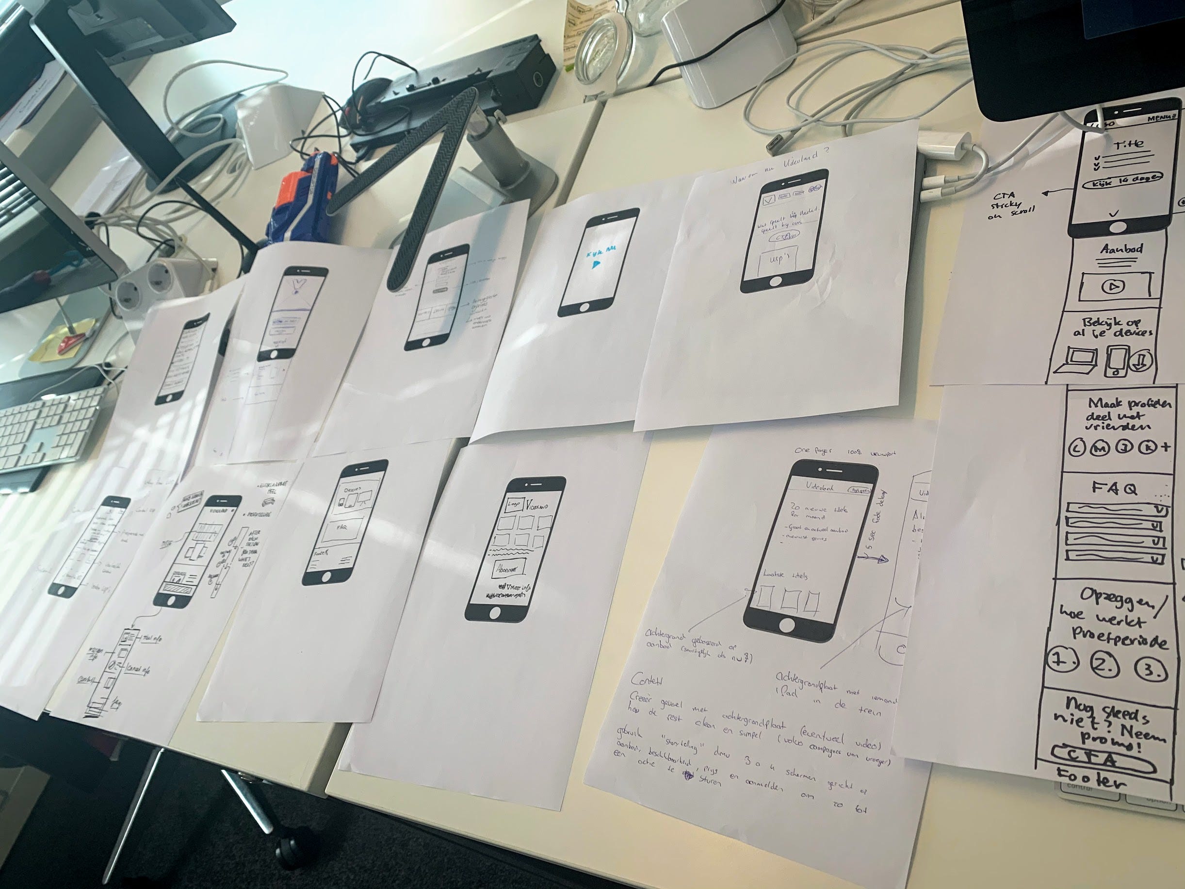
After gathering a lot of initial sketches from stakeholders, we turned them into digital wireframes of page-components. These components were printed and used for new sessions, with the UX team and with the CRO team, where we rearranged them to get to several possible layouts and the rationales behind them.
在從利益相關者那里收集了很多初始草圖之后,我們將它們變成了頁面組件的數字線框。 這些組件已被打印,并與UX團隊和CRO團隊一起用于新的會議,我們在其中重新排列了它們,以得到幾種可能的布局及其背后的原理。
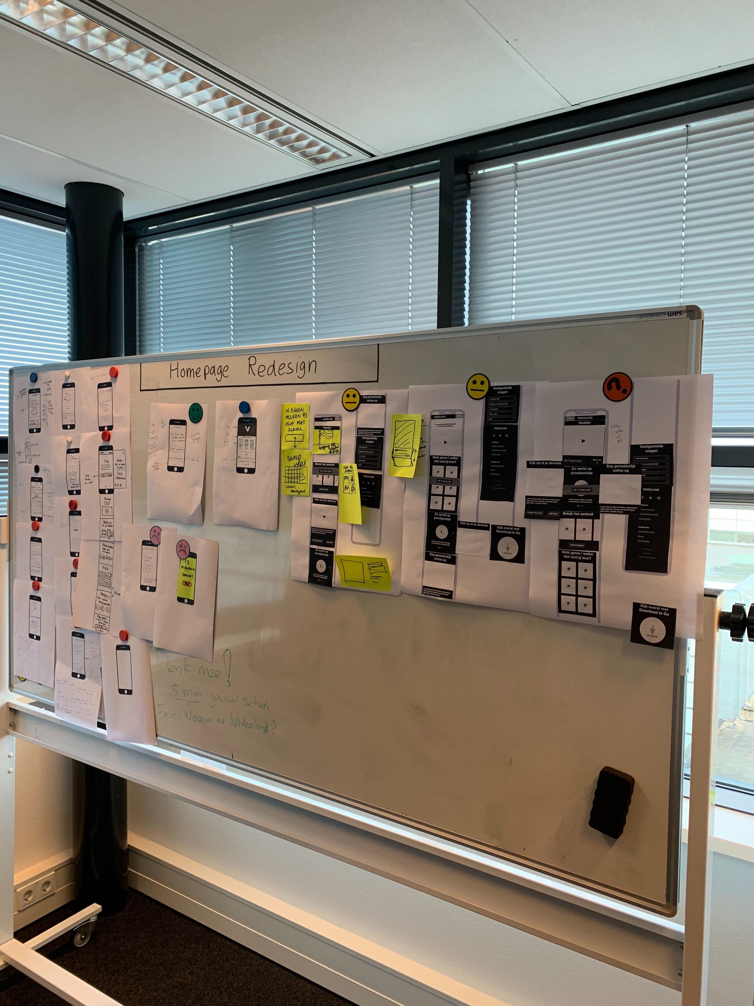
After the sessions we came to several possible layouts, and we had insight in the prioritization of the elements coming from the different disciplines. After these sessions the next step was to convert these lower-fidelity layouts to high-fidelity interface designs.
會議結束后,我們討論了幾種可能的布局,并了解了來自不同學科的元素的優先級。 在這些會議之后,下一步就是將這些低保真布局轉換為高保真界面設計。
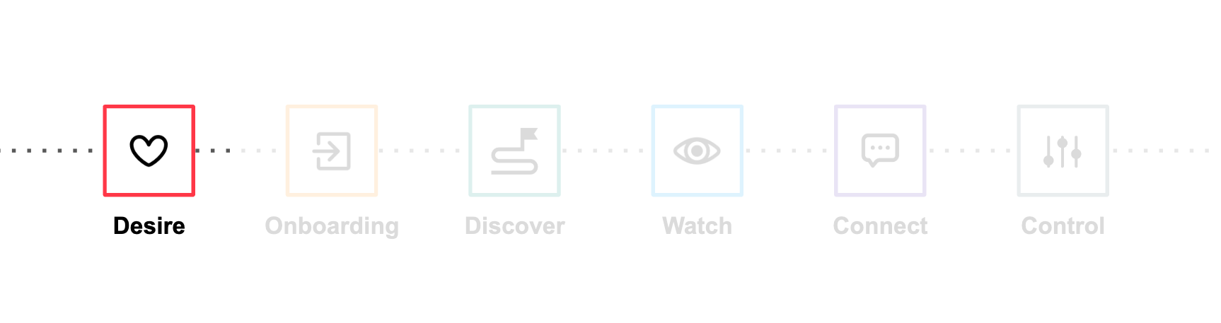
🖼低保真至高保真 (🖼 Lo-fi to Hi-fi)

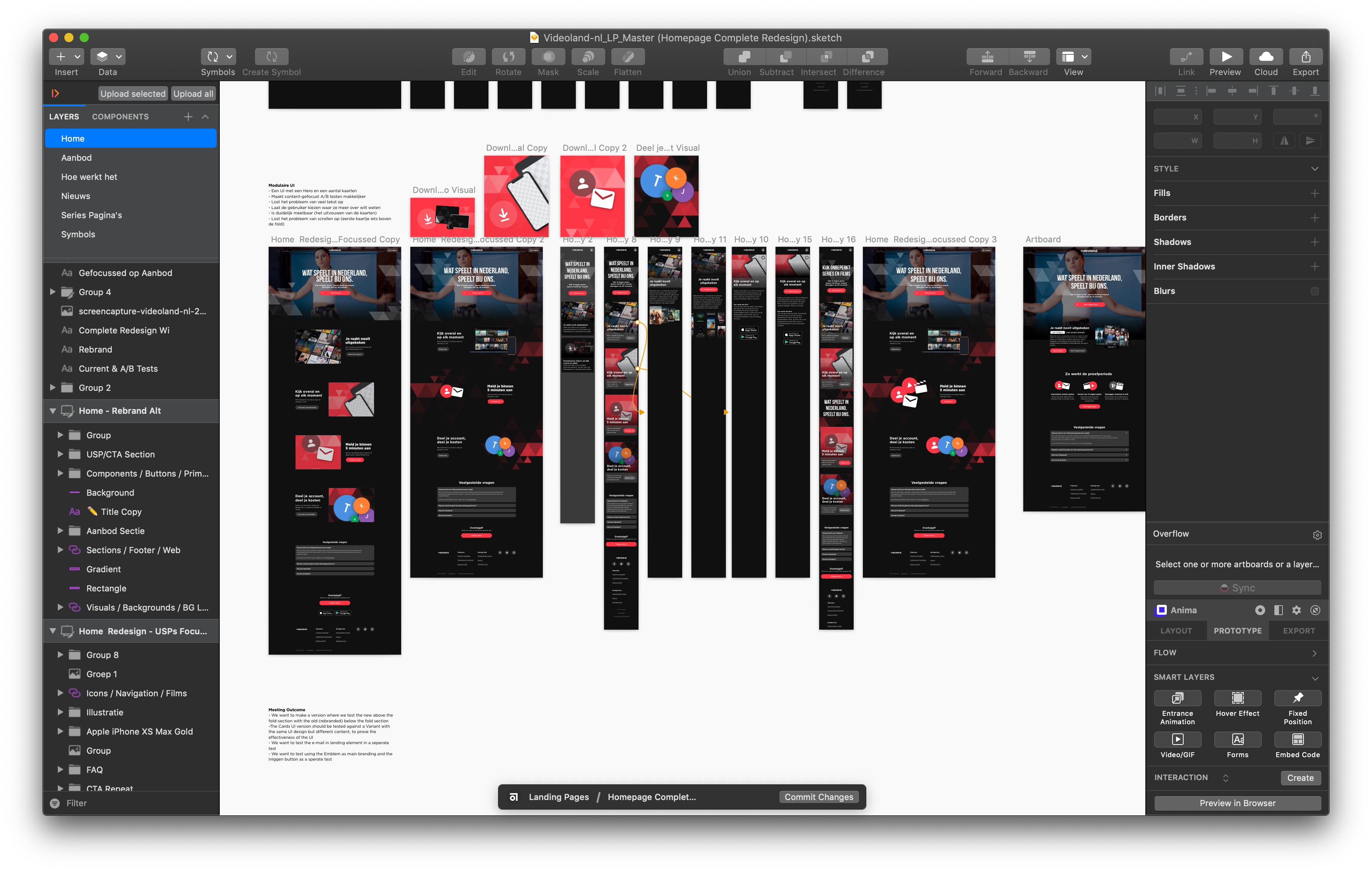
When creating the hi-fi designs for the landing page we were taking into account the previous sketches, wireframes and layouts, and findings from the research. Eventually, we created three different versions that we presented to the whole of Videoland. In these we explored different CTA’s, title/button placements, text hierarchies, different interactive elements displaying the content that we offer, different visual ways of communicating our USP’s, as well as different ways of presenting all these elements in a more cohesive way.
在為目標網頁創建高保真設計時,我們考慮了之前的草圖,線框和布局以及研究結果。 最終,我們創建了三個不同的版本,呈現給整個Videoland。 在這些文章中,我們探索了不同的CTA,標題/按鈕位置,文本層次結構,顯示我們提供的內容的不同交互式元素,不同的可視化方式來傳達我們的USP,以及以更緊密的方式呈現所有這些元素的不同方式。
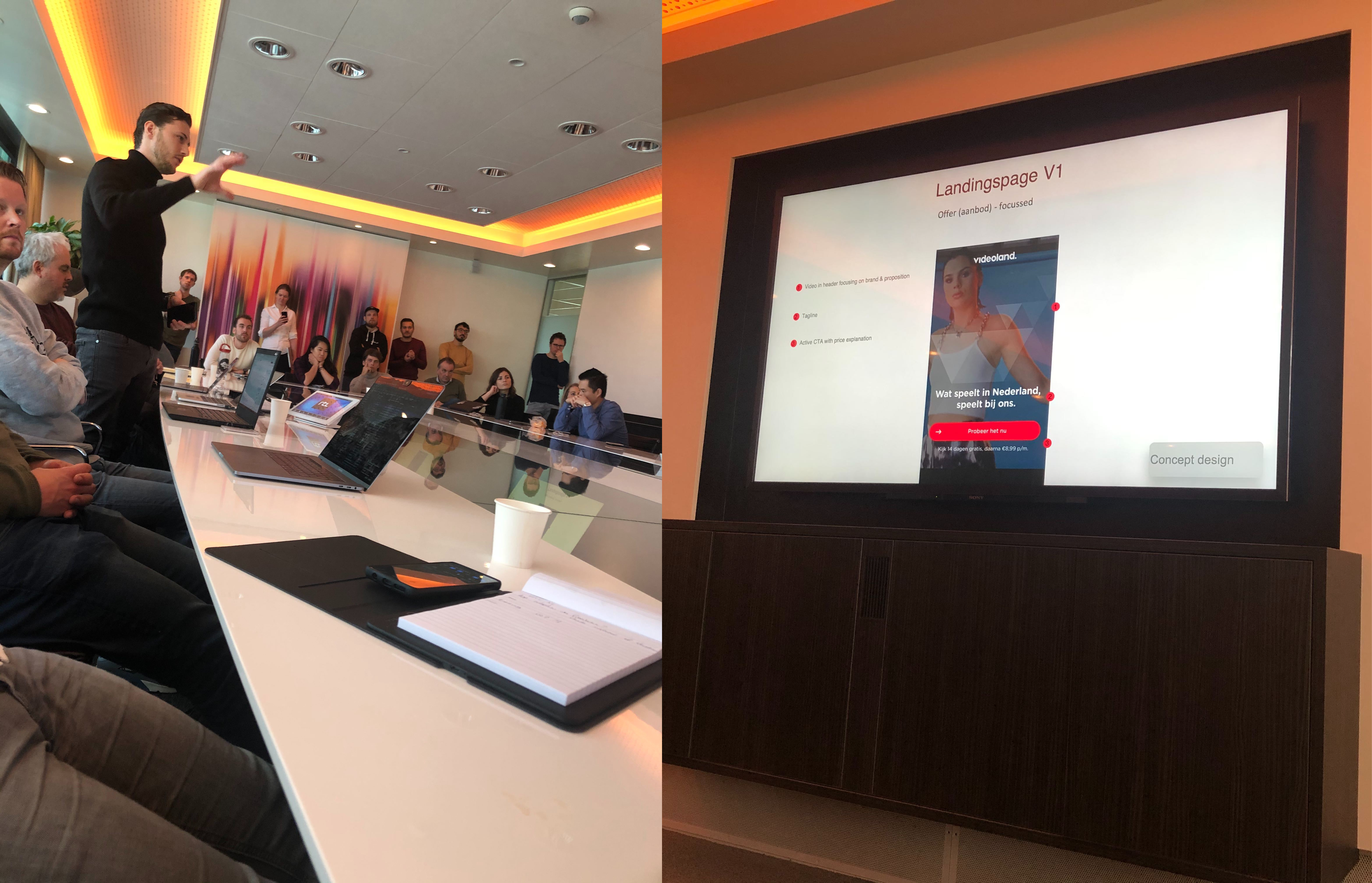
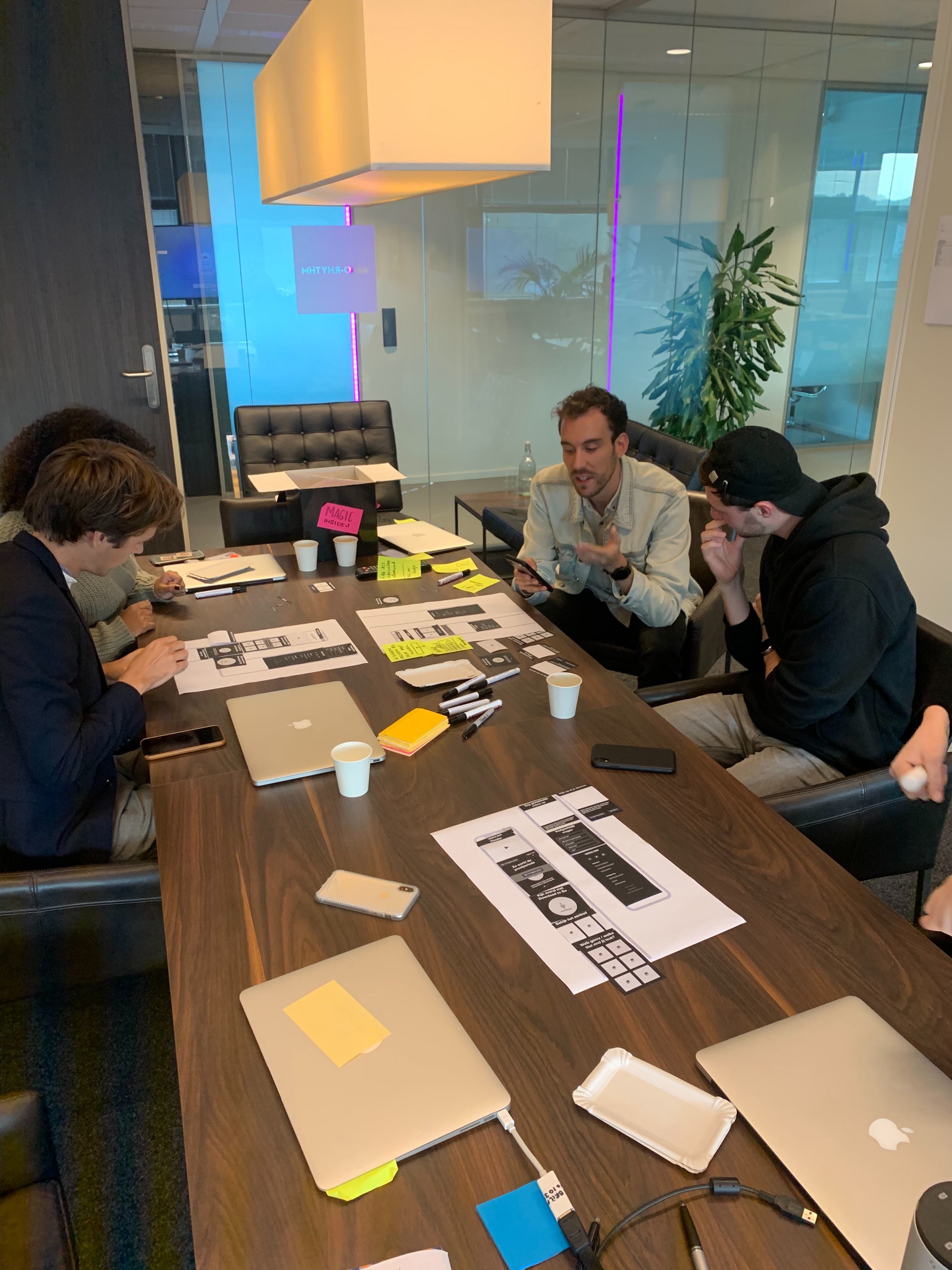
🔬用戶測試 (👨🏻?🔬 User testing)
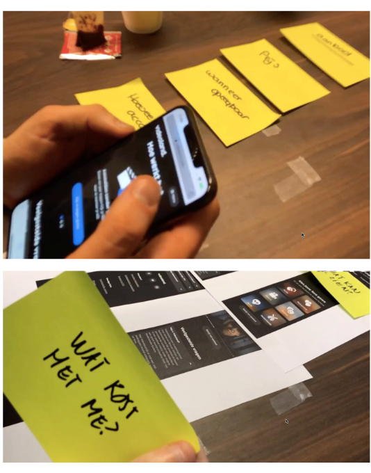
The next step in the process was to make the three different hi-fi designs of the page into interactive prototypes, and have people that are in the target group come on-site and have them walk through several different journeys while interacting with the redesigns. We had a total of 6 people come to the testlab in our office, spread across 2 days. Our researchers would facilitate, walking people through the journeys and asking them questions about the experience. Monitoring this process and sending our questions over, we were in the spectating room.
該過程的下一步是使頁面的三種不同的高保真設計成為交互式原型,并讓目標群體中的人們到現場,并在與重新設計進行交互的過程中經歷多個不同的旅程。 我們共有6人來到我們辦公室的testlab,歷時2天。 我們的研究人員將為您提供便利,引導人們完成旅程,并向他們詢問有關體驗的問題。 監視此過程并將我們的問題發送過來,我們當時正在觀眾室。
Quite a few findings came to light from the testing. Positives, as well as negatives. We found for example that an autoplaying video with trailers of our films and series in the header, had a negative effect on the goals the user wanted to achieve, and was generally regarded as ‘distracting’.
測試發現了很多發現。 正面和負面。 例如,我們發現一個自動播放的視頻在標題中包含我們的電影和系列的預告片,對用戶想要實現的目標產生負面影響,通常被認為是“分散注意力”。
On the findings from the user test we based the next round of iteration of the designs. The reason we did not (lo-fi) test earlier was mainly because we already had research insights from our current product that we based our hypotheses on, and we wanted a high fidelity prototype to validate more accurately.
根據用戶測試的結果,我們基于設計的下一輪迭代。 我們之所以沒有進行早期(lo-fi)測試的原因主要是因為我們已經有了我們基于假設的當前產品的研究見解,并且我們想要一個高保真度的原型來更準確地進行驗證。
💻設置A / B測試 (💻 Setting up A/B tests)
After incorporating the findings that we gathered in the user testing, the next step was… more validation. This time, however, with actual code and a much bigger sample size. Using SiteSpect, we A/B tested the new landing page against the current one. Using Google Analytics, and the provided insight by our Web Analyst, we gathered insights on several metrics like scroll depth and conversion. Fortunately, due to the large amount of traffic on this page we managed to gather a lot of data in a relatively short timespan.
納入我們在用戶測試中收集到的發現之后,下一步是…更多驗證。 但是,這次是使用實際代碼和更大的樣本量。 使用SiteSpect ,我們對當前目標網頁進行了A / B測試。 使用Google Analytics(分析 )以及Web分析師提供的見解,我們收集了有關多個指標(例如滾動深度和轉化率)的見解。 幸運的是,由于此頁面上的大量流量,我們設法在較短的時間內收集了很多數據。
In the first round of testing we found that there was not that much of an uplift in the metrics. We decided to alter the design and copy used based on previous insights, in order to run another test and see if there would be an uplift in this version. After running this test for two weeks and analysing the results we found that it was a winner 🎊 which meant that we could implement it and ship it to our users.
在第一輪測試中,我們發現指標沒有太多提升。 我們決定根據以前的見解更改設計和使用的副本,以便進行另一項測試,以查看該版本是否有所提升。 在運行了兩個星期的測試并分析了結果之后,我們發現它是一個勝利者,這意味著我們可以實施它,并將其交付給我們的用戶。
🚀最終設計與實施 (🚀 Final design and implementation)
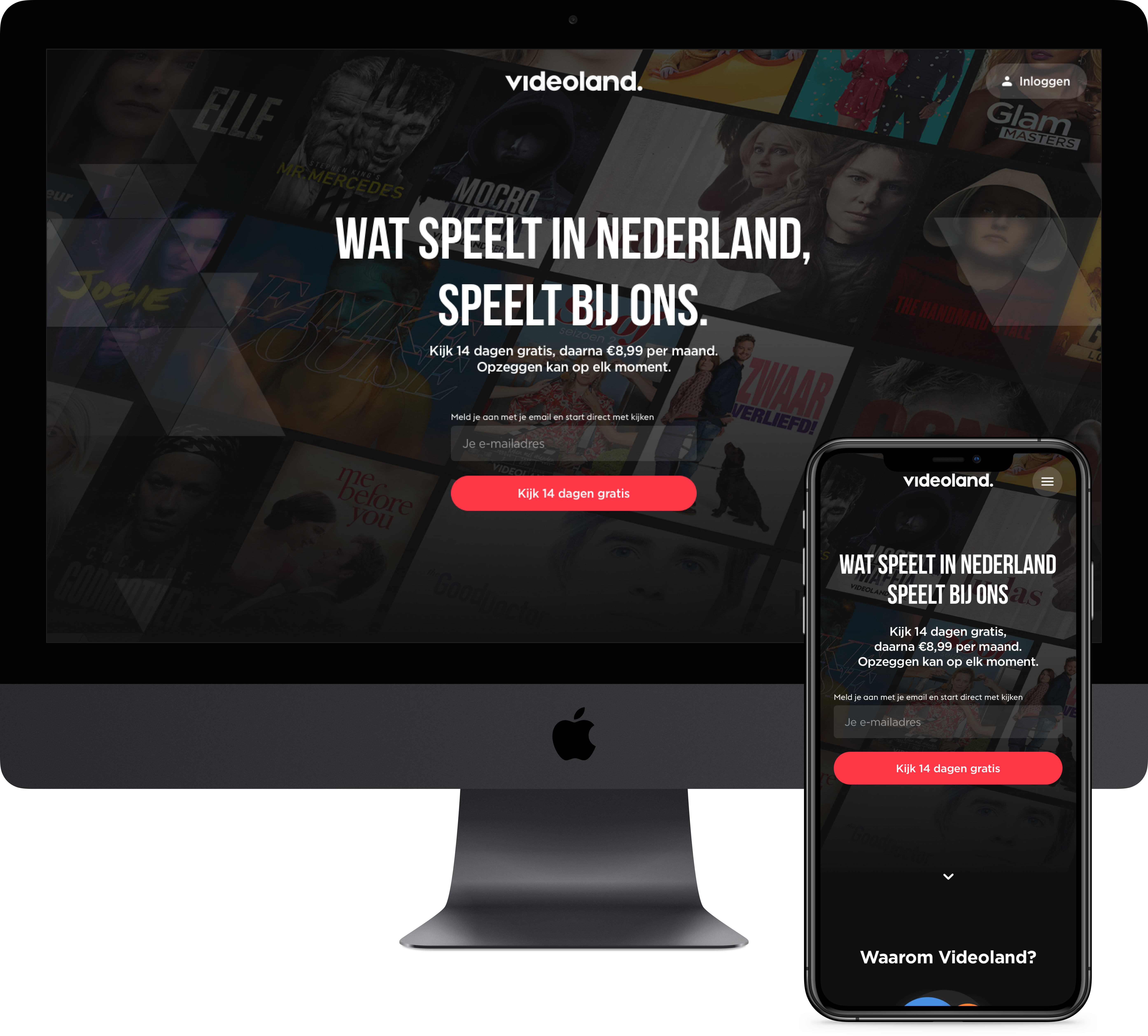
After several months of imagining, researching, drawing, researching some more, designing, prototyping, testing, testing some more, refining and analysing, we now have a brand new landing page.
經過幾個月的想象,研究,繪圖,更多研究,設計,原型制作,測試,更多測試,優化和分析,我們現在有了一個全新的著陸頁。
?? Click here for a full comparison (might take a while to load)
Click? 單擊此處進行完整比較 (可能需要一段時間才能加載)
s學習 (🎓 Learnings)
This was a project that I personally had wanted to do from the very first day I started working at Videoland. The process was fruitful for the users and the business in the end, but also for me personally. Setting up a project and taking the lead on several fronts, hosting the co-creation sessions and user tests were all valuable experiences. The room for improvement I saw combined with the enthusiasm from co-workers on this project really motivated me to push this project as far forward as we could. Of course, work is never done and we keep on improving this and many other pages.
從我開始在Videoland工作的第一天起,這就是我個人想要做的一個項目。 最終,該過程不僅對用戶和企業都富有成效,而且對我個人而言也是如此。 設置項目并在多個方面帶頭,主持共同創建會議和用戶測試都是寶貴的經驗。 我看到的改進空間,加上同事們對該項目的熱情,確實激發了我將項目推進到最大的可能。 當然,工作永遠不會完成,我們會繼續改進此頁面以及許多其他頁面。

My name is Joost Reus. I’m a UX/UI designer at Videoland in Hilversum.
我叫Joost Reus。 我是 希爾弗瑟姆 Videoland 的UX / UI設計師 。
Website | LinkedIn | Email
網站 | LinkedIn | 電子郵件
翻譯自: https://blog.prototypr.io/redesigning-videolands-landing-page-a-ux-case-study-6ab920ccfb0d
本文來自互聯網用戶投稿,該文觀點僅代表作者本人,不代表本站立場。本站僅提供信息存儲空間服務,不擁有所有權,不承擔相關法律責任。 如若轉載,請注明出處:http://www.pswp.cn/news/275091.shtml 繁體地址,請注明出處:http://hk.pswp.cn/news/275091.shtml 英文地址,請注明出處:http://en.pswp.cn/news/275091.shtml
如若內容造成侵權/違法違規/事實不符,請聯系多彩編程網進行投訴反饋email:809451989@qq.com,一經查實,立即刪除!相關文章

【常見Web應用安全問題】---5、File Inclusion

全新的 Vue3 狀態管理工具:Pinia

JS中變量和函數的使用

Win32 API消息函數:GetMessagePos

都快 2022 年了,這些 Github 使用技巧你都會了嗎?


Repeater\DataList\GridView實現分頁,數據編輯與刪除

網站快速成型_我的老板對快速成型有什么期望?

碎片化學前端,融入到積極上進的環境,我推薦~
)
重學JavaScript深入理解系列(六)
——系統首頁設計(上))
EXT.NET復雜布局(四)——系統首頁設計(上)

figma設計_在Figma中使用隔片移交設計

axios源碼中的10多個工具函數,值得一學~

安裝jenkins時出現 No such plugin: cloudbees-folder的解決辦法

寄充氣娃娃怎么寄_我如何在5小時內寄出新設計作品集

基于Hbase的用戶評分協同過濾推薦算法

最全 JavaScript Array 方法 詳解
![[譯] React Hooks: 沒有魔法,只是數組](http://pic.xiahunao.cn/[譯] React Hooks: 沒有魔法,只是數組)
[譯] React Hooks: 沒有魔法,只是數組

管理溝通中移情的應用_移情在設計中的重要性
