重點 (Top highlight)
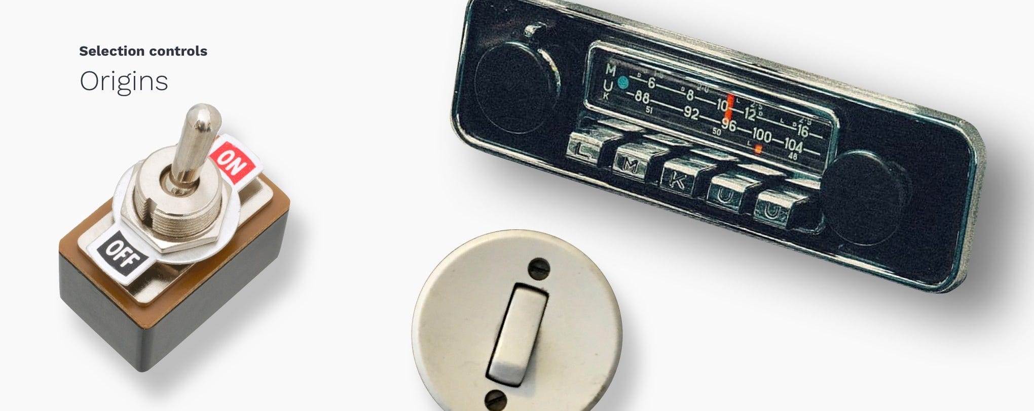
The word “toggle” is a reference to a switch with a short handle that alternates between two states each time it is activated. You encounter it every time you “switch” on the lights.
單詞“ toggle”是指帶有短手柄的開關,該開關每次被激活時都會在兩種狀態之間切換。 每次“打開”燈光時都會遇到它。
As for “Radio Buttons” the word comes from the car radios that as common practice had a set of buttons under the dial that could mechanically store station presets, so the user switch between stations faster. Pressing one of these buttons would cause it to stay down until another was pressed.
至于“收音機按鈕”,這個詞來自汽車收音機,通常情況下,表盤下方有一組按鈕,可以機械地存儲電臺預設,因此用戶可以更快地在電臺之間進行切換。 按下其中一個按鈕將使其保持向下狀態,直到按下另一個按鈕為止。
Checkboxes — are used when there are one or many independent options and users may select any number of choices, including none, one, or several.
復選框 -當有一個或多個獨立選項且用戶可以選擇任何數量的選項時使用,包括一個,一個或多個。
Radio buttons — are used when there is a list of two or more options that are mutually exclusive and users must select only one of them.
單選按鈕 -當存在兩個或多個互斥選項的列表且用戶必須僅選擇其中一個時使用。
Toggle switches — are used when are two mutually exclusive options and always have a default value. Toggles selection takes effect immediately.
撥動開關 —當兩個互斥選項且始終具有默認值時使用。 切換選擇立即生效。
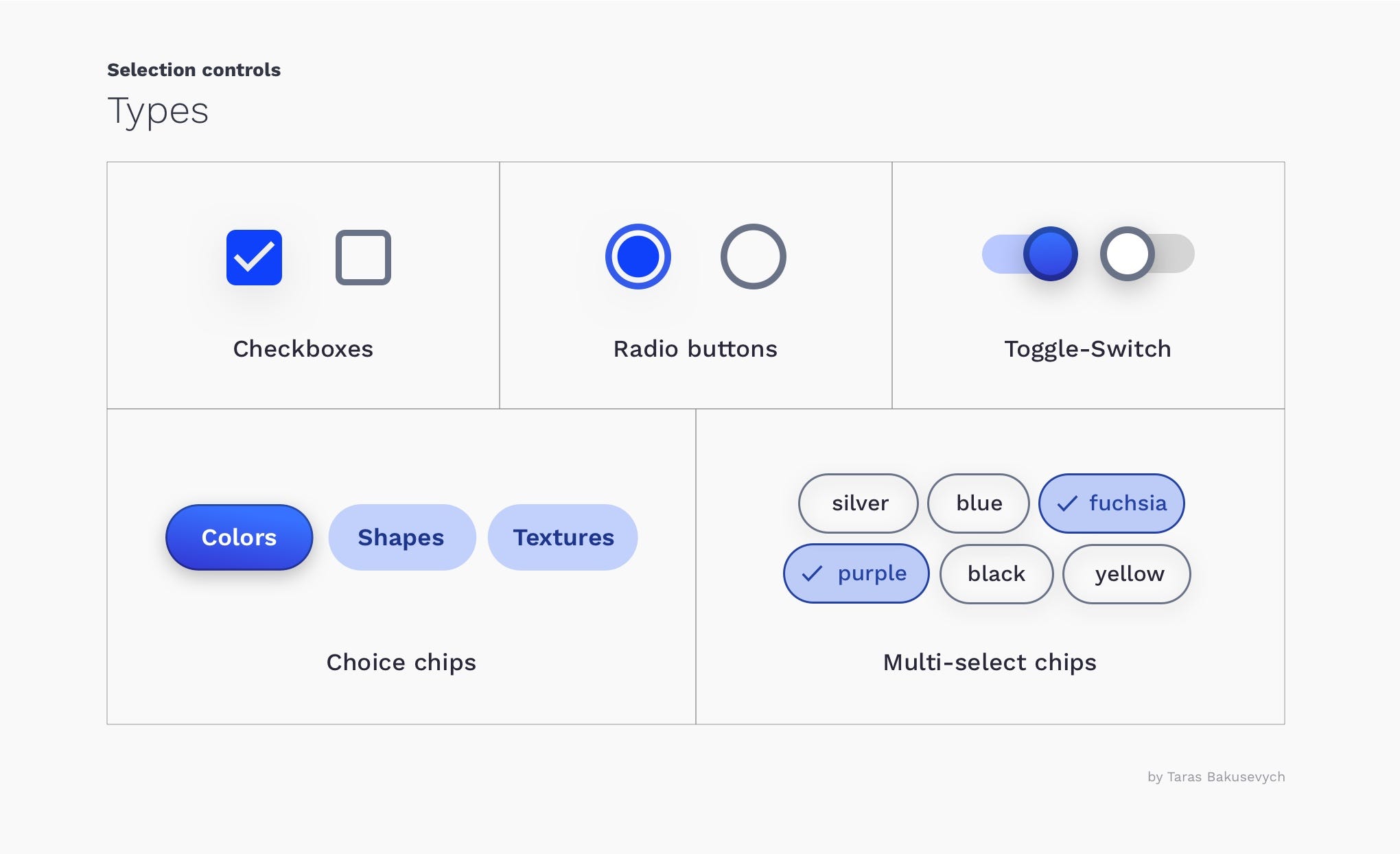
Choice chips - are a compact alternative to radio buttons. Containing at least two options, choice chips represent a single selection that users can make.
選擇芯片 -是單選按鈕的緊湊替代品。 選擇籌碼至少包含兩個選項,代表用戶可以進行的單個選擇。
Multi-select chips — are a compact alternative to checkboxes. Allow users to select multiple options and are primarily used for filtering on mobile.
多選芯片 -是復選框的緊湊替代品。 允許用戶選擇多個選項,主要用于在移動設備上進行過濾。
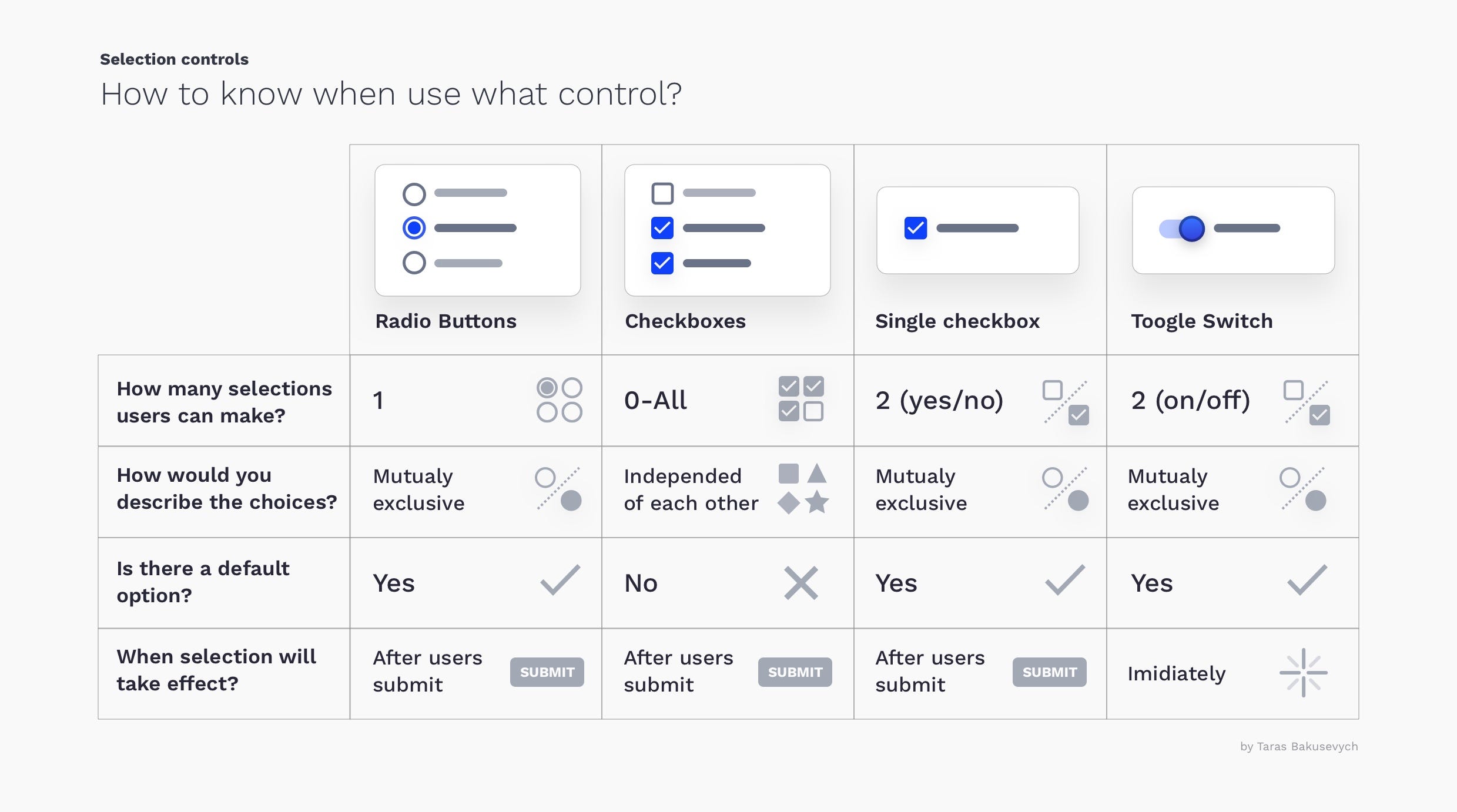
Selection controls have been used in user interfaces for a long time, so we have formed strong expectations on how they should behave. Here is a simple cheat sheet that you can follow to choose the right type for the right situation.
選擇控件已經在用戶界面中使用了很長時間,因此我們對它們的行為方式形成了強烈的期望。 這是一個簡單的備忘單,您可以按照它為正確的情況選擇正確的類型。
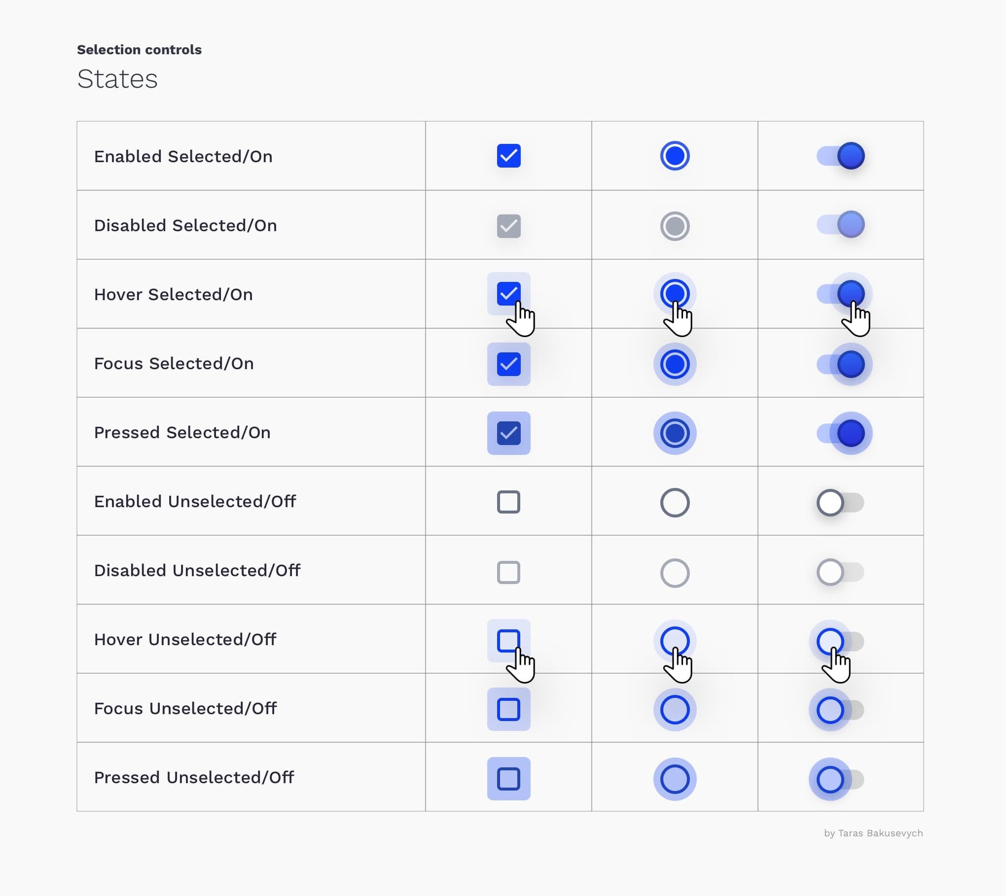
狀態 (States)
Checkboxes & radio buttons can be selected or unselected, and Toggles can be Off or On. All of them have enabled, disabled, hover, focused, and pressed states. And I know it looks like a lot), but it's good to create all those states for reliable interaction.
可以選擇或取消選中復選框和單選按鈕,并且“切換”可以為“關”或“開”。 它們全部具有啟用,禁用,懸停,集中和按下狀態。 而且我知道它看起來很多),但是最好創建所有這些狀態以實現可靠的交互。
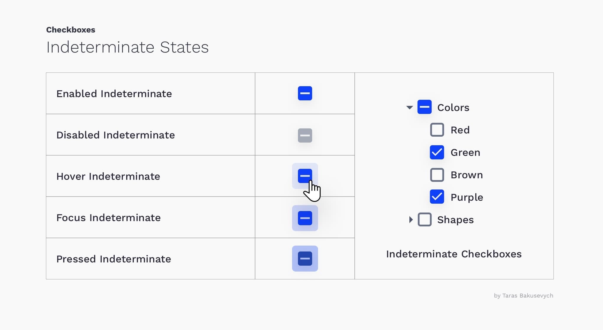
不要忘記不確定的狀態 (Don't forget about the indeterminate state)
State for a checkbox that is neither checked nor unchecked. The state is not fully determined, hence the name- indeterminate. Created to handle a scenario when there's a parent checkbox that has multiple children, some of which are selected and others are not.
聲明未選中或未選中的復選框。 狀態尚未完全確定,因此名稱不確定。 創建該應用程序是為了處理具有多個子級的父級復選框的情況,其中某些子級被選中,而其他子級則沒有。
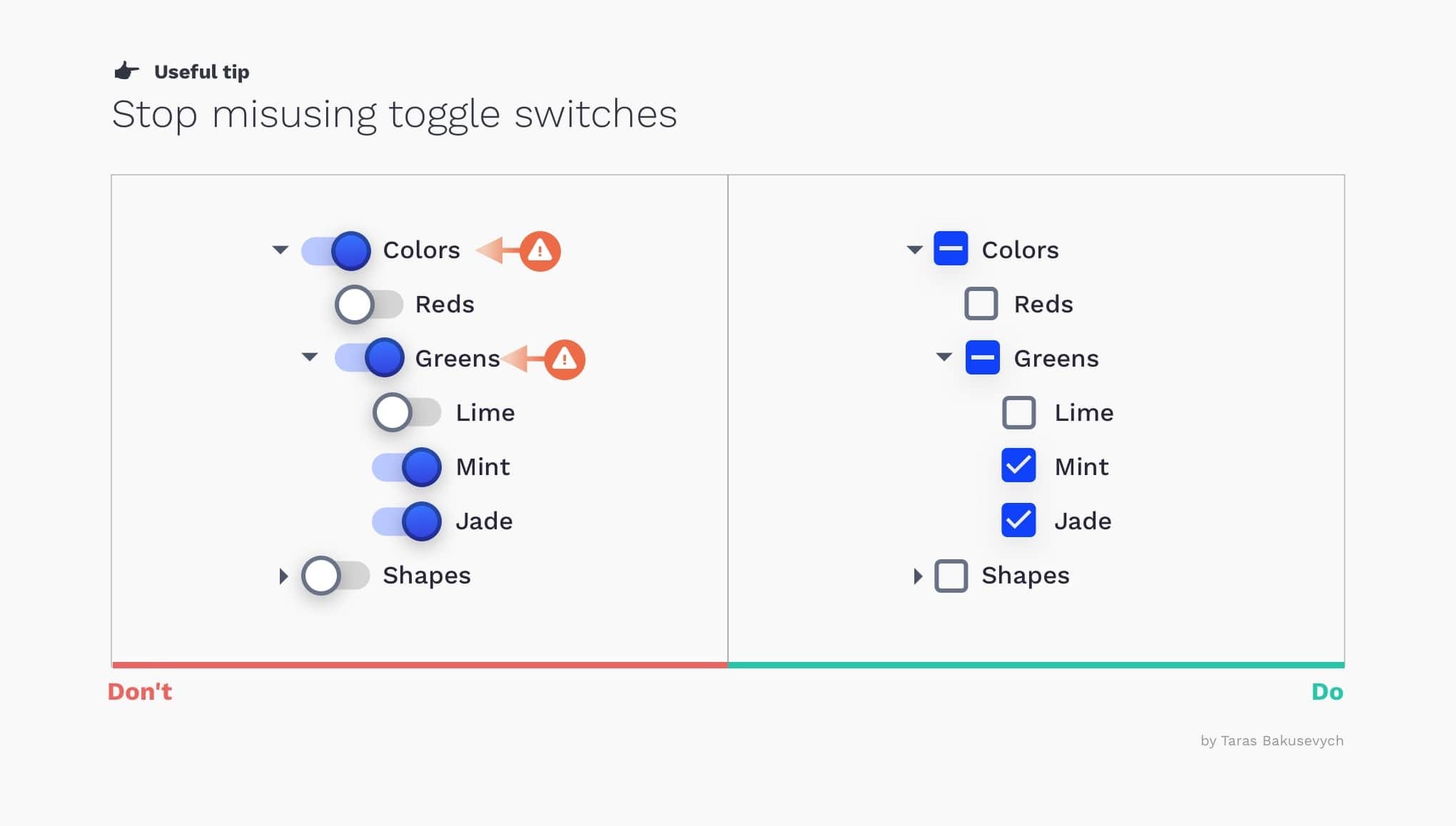
停止誤用撥動開關 (Stop misusing toggle switches)
Do not create hierarchal structures with toggles. It's more visually distracting and can create a false impression that all child options are On/Off.
不要使用切換創建層次結構。 它在視覺上更加分散注意力,并且會給人一種錯誤的印象,即所有子選項都處于“開/關”狀態。
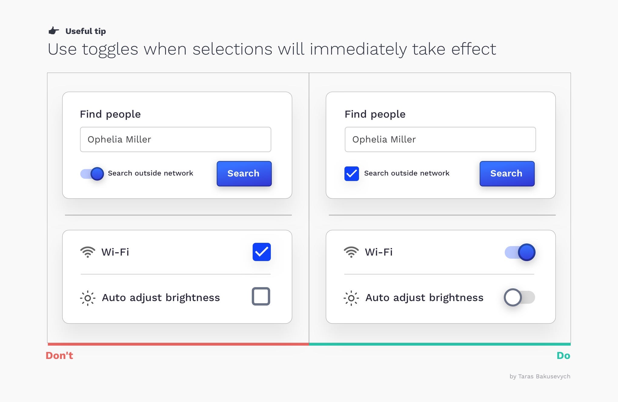
選擇立即生效時使用切換 (Use toggles when selection will immediately take effect)
A toggle switch is digital on/off switch. Any effect triggered by the toggle switch should immediately take effect. If that is not the case better to replace toggle switch with a single checkbox.
撥動開關是數字開/關開關。 撥動開關觸發的任何效果都應立即生效。 如果不是這種情況,最好用單個復選框替換撥動開關。
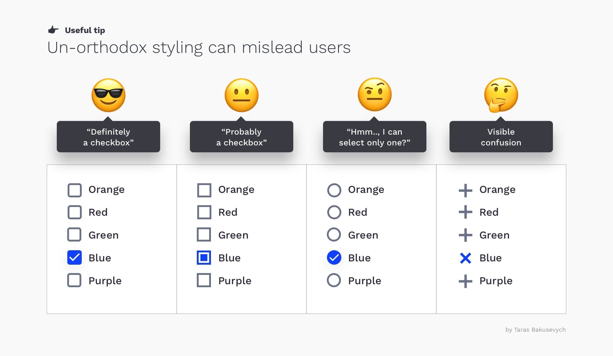
非正統的樣式可能會使用戶感到困惑 (Un-orthodox styling can confuse users)
Any deviation from what is considered standard for the platform you design will add additional cognitive load for users. I often see circular checkboxes that can be easily confused with radio buttons.
與您設計的平臺的標準有所不同的情況會給用戶增加額外的認知負擔。 我經常看到圓形復選框,這些復選框容易與單選按鈕混淆。
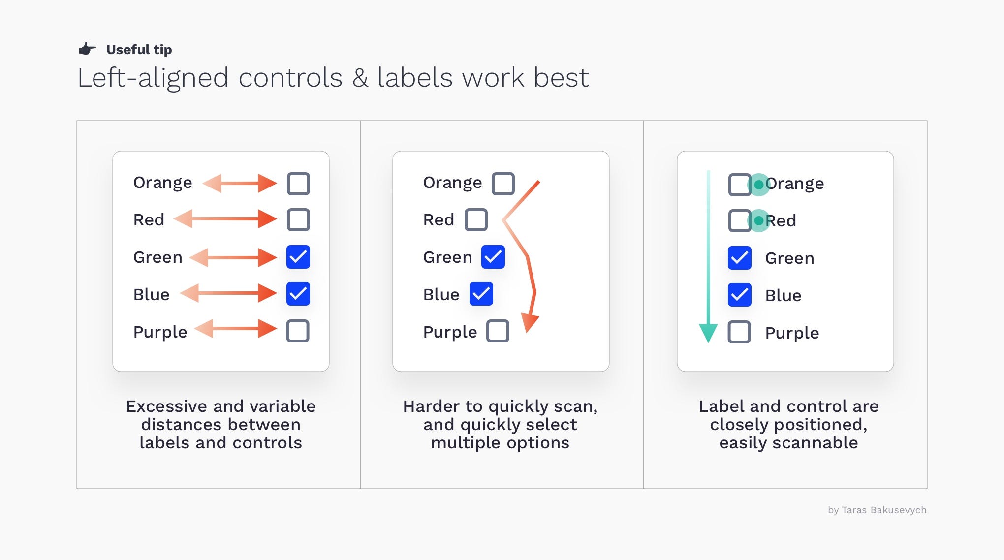
在垂直列表中顯示選項將幫助用戶輕松掃描它們 (Presenting options in the vertical list will help users easily scan them)
Left-aligned controls and labels will work best as they closely positioned to each other. This supports the fastest completion times and fewer mistakes. Right-aligned controls have some benefits on mobile, as labels and buttons, can't get too far apart. Having a button close to the right edge makes it more easily reachable when holding the device in one hand. Also, we are not obscuring the labels with a finger during selection.
左對齊的控件和標簽相互靠近時效果最佳。 這支持最快的完成時間和更少的錯誤。 右對齊控件在移動設備上有一些好處,因為標簽和按鈕之間的距離不能太遠。 將按鈕靠近右邊緣可使用一只手握住設備時更容易夠到它。 此外,在選擇過程中,我們不會用手指遮蓋標簽。
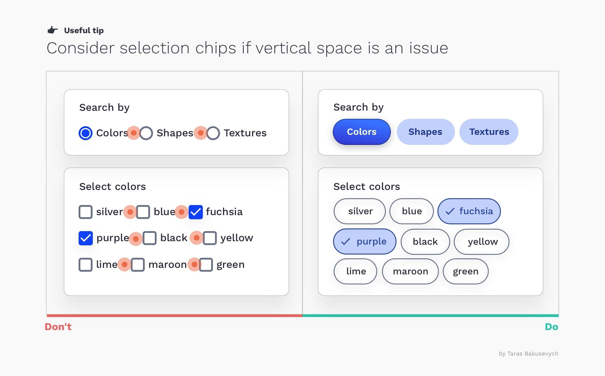
如果存在垂直空間,請考慮使用芯片 (Consider chips if vertical space is an issue)
You should prevent a situation when it’s really difficult to see which control is selected ( make sure to space the buttons and labels). Consider using chips to clearly visually separate options.
您應該避免在很難看到選擇哪個控件的情況下(確保將按鈕和標簽隔開)。 考慮使用芯片在視覺上清晰地分離選項。
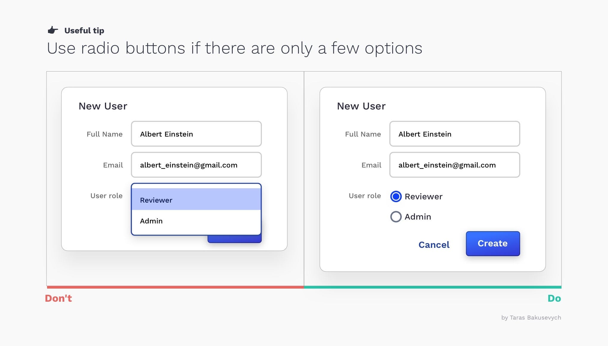
如果可能,請使用單選按鈕,而不要使用下拉菜單 (If possible, use radio buttons rather than drop-down menus)
Making all options permanently visible so that users can easily compare them reduces cognitive load and help forms be more transparent.
使所有選項永久可見,以便用戶可以輕松地比較它們,從而減輕了認知負擔,并使表格更加透明。
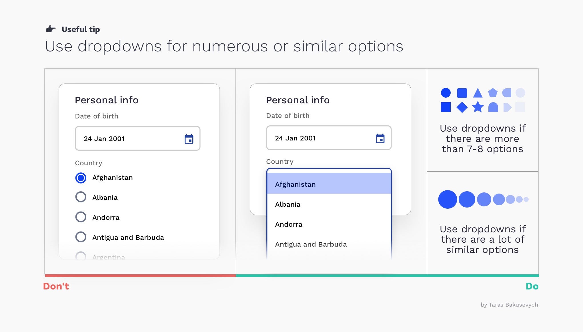
使用下拉菜單選擇眾多或類似選項 (Use dropdowns for numerous or similar options)
If the number of options is more than 6–7 you should consider putting them in the dropdown as users anyway will not be able to keep all of them in mind. The same will apply to predictable, similar, or incremental options like (zoom — 10%, 20%, 30% ..).
如果選項的數量超過6–7,則應考慮將其置于下拉菜單中,因為無論如何用戶都無法牢記所有這些選項。 這同樣適用于可預測的,相似的或增量的選項,例如(zoom-10%,20%,30%..)。
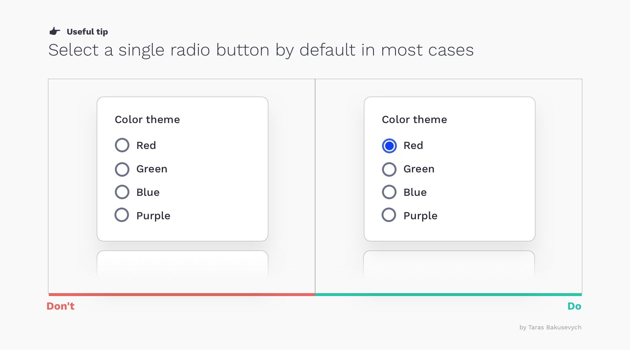
默認情況下最好選擇一個單選按鈕 (It is better to have a selected radio button by default)
Users cannot deselect and set the radio button back to its original state once one has been selected. If users might need to refrain from making a selection, you should provide a radio button labeled “None.” Structure the list of options in a logical order, and harness the power of suggestion.
一旦選擇了單選按鈕,用戶便無法取消選擇并將其設置回其原始狀態。 如果用戶可能需要避免進行選擇,則應提供一個標有“無”的單選按鈕。 按照邏輯順序構建選項列表,并充分利用建議的力量。
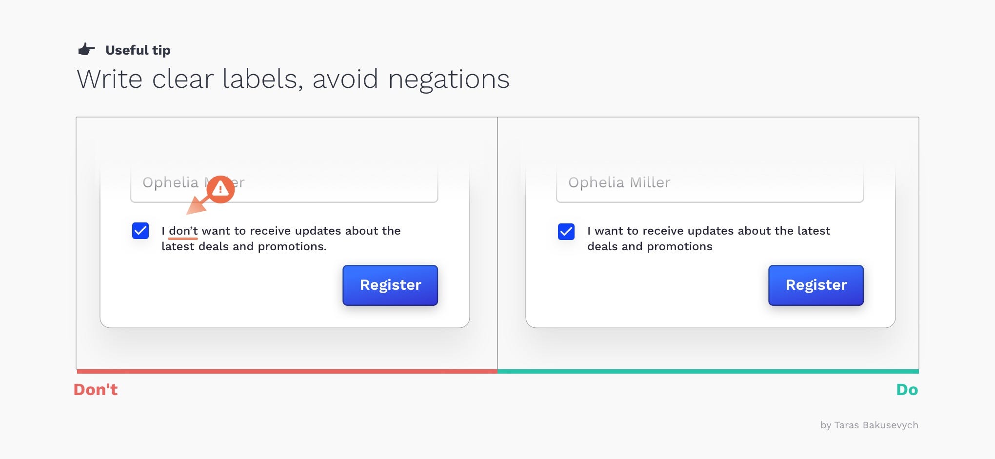
寫清楚標簽,避免否定 (Write clear labels, avoid negations)
Avoid situations when users need to tick the box in order for something not to happen.
避免出現當用戶需要勾選框,以便不事發生。
突出顯示所選選項以吸引用戶的注意 (Highlight selected options to draw users attention)
Visually differentiate selected options from others, especially important for rows selection in data tables.
從視覺上區分所選選項,這對于數據表中的行選擇尤為重要。

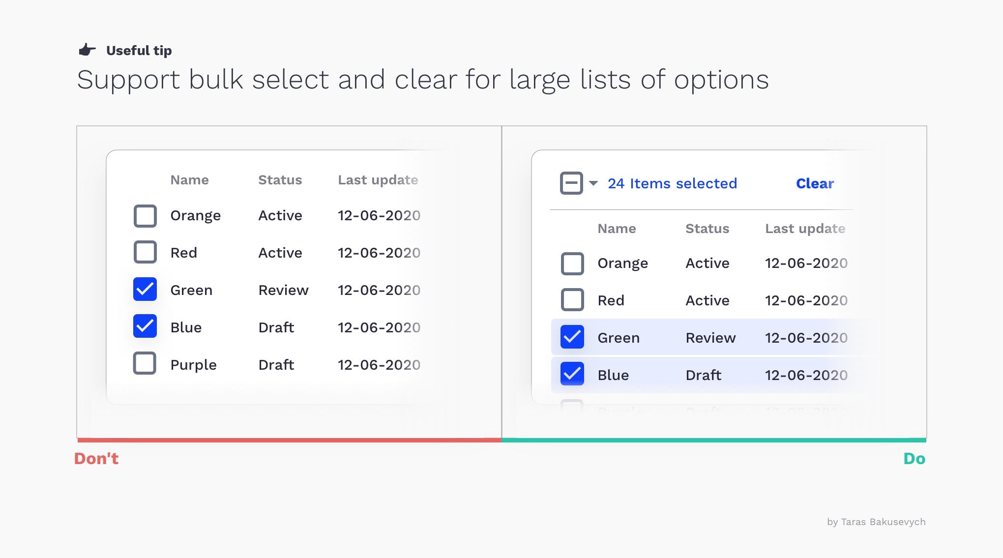
支持批量選擇和清除 (Support bulk select and clear)
Selecting or clearing multiple items at once should be effortless for users.
對于用戶而言,一次選擇或清除多個項目應該毫不費力。
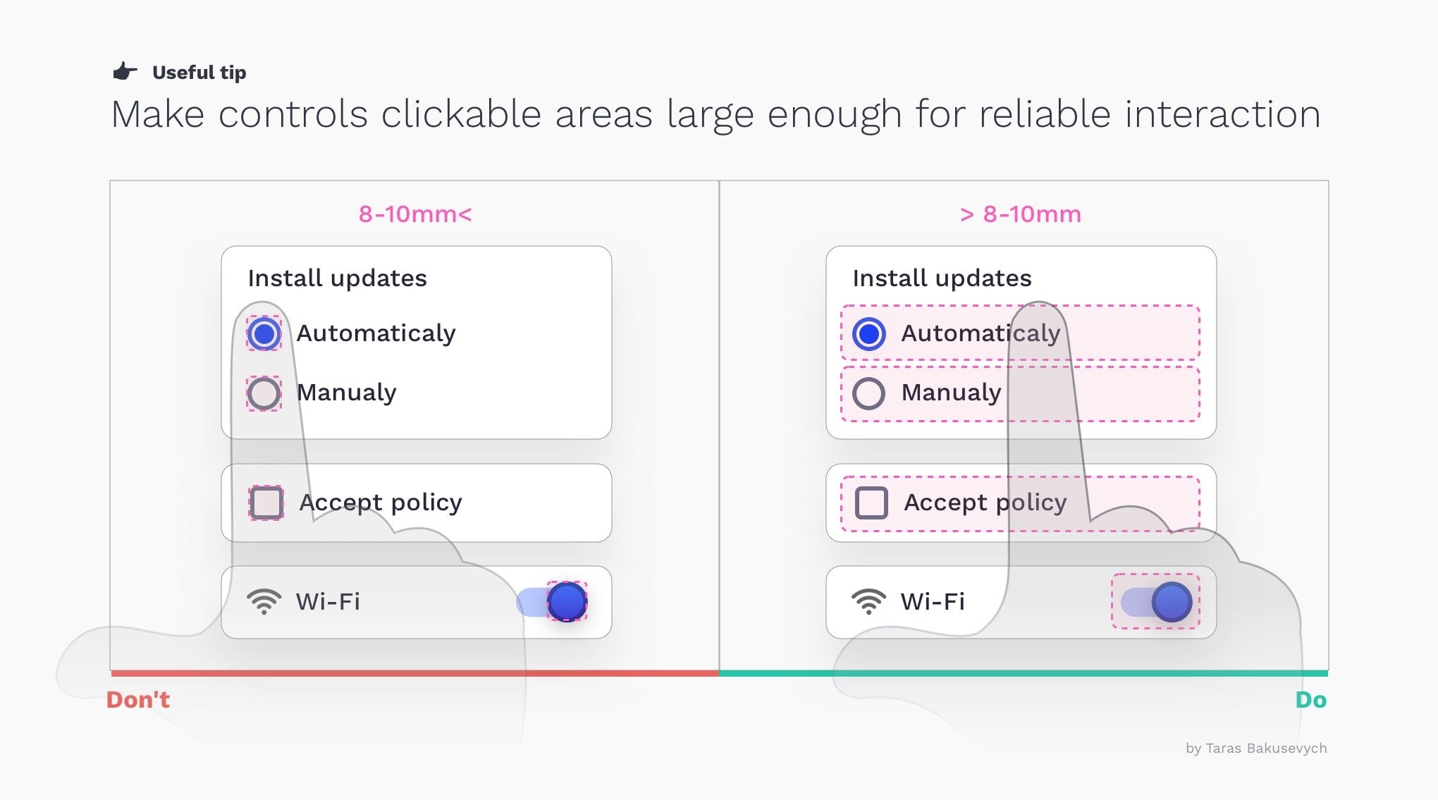
使可點擊區域足夠大,以實現可靠的交互 (Make clickable areas large enough for reliable interaction)
Include both buttons and labels in the generous clickable/tappable area. According to Fitts’s Law the size of the target plays an important role. Checkboxes and radio buttons are generally tiny and can be tricky to click or tap, especially on mobile.
在寬敞的可點擊/可敲擊區域中同時包含按鈕和標簽。 根據菲茨定律,目標的大小起著重要作用。 復選框和單選按鈕通常很小,因此單擊或點擊時會比較棘手,尤其是在移動設備上。
翻譯自: https://uxdesign.cc/selection-controls-ui-component-series-3badc0bdb546
本文來自互聯網用戶投稿,該文觀點僅代表作者本人,不代表本站立場。本站僅提供信息存儲空間服務,不擁有所有權,不承擔相關法律責任。 如若轉載,請注明出處:http://www.pswp.cn/news/275008.shtml 繁體地址,請注明出處:http://hk.pswp.cn/news/275008.shtml 英文地址,請注明出處:http://en.pswp.cn/news/275008.shtml
如若內容造成侵權/違法違規/事實不符,請聯系多彩編程網進行投訴反饋email:809451989@qq.com,一經查實,立即刪除!相關文章

linux -- Linux diff與patch的深入分析

shell命令之---sed

SEE Conf: Umi 4 設計思路文字稿

用戶體驗改善案例_改善用戶體驗研究的5種習慣

一場賽跑引起的并發知識

oracle中使用子查詢為何取到大于自然數1 rownum 淺度解析

巴克萊對沖_“巴克萊的財政預算案”:使金錢管理對心理健康有效—用戶體驗案例研究

6 個對所有 Web 開發者都有用的 GitHub 倉庫

快速刪除數據庫中所有表中的數據
)
openfiler的iSCSI配置(二)

送你一份用Electron開發桌面應用的避坑指南【送3本書,含犀牛書】

)
nginx修改upstream不重啟的方法(ngx_http_dyups_module模塊)

c# 設計原則需要學習嗎_向最好的學習:產品設計原則


Node.js 2021年開發者報告解讀

搭建nginx反向代理用做內網域名轉發

外國經典兒童讀物合集pdf_幫助父母在線購買兒童讀物–用戶體驗案例研究

Windows Azure Marketplace增加對六種語言和HTML5應用程序的支持
