<style>#box{position: absolute;margin: auto;top:0px;right: 0px;bottom: 0px;left: 0px;width: 100%;height: 30%;background-color: red;text-align: center;}
</style>
<body><div id="box"><h1>文字居中</h1></div>
</body>
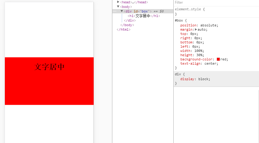
第一種的好處是不用知道垂直居中的元素的高寬,但是必須設置元素的寬高!然后通過margin:auto;來達到效果。
<style>#box{position: absolute;top:50%;left:50%;transform:translate3d(-50%,50%,0);background-color: red;text-align: center;}
</style>
<body><div id="box"><h1>文字居中</h1></div>
</body>
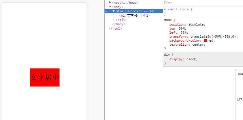
這種的好處是寬高不用定義!
<style>.box{  display: flex;  height: 400px;  align-items:center;  justify-content:center;background: #0099cc  }  h1{  display: flex;  align-items:center;  justify-content:center;}
</style>
<body><div class="box">  <h1>實現元素水平居中</h1>  </div>
</body>
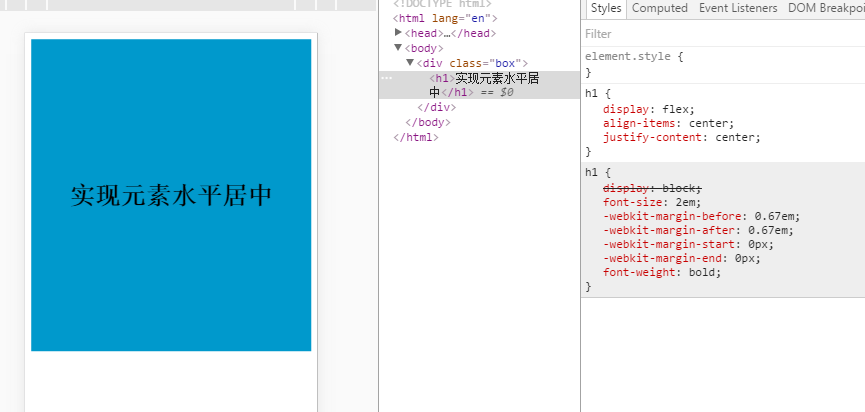
想要讓那個元素居中,就在其父元素加 display:flex;justify-content:center;align-items:center;
按照原理,往body里設置這3個樣式,就能按body垂直居中,但是沒有,是因為body的默認高度為0px;在給個height:600px;就會有效果的!
<style>#container{position: absolute;top:0px;right: 0px;bottom: 0px;left: 0px;display: flex;justify-content:center;align-items:center;}.box{  display: flex;  height: 400px;  align-items:center;  justify-content:center;background: #0099cc  }  h1{  display: flex;  align-items:center;  justify-content:center;}
</style>
<body><div id="container"><div class="box">  <h1>實現元素水平居中</h1>  </div></div>
</body>
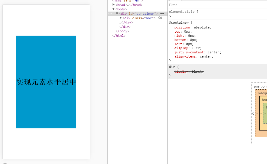
對于移動端,這是我常用的一種方法,這樣屏幕的寬高就都有了!
?

)

)


0x56000010) 的理解)


 Popwindow 制作常見花哨效果)

