前幾天寫了一篇文章【淺談WPF之控件模板和數據模板】,有粉絲反饋說這兩種模板容易弄混,不知道什么時候該用控件模塊,什么時候該用數據模板,以及template和itemtemplate之間的關系等,今天專門寫一篇文章,簡述WPF中各種模板及其相互關系。僅供學習分享使用,如有不足之處,還請指正。

概述
在WPF中,一共有三種模板,分別如下:
- 控件模板ControlTemplate,用來指定控件的呈現樣式。
- 數據模板DataTemplate,用來指定子項數據的呈現樣式。
- 子控件模板ItemsPanelTemplate,用來指定子項控件的布局樣式。
模板與控件之間的關系
關于各個模板與控件之間的關系,如下圖所示:
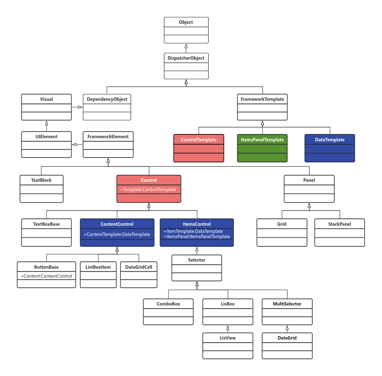
通過上圖可以看出:
- Control擁有Template屬性,是ControlTemplate類型,所有Control派生的子控件,都具有Template屬性,都可以通過控件模板設置控件的樣式。
- ContentControl擁有ContentTemplate屬性,是DataTemplate類型,所有ContentControl派生的控件,都具有ContentTemplate屬性,如Button,ListBoxItem,DataGridCell等。
- ItemsControl擁有ItemsTemplate屬性,是DataTemplate類型,所有ItemsControl派生的控件,都具有ItemsTemplate屬性,如ListBox,ComboBox,DataGrid,ListView等。
- ItemsControl擁有ItemsPanel屬性,是ItemsPanelTemplate類型,所有ItemsControl派生的控件,都具有ItemsPanel屬性,如ListBox,ComboBox,DataGrid,ListView等。
- Template,ContentTemplate,ItemsTemplate,ItemsPanel只是屬性名稱,而DataTemlate,ControlTemplate,ItemsPanelTemplate才是模板類型。
ControlTemplate控件模板詳解
利用ControlTemplate可以徹底的顛覆控件的默認外觀。<ControlTemplate>里面的內容就是視覺樹VisualTree。
兩個重要屬性:
a)ContentPresenter
重定義控件模板,默認模板將會被覆蓋,此時需要利用ContentPresenter,把原有模板的屬性原封不動的投放到自定義模板中。
b)Triggers
觸發器列表,里面包含一些觸發器Trigger,我們可以定制這個觸發器列表來使控件對外界的刺激發生反應,比如鼠標經過時文本變成粗體等。
控件模板示例
<Window x:Class="WpfApplication1.MainWindow"xmlns="http://schemas.microsoft.com/winfx/2006/xaml/presentation"xmlns:x="http://schemas.microsoft.com/winfx/2006/xaml"xmlns:sys="clr-namespace:System;assembly=mscorlib"Title="MainWindow" Height="350" Width="525"><Window.Resources><ControlTemplate x:Key="rect" TargetType="{x:Type CheckBox}"><ControlTemplate.Resources><SolidColorBrush x:Key="redBrush" Color="Red"/></ControlTemplate.Resources><StackPanel><Rectangle Name="breakRectangle" Stroke="Red" StrokeThickness="2" Width="20" Height="20"><Rectangle.Fill><SolidColorBrush Color="White"/></Rectangle.Fill></Rectangle><ContentPresenter/></StackPanel><ControlTemplate.Triggers><Trigger Property="IsChecked" Value="True"><Setter TargetName="breakRectangle" Property="Fill" Value="{StaticResource ResourceKey=redBrush}"></Setter></Trigger></ControlTemplate.Triggers></ControlTemplate></Window.Resources><Canvas><CheckBox Template="{StaticResource ResourceKey=rect}"  Content="我是CheckBox"/></Canvas>
</Window>
?
注意:<ContentPresenter Margin="{TemplateBinding Padding}" /> 實現了將模板中的Margin綁定到原控件中的Padding上去。
將控件模板寫到樣式里面,如下所示:
<Style x:Key="cbx" TargetType="{x:Type CheckBox}"><Setter Property="Template"><Setter.Value><ControlTemplate TargetType="{x:Type CheckBox}"><ControlTemplate.Resources><SolidColorBrush x:Key="redBrush" Color="Red"/></ControlTemplate.Resources><StackPanel><Rectangle Name="breakRectangle" Stroke="Red" StrokeThickness="2" Width="20" Height="20"><Rectangle.Fill><SolidColorBrush Color="White"/></Rectangle.Fill></Rectangle><ContentPresenter/></StackPanel><ControlTemplate.Triggers><Trigger Property="IsChecked" Value="True"><Setter TargetName="breakRectangle" Property="Fill" Value="{StaticResource ResourceKey=redBrush}"></Setter></Trigger></ControlTemplate.Triggers></ControlTemplate></Setter.Value></Setter>
</Style>
?
通過綁定樣式資源,如下所示:
<CheckBox Style="{StaticResource ResourceKey=cbx}" Content="我是CheckBox"/>?
c)ItemsPresenter
繼承自ItemsControl的控件,有一個ItemsPanel屬性作為集合元素承載容器。子元素ItemsPresenter負責呈現控件的任務。
只要把ItemsPresenter放在內部模板中,那么ItemsPresenter則會去檢測父元素是否為集合控件,然后將ItemsPanel添加到其內部視覺樹當中。
<Style x:Key="{x:Type ItemsControl}" TargetType="{x:Type ItemsControl}"><Setter Property="Template"><Setter.Value><ControlTemplate TargetType="{x:Type ItemsControl}"><Border Background="{TemplateBinding Background}"BorderBrush="{TemplateBinding BorderBrush}"BorderThickness="{TemplateBinding BorderThickness}"Padding="{TemplateBinding Padding}"SnapsToDevicePixels="true"><ItemsPresenter SnapsToDevicePixels="{TemplateBinding SnapsToDevicePixels}"/></Border></ControlTemplate></Setter.Value></Setter>
</Style>
?
比較常見的繼承自ItemsControl的控件,比如ComboBox,ContextMenu,ListBox,DataGrid,ListView等。
DataTemplate數據模板詳解
數據模板定義了數據的顯示方式,也就是數據對象的可視結構。主要是可以自定義控件的同時進行數據綁定。
<Window x:Class="WpfApplication1.MainWindow"xmlns="http://schemas.microsoft.com/winfx/2006/xaml/presentation"xmlns:x="http://schemas.microsoft.com/winfx/2006/xaml"xmlns:sys="clr-namespace:System;assembly=mscorlib"xmlns:src="clr-namespace:WpfApplication1"Title="MainWindow" Height="350" Width="525"><Window.Resources><ObjectDataProvider x:Key="personList" ObjectType="{x:Type src:PersonList}"/><DataTemplate x:Key="rect"><Border Name="border" BorderBrush="Aqua" BorderThickness="1" Padding="5" Margin="5"><StackPanel><StackPanel Orientation="Horizontal"><TextBlock Text="{Binding Name}" Margin="5,0,0,0"/><TextBlock Text="{Binding Age}" Margin="5,0,0,0"/></StackPanel><StackPanel Orientation="Horizontal"><TextBlock Text="{Binding Address}" Margin="5,0,0,0"/></StackPanel></StackPanel></Border></DataTemplate></Window.Resources><Grid><ListBox ItemsSource="{Binding Source={StaticResource ResourceKey=personList}}"ItemTemplate="{StaticResource ResourceKey=rect}"></ListBox></Grid>
</Window>
?
注意:這里在調用時應該綁定的是 ItemTemplate 屬性。?
ItemsPanelTemplate詳解
首先我們要知道常見的條目控件有:ListBox,Menu,StatusBar等。
比如拿ListBox來說,ItemBox的ItemPanel其實是一個VisualizingStackPanel,就是說ListBox的每一項的排列方式是遵循StackPanel的
原則,也就是從上到下的排列方式。如果要實現從左到右排列:
<Window x:Class="WpfApplication1.MainWindow"xmlns="http://schemas.microsoft.com/winfx/2006/xaml/presentation"xmlns:x="http://schemas.microsoft.com/winfx/2006/xaml"xmlns:sys="clr-namespace:System;assembly=mscorlib"xmlns:src="clr-namespace:WpfApplication1"Title="MainWindow" Height="350" Width="525"><Window.Resources><ObjectDataProvider x:Key="personList" ObjectType="{x:Type src:PersonList}"/><DataTemplate x:Key="rect"><Border Name="border" BorderBrush="Aqua" BorderThickness="1" Padding="5" Margin="5"><StackPanel><StackPanel Orientation="Horizontal"><TextBlock Text="{Binding Name}" Margin="5,0,0,0"/><TextBlock Text="{Binding Age}" Margin="5,0,0,0"/></StackPanel><StackPanel Orientation="Horizontal"><TextBlock Text="{Binding Address}" Margin="5,0,0,0"/></StackPanel></StackPanel></Border></DataTemplate><ItemsPanelTemplate x:Key="items"><StackPanel Orientation="Horizontal" VerticalAlignment="Center" HorizontalAlignment="Center"/></ItemsPanelTemplate></Window.Resources><Grid><ListBox ItemsSource="{Binding Source={StaticResource ResourceKey=personList}}"ItemTemplate="{StaticResource ResourceKey=rect}" ItemsPanel="{StaticResource ResourceKey=items}"></ListBox></Grid>
</Window>
也就是說,ItemsPanelTemplate可以用來定義集合控件的容器外觀。
總結
1、Template
控件模板,是指整個控件的展示和布局。
如ComboBox,可分為文本區域,下拉按鈕區域,Items的Popup區域。
Template就是管理這些位置的布局。
2、ItemsPresenter
可以簡單理解為占位符,在樣式中使用,標記著這個區域用來展示該控件的Items。
如:ComboBox的下拉列表的可選項。
但是,只負責顯示,而不能管理如何顯示,如果我們要內容橫向排列,就要用到ItemsPanel。
3、ItemsPanel
管理Items的排列方式,如,ComboBox默認是豎直排列的,我們要橫著排列,只需要定義ItemsPanel為WrapPanel,就可以了。
這時候Items的排列方式已經完成,如果還要讓ComboBox的每個項都重寫,比如,背景、圖標等,就要用到ItemContainerStyle。
4、ItemContainerStyle
就是每個項的樣式,自己重寫,就可以定制出每個項的樣式了。
以上就是淺談WPF之各種模板的全部內容。

SQL)
![TC397 EB MCAL開發從0開始系列 之 [15.1] Fee配置 - 雙扇區demo](http://pic.xiahunao.cn/TC397 EB MCAL開發從0開始系列 之 [15.1] Fee配置 - 雙扇區demo)


 操作符的妙用)


