通過 數學計算 + CSS mask 復合遮罩 實現的真正幾何內凹效果:
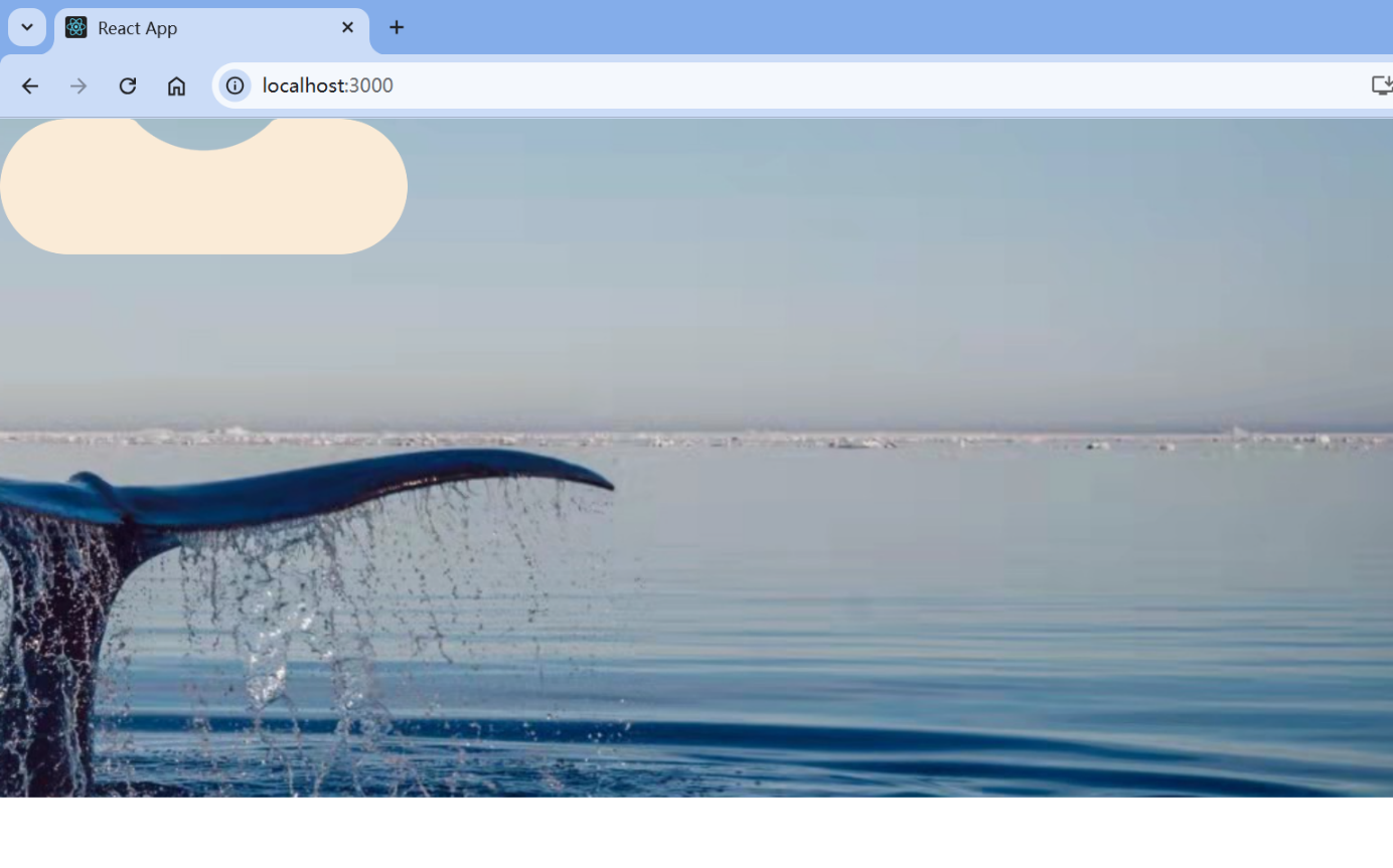
背景是一張圖片,用來證明中間的凹陷是透明的。
完整代碼:
app.js
import FormPage from "./pages/formPage";
import "./App.css";
const App = () => {return (<div className="box"><div className="block"></div></div>);
};export default App;
app.css
.box {background: url(../src/pages/img/10.jpg) 100%;height: 500px;
}.block {/* 增大圓角半徑 */--r: 6px;/* 適當增加斜切長度 */--s: 69px;/* 微調角度使過渡更自然 */--a: 44deg;/* 更柔和的邊緣過渡 */--_m: 0/calc(2*var(--r)) var(--r) no-repeat radial-gradient(50% 100% at bottom, #000 calc(100% - 0.8px), transparent);/* 自動計算的水平偏移 */--_d: (var(--s) + var(--r)) * cos(var(--a));width: 300px;height: 100px;background-color: antiquewhite;border-radius: 150px;mask:calc(50% + var(--_d)) var(--_m), calc(50% - var(--_d)) var(--_m),radial-gradient(var(--s) at 50% calc(-1*sin(var(--a))*var(--s)),transparent 100%, #000 calc(100% + 0.8px)) 0 calc(var(--r)*(1 - sin(var(--a)))),linear-gradient(90deg, #000 calc(50% - var(--_d)), transparent 0 calc(50% + var(--_d)), #000 0);mask-repeat: no-repeat;
}
整體思路
這段代碼的核心思想是:
使用多個 mask 圖層組合,通過 radial-gradient 和 linear-gradient 的疊加,形成一個“中間凹進去、邊緣過渡柔和”的視覺效果。
它利用了 CSS 中的變量(--r, --s, --a)、三角函數和 mask 屬性,實現了動態可配置的內凹圓角效果。
變量解析(CSS Custom Properties)
--r: 6px;        /* 凹陷區域的半徑(控制凹陷大小) */
--s: 69px;       /* 圓弧的半徑(控制凹陷的位置) */
--a: 44deg;      /* 角度(用于三角函數計算) */
這些變量可以方便地調整最終的視覺效果。
計算變量(關鍵邏輯)
--_m:定義一個遮罩圖層(更柔和的邊緣過渡)
--_m: 0 / calc(2*var(--r)) var(--r) no-repeatradial-gradient(50% 100% at bottom, #000 calc(100% - 0.8px), transparent);
- 創建一個寬度為
2 * --r,高度為--r的徑向漸變。 - 漸變從底部開始,顏色從不透明到透明,形成一個邊緣模糊的遮罩條帶。
- 這個條帶會在最終 mask 中作為“邊緣柔化”層使用。
--_d:水平偏移距離(基于三角函數自動計算)
--_d: (var(--s) + var(--r)) * cos(var(--a));
- 使用余弦函數計算出一個水平方向上的偏移值。
- 這個偏移值決定了凹陷區域在水平方向上的位置。
- 結合下面的 mask 設置,使凹陷區域對稱分布在中心兩側。
Mask 圖層詳解(這是整個效果的關鍵)
mask:calc(50% + var(--_d)) var(--_m),calc(50% - var(--_d)) var(--_m),radial-gradient(var(--s) at 50% calc(-1*sin(var(--a))*var(--s)),transparent 100%, #000 calc(100% + 0.8px)) 0 calc(var(--r)*(1 - sin(var(--a)))),linear-gradient(90deg, #000 calc(50% - var(--_d)), transparent 0 calc(50% + var(--_d)), #000 0);
我們來逐行拆解這四個 mask 圖層:
🔹 第一層 & 第二層(邊緣柔化層)
calc(50% + var(--_d)) var(--_m),
calc(50% - var(--_d)) var(--_m)
- 這兩個圖層使用的是之前定義好的
--_m遮罩條帶。 - 分別放置在中心左右各偏移
--_d的位置。 - 作用是柔和邊緣,避免生硬的裁剪邊界。
🔸 第三層(核心凹陷層)
radial-gradient(var(--s) at 50% calc(-1*sin(var(--a))*var(--s)),transparent 100%, #000 calc(100% + 0.8px))0 calc(var(--r)*(1 - sin(var(--a))));
- 創建一個以中心為圓心、向上偏移一定距離的徑向漸變。
- 半徑為
--s,位于垂直方向上偏移sin(a) * s。 - 漸變從透明到黑色,超出部分變為不透明。
- 最后定位在
0 calc(...),即垂直方向向下偏移一點,讓凹陷區域更貼合整體形狀。
? 這一層是形成“內凹”視覺的核心圖層。
🔷 第四層(背景遮罩層)
linear-gradient(90deg, #000 calc(50% - var(--_d)), transparent 0 calc(50% + var(--_d)), #000 0)
-
水平方向的線性漸變:
- 左側和右側為黑色(顯示區域)
- 中間一段為透明(隱藏區域)
-
作用是遮住中間的凹陷區域,只保留兩邊的內容。
最終效果總結
| 圖層 | 作用 |
|---|---|
| 第一、二層 | 邊緣柔化處理(避免鋸齒感) |
| 第三層 | 核心凹陷區域(模擬“內凹”形狀) |
| 第四層 | 背景遮罩(只顯示兩邊,中間隱藏) |
結合起來就形成了一個中間凹陷、邊緣柔和、對稱分布的視覺效果,非常適合用在按鈕、卡片等需要輕微凹陷質感的 UI 元素中。
示例效果預覽(文字描述)
想象一個橢圓形的盒子(border-radius: 150px),原本是完整的圓形。但在它的正中央,有一個向上彎曲的凹陷區域,就像輕輕按下按鈕時那種感覺,邊緣還有輕微的陰影過渡。
這種效果常見于 macOS 的菜單欄按鈕、iOS 控件等現代 UI 設計中。
如何調整?
你可以通過修改以下變量來實時調整視覺效果:
| 變量 | 默認值 | 調整建議 | 影響 |
|---|---|---|---|
--r | 6px | 增大 → 凹陷更大 | 凹陷區域大小 |
--s | 69px | 增大 → 凹陷更深 | 凹陷位置與深度 |
--a | 44deg | 增大 → 凹陷更靠上 | 凹陷角度與位置 |
background-color | antiquewhite | 更淺/深色 | 整體對比度和質感 |
在小程序中實現實現平滑內凹圓角
在支付寶小程序中使用
canvas實現帶內凹圓角矩形
小程序的結構:
<view class="mask-layer"><canvas style="width:100%;height:100%" id="canvas" type="2d" onReady="onCanvasReady"></canvas>
</view>
小程序的canvas邏輯:
Page({onCanvasReady() {const systemInfo = my.getSystemInfoSync();const screenWidth = systemInfo.windowWidth;my.createSelectorQuery().select('#canvas').node().exec((res) => {const canvas = res[0].node;if (!canvas || !canvas.getContext) return;const ctx = canvas.getContext('2d');// 設置 canvas 像素尺寸(避免模糊)canvas.width = screenWidth;canvas.height = 200;// 動態計算參數let width = screenWidth * 0.9;let x = (screenWidth - width) / 2; // 居中顯示let y = 0;let height = 100;let radius = Math.min(width, height) / 2;let indentationWidth = width * 0.35;let indentationDepth = 15;// 設置顏色ctx.fillStyle = 'rgba(255, 255, 255, 0.4)';// 調用繪制函數this.drawRoundedIndentedRect(ctx, x, y, width, height, radius, indentationWidth, indentationDepth);});},drawRoundedIndentedRect(ctx, x, y, width, height, radius, indentationWidth, indentationDepth) {ctx.beginPath();ctx.moveTo(x + radius, y);ctx.lineTo(x + width / 2 - indentationWidth / 2, y);ctx.bezierCurveTo(x + width / 2 - indentationWidth / 4, y,x + width / 2 - indentationWidth / 4, y + indentationDepth,x + width / 2, y + indentationDepth);ctx.bezierCurveTo(x + width / 2 + indentationWidth / 4, y + indentationDepth,x + width / 2 + indentationWidth / 4, y,x + width / 2 + indentationWidth / 2, y);ctx.lineTo(x + width - radius, y);ctx.quadraticCurveTo(x + width, y, x + width, y + radius);ctx.lineTo(x + width, y + height - radius);ctx.quadraticCurveTo(x + width, y + height, x + width - radius, y + height);ctx.lineTo(x + radius, y + height);ctx.quadraticCurveTo(x, y + height, x, y + height - radius);ctx.lineTo(x, y + radius);ctx.quadraticCurveTo(x, y, x + radius, y);ctx.closePath();ctx.fill();}
});
在 css 中使用 canvas 實現平滑內凹圓角
直接展示源碼了,和上邊小程的差不多
<!DOCTYPE html>
<html lang="en"><head><meta charset="UTF-8"><meta name="viewport" content="width=device-width, initial-scale=1.0"><title>Canvas - 帶凹陷的圓角矩形</title><style>canvas {display: block;margin: 40px auto;box-shadow: 0px 0px 5px #ccc;border-radius: 8px;background: url("./截屏2025-05-28 11.15.50.png") no-repeat center center;background-size: cover;}</style>
</head><body><canvas id="canvas" width="500" height="200">當前瀏覽器不支持canvas元素,請升級或更換瀏覽器!</canvas><script>function draw() {const canvas = document.getElementById('canvas');if (!canvas || !canvas.getContext) return;const ctx = canvas.getContext('2d');// 動態設置畫布大小canvas.width = window.innerWidth * 0.9;canvas.height = 150;ctx.clearRect(0, 0, canvas.width, canvas.height);let width = canvas.width * 0.9;let height = 80;let x = (canvas.width - width) / 2;let y = 40;let radius = Math.min(width, height) / 2;let indentationWidth = width * 0.7;let indentationDepth = 20;ctx.fillStyle = '#bfc';drawRoundedIndentedRect(ctx, x, y, width, height, radius, indentationWidth, indentationDepth);}function drawRoundedIndentedRect(ctx, x, y, width, height, radius, indentationWidth, indentationDepth) {ctx.beginPath();ctx.moveTo(x + radius, y);ctx.lineTo(x + width / 2 - indentationWidth / 2, y);ctx.bezierCurveTo(x + width / 2 - indentationWidth / 4, y,x + width / 2 - indentationWidth / 4, y + indentationDepth,x + width / 2, y + indentationDepth);ctx.bezierCurveTo(x + width / 2 + indentationWidth / 4, y + indentationDepth,x + width / 2 + indentationWidth / 4, y,x + width / 2 + indentationWidth / 2, y);ctx.lineTo(x + width - radius, y);ctx.quadraticCurveTo(x + width, y, x + width, y + radius);ctx.lineTo(x + width, y + height - radius);ctx.quadraticCurveTo(x + width, y + height, x + width - radius, y + height);ctx.lineTo(x + radius, y + height);ctx.quadraticCurveTo(x, y + height, x, y + height - radius);ctx.lineTo(x, y + radius);ctx.quadraticCurveTo(x, y, x + radius, y);ctx.closePath();ctx.fill();}window.addEventListener('load', draw);window.addEventListener('resize', draw);</script>
</body></html>
嘿嘿!
簡單點,直接找UI 要背景圖,直接用就好 !!!


 變換圖像與形態學操作)


Java/python/JavaScript/C++/C語言/GO六種語言最佳實現)

