今日核心:
- 容器組件:Swiper、Grid\GridItem
- 樣式&結構重用:@Builder、@Extend、@Styles
相關資源:
- 圖片素材:📎day01.zip
1. Swiper
1.1. 適用場景
首先來看看 Swiper 在什么情況下會用到
鏈接
Swiper組件提供滑動輪播顯示的能力。Swiper本身是一個容器組件,當設置了多個子組件后,可以對這些子組件進行輪播顯示,比如:
1.2. 基本用法
首先來看看如何設置輪播內容,以及設置尺寸
- 輪播內容:內容作為Swiper的子組件即可
- 尺寸:
-
- 設置 Swiper 的尺寸:內容會拉伸為和 Swiper 一致(優先級高)
- 設置內容尺寸:會將Swiper撐開
Swiper() {// 輪播內容 // (設置尺寸,撐開swiper)
}
// 設置尺寸(內容拉伸、優先級高)
.width('100%')
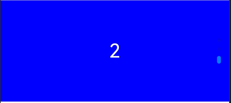
.height(100)實現一個數字輪播的效果:

參考代碼:
@Entry
@Component
struct Page01_Swiper {// Swiper 基本使用build() {Column() {Text('Swiper基本使用').fontSize(20).fontWeight(900).padding(10)Swiper() {Text('0').textAlign(TextAlign.Center).backgroundColor(Color.Red).fontColor(Color.White).fontSize(30)Text('1').textAlign(TextAlign.Center).backgroundColor(Color.Green).fontColor(Color.White).fontSize(30)Text('2').textAlign(TextAlign.Center).backgroundColor(Color.Blue).fontColor(Color.White).fontSize(30)}.width('100%').height(100)}.width('100%').height('100%')}
}
1.3. 常用屬性
設置了內容以及尺寸之后已經可以實現基礎的輪播效果啦,接下來看看一些常見屬性
| loop | boolean | 是否開啟循環。 設置為true時表示開啟循環,在LazyForEach懶循環加載模式下,加載的組件數量建議大于5個。 默認值:true |
| autoPlay | boolean | 子組件是否自動播放。 默認值:false 說明: loop為false時,自動輪播到最后一頁時停止輪播。手勢切換后不是最后一頁時繼續播放。 |
| interval | number | 使用自動播放時播放的時間間隔,單位為毫秒。 默認值:3000 |
| vertical | boolean | 是否為縱向滑動。 默認值:false |
| 更多屬性參考文檔。。。。。 | ||
使用上述屬性,將輪播圖調整為:
- 自動播放
- 播放間隔:4 秒鐘
- 縱向滑動
基礎模版
@Entry
@Component
struct Page02_SwiperAttribute {build() {Column() {Text('Swiper常用屬性').fontSize(20).fontWeight(900).padding(10)Swiper() {Text('0').textAlign(TextAlign.Center).backgroundColor(Color.Red).fontColor(Color.White).fontSize(30)Text('1').textAlign(TextAlign.Center).backgroundColor(Color.Green).fontColor(Color.White).fontSize(30)Text('2').textAlign(TextAlign.Center).backgroundColor(Color.Blue).fontColor(Color.White).fontSize(30)}.width('100%').height(100)}.width('100%').height('100%')}
}
參考代碼:
@Entry
@Component
struct Page02_SwiperAttribute {build() {Column() {Text('Swiper常用屬性').fontSize(20).fontWeight(900).padding(10)Swiper() {Text('0').textAlign(TextAlign.Center).backgroundColor(Color.Red).fontColor(Color.White).fontSize(30)Text('1').textAlign(TextAlign.Center).backgroundColor(Color.Green).fontColor(Color.White).fontSize(30)Text('2').textAlign(TextAlign.Center).backgroundColor(Color.Blue).fontColor(Color.White).fontSize(30)}.width('100%').height(160).loop(false) // 是否開啟循環 true/false.autoPlay(true) // 是否自動播放 true/false.interval(4000) // 自動播放時間間隔 單位毫秒.vertical(true) // 是否縱向滑動}.width('100%').height('100%')}
}
1.4. 調整導航點
如果默認的導航點不滿足效果,可以自行調整
導航點的調整可以分為 2 類:
- 顯示 or 隱藏
- 導航點類型:
-
- 圓點(掌握)
- 數字(了解)
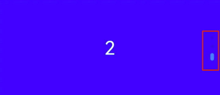
| indicator | DotIndicator | DigitIndicator | boolean | 設置可選導航點指示器樣式。 - DotIndicator:圓點指示器樣式。 - DigitIndicator:數字指示器樣式。 - boolean:是否啟用導航點指示器。 默認值:true 默認類型:DotIndicator |
Swiper(){// 略
}
// .indicator(false) // 關閉導航
// .indicator(Indicator.dot()) // 圓點指示器(默認)
// .indicator(Indicator.digit()) // 數字指示器
日常開發中 較為常見的是圓點指示器,咱們重點掌握如何調整他即可
Swiper(){// 略
}.indicator(Indicator.dot()// .xxx(設置圓點指示器的屬性)) // 圓點指示器(默認)
位置屬性:
| 參數名 | 參數類型 | 必填項 | 參數描述 |
| left | Length | 否 | 設置導航點距離Swiper組件左邊的距離。 默認值:0 單位:vp |
| top | Length | 否 | 設置導航點距離Swiper組件頂部的距離。 默認值:0 單位:vp |
| right | Length | 否 | 設置導航點距離Swiper組件右邊的距離。 默認值:0 單位:vp |
| bottom | Length | 否 | 設置導航點距離Swiper組件底部的距離。 默認值:0 單位:vp |
樣式屬性:
| 參數名 | 參數類型 | 必填項 | 參數描述 |
| itemWidth | Length | 否 | 設置Swiper組件圓點導航指示器的寬,不支持設置百分比。 默認值:6 單位:vp |
| itemHeight | Length | 否 | 設置Swiper組件圓點導航指示器的高,不支持設置百分比。 默認值:6 單位:vp |
| selectedItemWidth | Length | 否 | 設置選中Swiper組件圓點導航指示器的寬,不支持設置百分比。 默認值:12 單位:vp |
| selectedItemHeight | Length | 否 | 設置選中Swiper組件圓點導航指示器的高,不支持設置百分比。 默認值:6 單位:vp |
| color | ResourceColor | 否 | 設置Swiper組件圓點導航指示器的顏色。 默認值:'#182431'(10%透明度) |
| selectedColor | ResourceColor | 否 | 設置選中Swiper組件圓點導航指示器的顏色。 默認值:'#007DFF' |
| 更多屬性參考文檔。。。。。 | |||
基礎模版
@Entry
@Component
struct Page03_SwiperIndicator {build() {Column() {Text('Swiper導航點').fontSize(20).fontWeight(900).padding(10)Swiper() {Text('0').textAlign(TextAlign.Center).backgroundColor(Color.Red).fontColor(Color.White).fontSize(30)Text('1').textAlign(TextAlign.Center).backgroundColor(Color.Green).fontColor(Color.White).fontSize(30)Text('2').textAlign(TextAlign.Center).backgroundColor(Color.Blue).fontColor(Color.White).fontSize(30)}.width('100%').height(160)}.width('100%').height('100%')}
}
參考代碼:
@Entry
@Component
struct Page03_SwiperIndicator {build() {Column() {Text('Swiper導航點').fontSize(20).fontWeight(900).padding(10)Swiper() {Text('0').textAlign(TextAlign.Center).backgroundColor(Color.Red).fontColor(Color.White).fontSize(30)Text('1').textAlign(TextAlign.Center).backgroundColor(Color.Green).fontColor(Color.White).fontSize(30)Text('2').textAlign(TextAlign.Center).backgroundColor(Color.Blue).fontColor(Color.White).fontSize(30)}.width('100%').height(160)// .indicator(false) // 關閉導航點// .indicator(Indicator.digit()) // 數字導航點.indicator(Indicator.dot().left(10)// 左側距離.top(10)// 頂部距離.bottom(10)// 底部距離.right(10)// 右側距離(距離屬性組合使用,無需全部設置).itemWidth(20)// 指示器寬度.itemHeight(20)// 指示器高度.selectedItemWidth(30)// 選中指示器寬度.selectedItemHeight(30)// 選中指示器高度.selectedColor(Color.Yellow)// 選中指示器顏色.color(Color.Blue) // 默認指示器寬度) // 圓形導航點}.width('100%').height('100%')}
}
1.5. 案例-小米有品
通過剛剛學習的內容,咱們來完成小米有品首頁的輪播效果

關鍵信息:
- 寬高:100%、160
- 循環、自動輪播,間隔 4000
- 圓點指示器:
-
- 選中顏色:白色
- 選中寬高:30、4
- 默認寬高:10、4
基礎模版:
@Entry
@Component
struct Page04_SwiperDemo_xiaomi {build() {Column() {Text('Swiper案例-小米').fontSize(20).fontWeight(900).padding(10)Swiper() {Image($r('app.media.ic_swiper_xmyp01'))Image($r('app.media.ic_swiper_xmyp02'))Image($r('app.media.ic_swiper_xmyp03'))Image($r('app.media.ic_swiper_xmyp04'))}}.width('100%').height('100%')}
}
參考代碼:
@Entry
@Component
struct Page04_SwiperDemo_xiaomi {build() {Column() {Text('Swiper案例-小米').fontSize(20).fontWeight(900).padding(10)Swiper() {Image($r('app.media.ic_swiper_xmyp01'))Image($r('app.media.ic_swiper_xmyp02'))Image($r('app.media.ic_swiper_xmyp03'))Image($r('app.media.ic_swiper_xmyp04'))}.width('100%').height(160).indicator(Indicator.dot()// 圓形導航點.selectedColor(Color.White)// 選中顏色.selectedItemWidth(30)// 選中寬度.selectedItemHeight(4)// 選中高度.itemWidth(10)// 默認寬度.itemHeight(4) // 默認高度)}.width('100%').height('100%')}
}
2. 樣式&結構重用
隨著頁面復雜程度提高,頁面中會有很多的樣式&結構代碼,其中難免重復的部分,如果可以提取出來重復使用,就可以提升編碼效率,減少重復代碼,提升代碼可讀性。
咱們來來學習3 種樣式&結構復用的語法:
- @Styles: 抽取公共樣式、事件
- @Extends:擴展組件樣式、事件
- @Builder:輕量級的元素復用機制(結構、樣式、事件)- 重點掌握
2.1. @Styles
@Styles 可以抽取 通用的事件和屬性,比如:
鏈接
Text(this.message).width(100).height(100).backgroundColor(this.bgColor).onClick(() => {this.bgColor = Color.Orange})Column() {
}
.width(100)
.height(100)
.backgroundColor(this.bgColor)
.onClick(() => {this.bgColor = Color.Orange
})Button('按鈕').width(100).height(100).backgroundColor(this.bgColor).onClick(() => {this.bgColor = Color.Orange})
Text(this.message).sizeAndColorFancy()Column() {
}
.sizeAndColorFancy()Button('按鈕').sizeAndColorFancy()

)


![[創業之路-376]:企業法務 - 創業,不同的企業形態,個人承擔的風險、收益、稅費、成本不同](http://pic.xiahunao.cn/[創業之路-376]:企業法務 - 創業,不同的企業形態,個人承擔的風險、收益、稅費、成本不同)


)
