原文:如何用CSS實現HTML元素的旋轉效果 | w3cschool筆記
(本文為科普文章,請勿標記為付費)
在網頁制作中,為?HTML?元素設置旋轉效果可使其更靈動,提升用戶體驗。本文將深入淺出地介紹如何利用?CSS?實現 HTML 元素的旋轉效果,從基礎到高級,助你全面掌握相關技巧。
一、基礎旋轉效果
CSS 的?transform?屬性是實現旋轉效果的核心工具。最簡單的旋轉效果可通過?rotate()?函數完成,其基本語法為?transform: rotate(角度);,角度單位通常是?deg,正值表示順時針旋轉,負值則表示逆時針旋轉。
例如,要使一個元素順時針旋轉 45 度,可編寫如下代碼:
.rotated-element {transform: rotate(45deg);
}
<div class="rotated-element">旋轉的元素</div>這段代碼中,我們定義了一個樣式類?.rotated-element,其中?transform: rotate(45deg);?表示將元素旋轉 45 度。然后將該樣式應用到一個?div?元素上,該元素的內容就會按照指定角度旋轉顯示。
二、設置旋轉中心點
默認情況下,元素圍繞中心點旋轉,但可通過?transform-origin?屬性改變旋轉中心。transform-origin?可接受像素值、百分比或關鍵字(如?top、right、bottom、left、center)等。
若想讓元素以左上角為中心旋轉,可這樣設置:
.rotated-element {transform: rotate(45deg);transform-origin: top left;
}
此代碼將元素的旋轉中心從中心點移至左上角,旋轉時會以左上角為支點進行變換。
三、旋轉動畫效果
除了設置靜態旋轉效果,還能利用 CSS 動畫實現元素的動態旋轉。通過?@keyframes?規則定義動畫關鍵幀,再結合?animation?屬性應用到元素上。
以下代碼創建了一個無限循環的旋轉動畫,元素會在 2 秒內完成一次 360 度旋轉:
@keyframes rotateAnimation {from {transform: rotate(0deg);}to {transform: rotate(360deg);}
}.rotating-element {animation: rotateAnimation 2s linear infinite;
}
<div class="rotating-element">旋轉動畫元素</div>其中,@keyframes rotateAnimation?定義了從 0 度到 360 度的旋轉動畫,animation?屬性則指定了動畫的名稱、持續時間、時間函數以及無限循環播放。
四、3D 旋轉效果
CSS 還支持 3D 旋轉效果,借助?rotateX()?和?rotateY()?函數可實現元素在三維空間中的旋轉。例如:
.rotated-3d {transform: rotateX(30deg) rotateY(30deg);
}
該代碼使元素在 X 軸方向旋轉 30 度,并在 Y 軸方向也旋轉 30 度,從而產生 3D 旋轉的視覺效果。
實例展示
以下是一個綜合使用旋轉效果的完整 HTML 頁面示例:
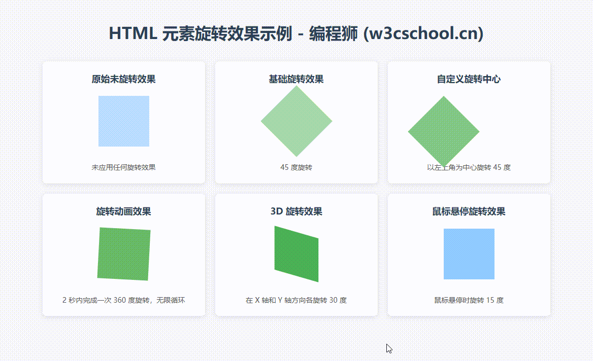
效果截圖:
源碼:
<!DOCTYPE html>
<html lang="zh-CN">
<head><meta charset="UTF-8"><meta name="viewport" content="width=device-width, initial-scale=1.0"><title>HTML 元素旋轉效果示例 - 編程獅 (w3cschool.cn)</title><style>body {font-family: "Microsoft YaHei", Arial, sans-serif;line-height: 1.6;max-width: 1200px;margin: 0 auto;padding: 20px;background-color: #f5f5f5;}h1 {text-align: center;color: #2c3e50;margin-bottom: 30px;}.demo-container {display: flex;flex-wrap: wrap;gap: 20px;justify-content: center;}.demo-item {background-color: white;border-radius: 8px;padding: 20px;box-shadow: 0 2px 10px rgba(0, 0, 0, 0.1);width: 280px;display: flex;flex-direction: column;align-items: center;}.demo-title {font-size: 18px;font-weight: bold;margin-bottom: 20px;color: #2c3e50;text-align: center;}.demo-element {width: 100px;height: 100px;margin: 0 auto 30px;}.demo-explanation {font-size: 14px;color: #555;text-align: center;}/* 原始未旋轉效果 */.original {background-color: #bbdefb;}/* 基礎旋轉 */.rotate-basic {background-color: #a5d6a7;transform: rotate(45deg);}/* 自定義旋轉中心 */.rotate-center {background-color: #81c784;transform: rotate(45deg);transform-origin: top left;}/* 旋轉動畫效果 */@keyframes rotateAnimation {from {transform: rotate(0deg);}to {transform: rotate(360deg);}}.rotate-animation {background-color: #66bb6a;animation: rotateAnimation 2s linear infinite;}/* 3D 旋轉效果 */.rotate-3d {background-color: #4caf50;transform: rotateX(30deg) rotateY(30deg);}/* 鼠標懸停旋轉效果 */.rotate-hover {background-color: #90caf9;transition: transform 0.5s ease;}.rotate-hover:hover {transform: rotate(15deg);}</style>
</head>
<body><h1>HTML 元素旋轉效果示例 - 編程獅 (w3cschool.cn)</h1><div class="demo-container"><div class="demo-item"><div class="demo-title">原始未旋轉效果</div><div class="demo-element original"></div><div class="demo-explanation">未應用任何旋轉效果</div></div><div class="demo-item"><div class="demo-title">基礎旋轉效果</div><div class="demo-element rotate-basic"></div><div class="demo-explanation">45 度旋轉</div></div><div class="demo-item"><div class="demo-title">自定義旋轉中心</div><div class="demo-element rotate-center"></div><div class="demo-explanation">以左上角為中心旋轉 45 度</div></div><div class="demo-item"><div class="demo-title">旋轉動畫效果</div><div class="demo-element rotate-animation"></div><div class="demo-explanation">2 秒內完成一次 360 度旋轉,無限循環</div></div><div class="demo-item"><div class="demo-title">3D 旋轉效果</div><div class="demo-element rotate-3d"></div><div class="demo-explanation">在 X 軸和 Y 軸方向各旋轉 30 度</div></div><div class="demo-item"><div class="demo-title">鼠標懸停旋轉效果</div><div class="demo-element rotate-hover"></div><div class="demo-explanation">鼠標懸停時旋轉 15 度</div></div></div>
</body>
</html>
此示例包含了基礎旋轉、自定義旋轉中心、旋轉動畫以及 3D 旋轉等多種效果,通過不同樣式類的應用,展示了如何在 HTML 頁面中為元素添加豐富多樣的旋轉效果。
五、注意事項與技巧
- 瀏覽器兼容性?:雖然大多數現代瀏覽器都支持?
transform?屬性,但在一些較舊的瀏覽器中可能需要添加瀏覽器前綴,如?-webkit-、-moz-、-ms-、-o-?等,以確保兼容性。例如:.rotated-element {-webkit-transform: rotate(45deg);-moz-transform: rotate(45deg);-ms-transform: rotate(45deg);-o-transform: rotate(45deg);transform: rotate(45deg); }
- 性能優化?:過度使用復雜的旋轉動畫可能會影響頁面性能,尤其是在動畫元素較多或動畫效果較為復雜時。因此,在實際項目中要合理控制動畫的復雜度和數量,避免對頁面性能造成過大影響。
-
結合過渡效果?:在設置旋轉效果時,可以搭配?
transition?屬性使用,使旋轉變化更加平滑自然。例如:.hover-rotate {transition: transform 0.5s; }.hover-rotate:hover {transform: rotate(180deg); }這樣,當鼠標懸停在元素上時,元素會平滑地旋轉 180 度,而不是瞬間完成旋轉。
通過以上內容的學習,相信你已經掌握了如何設置 HTML 元素的旋轉效果。如果你還想進一步深入學習相關知識,提升自己的前端開發技能,歡迎訪問編程獅官網,那里有更多的 HTML、CSS 教程和案例供你學習和參考。


![【算法題】荷蘭國旗問題[力扣75題顏色分類] - JAVA](http://pic.xiahunao.cn/【算法題】荷蘭國旗問題[力扣75題顏色分類] - JAVA)

![AtCoder AT_abc404_g [ABC404G] Specified Range Sums](http://pic.xiahunao.cn/AtCoder AT_abc404_g [ABC404G] Specified Range Sums)

)