1.概要
本章將繼續介紹.NET MAUI中的常用基礎控件,讓剛剛接觸MAUI的小伙伴有寫基礎的認識,心里有底開發起來將得心應手。下面將列出一些常用的基礎控件:
| 控件名 | 中文名稱 | 說明 |
|---|---|---|
| Button | 按鈕 | 與WPF中的基礎用法無太大變化 |
| CheckBox | 單選框 | 與WPF中的基礎用法無太大變化 |
| ListView | 列表 | 類似WPF中列表控件“ListBox” |
| ImageButton | 圖片按鈕 | WPF中沒有該控件,通常需要開發者手動實現,MAUI中已經包含在基礎控件中。 |
| Entry | 輸入框 | 類似WPF中的輸入框控件“TextBox” |
| TableView | 選項卡 | 類似WPF中"TabControl" |
| DisplayAlert | 消息框 | 類似WPF中“MessageBox” |
2.詳細內容
(1)Button

xaml語法:
<Button Text="我是Btn" WidthRequest="200" HeightRequest="50" Command="{Binding OkCommand}" CommandParameter="{Binding}"/>(2)CheckBox
uncheck狀態

check狀態

xaml語法:
<CheckBox IsChecked="True"/>(3)ListView
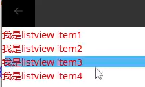
xaml語法1:
<ListView ItemsSource="{Binding Temps}" HeightRequest="500" WidthRequest="300"/>xaml語法2:
<ListView HeightRequest="500" WidthRequest="300"><ListView.ItemTemplate><DataTemplate><ViewCell><Label Text="我是listview item1" TextColor="Red"></Label></ViewCell></DataTemplate></ListView.ItemTemplate></ListView>(4)ImageButton

xaml語法:
<ImageButton Source="/img/1.jpg" WidthRequest="200" HeightRequest="50" Command="{Binding OkCommand}" CommandParameter="{Binding}"/>(5)Entry

xaml語法:
<Entry Text="我是輸入框" WidthRequest="100" HeightRequest="50"/>(6) TableView
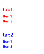
xaml語法:
<TableView HasUnevenRows="True"><TableView.Root><TableSection TextColor="Red" Title="Tab1">//Cell里也可以放其他內容<TextCell TextColor="Red" Text="Item1"></TextCell><TextCell TextColor="Red" Text="Item2" IsEnabled="False"></TextCell></TableSection><TableSection TextColor="Blue" Title="Tab2"><TextCell TextColor="Blue" Text="Item1"></TextCell><TextCell TextColor="Blue" Text="Item2" ?Detail="test"><TextCell.ContextActions><MenuItem Text="More"></MenuItem><MenuItem Text="Delete"></MenuItem></TextCell.ContextActions></TextCell></TableSection></TableView.Root></TableView>(6) DisplayAlert

C#語法:
DisplayAlert("新消息","新年快樂","ok");
——第七章:數據庫恢復技術)
)


![[轉]【JAVA各版本特性】JAVA 1.0](http://pic.xiahunao.cn/[轉]【JAVA各版本特性】JAVA 1.0)
——第八章:數據庫并發控制)
)
)
】成功易(廣州).Net Core中高級開發工程師)
——第九章:數據庫安全性)

: Access denied for user 'ODBC'@'localhost' 解決Mysql錯誤)

——第十章:數據庫完整性)


 加入友情鏈接功能)
——第十二章:數據庫技術新發展)