
本篇文章給大家帶來的內容是關于如何使用純CSS實現一個圓環旋轉錯覺的動畫效果,有一定的參考價值,有需要的朋友可以參考一下,希望對你有所幫助。
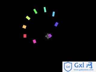
效果預覽
源代碼下載
https://github.com/comehope/front-end-daily-challenges
代碼解讀
定義 dom,容器中包含 10 個
定義容器尺寸:.container {
width: 17em;
height: 17em;
font-size: 16px;
}
定義子元素的尺寸,和容器相同:.container {
position: relative;
}
.container div {
position: absolute;
width: inherit;
height: inherit;
}
在子元素的正中畫一個黃色的小方塊:.container div {
display: flex;
align-items: center;
justify-content: center;
}
.container span {
position: absolute;
width: 1em;
height: 1em;
background-color: yellow;
}
增加讓小方塊左右移動的動畫效果,動畫時長還會在后面用到,所以定義成變量:.container span {
--duration: 2s;
animation: move var(--duration) infinite;
}
@keyframes move {
0%, 100% {
left: calc(10% - 0.5em);
}
50% {
left: calc(90% - 0.5em);
}
}
用貝賽爾曲線調整動畫的時間函數,使小方塊看起來就像在左右兩側跳來跳去:.container span {
animation: move var(--duration) cubic-bezier(0.6, -0.3, 0.7, 0) infinite;
}
增加小方塊變形的動畫,使它看起來有下蹲起跳的擬人效果:.container span {
animation:
move var(--duration) cubic-bezier(0.6, -0.3, 0.7, 0) infinite,
morph var(--duration) ease-in-out infinite;
}
@keyframes morph {
0%, 50%, 100% {
transform: scale(0.75, 1);
}
25%, 75% {
transform: scale(1.5, 0.5);
}
}
至此,完成了 1 個方塊的動畫。接下來設置多個方塊的動畫效果。
為子元素定義 CSS 下標變量:.container div:nth-child(1) { --n: 1; }
.container div:nth-child(2) { --n: 2; }
.container div:nth-child(3) { --n: 3; }
.container div:nth-child(4) { --n: 4; }
.container div:nth-child(5) { --n: 5; }
.container div:nth-child(6) { --n: 6; }
.container div:nth-child(7) { --n: 7; }
.container div:nth-child(8) { --n: 8; }
.container div:nth-child(9) { --n: 9; }
旋轉子元素,使小方塊分布均勻地在容器的四周,圍合成一個圓形:.container p {
transform: rotate(calc(var(--n) * 40deg));
}
設置動畫延時,現在看起來就像是一群小方塊貼著一個圓的內邊線在旋轉了(但實際上沒有任何元素在做旋轉運動,大腦感覺到的旋轉是一種錯覺):.container span {
animation-delay: calc(var(--duration) / 9 * var(--n) * -1);
}
最后,為小方塊上色:.container span {
background-color: hsl(calc(var(--n) * 80deg), 100%, 70%);
}
大功告成!想要了解更多css知識,可以去Gxl網css教程欄目去學習一下。
相關推薦:
如何使用純CSS實現太陽和地球和月亮的運轉模型動畫
如何使用純CSS實現一個足球場的俯視圖(附源碼)


![數據庫作業[定時執行任務]的創建](http://pic.xiahunao.cn/數據庫作業[定時執行任務]的創建)


 B. The Bakery)
)


