Login登錄組件
1. 新增登錄頭像(css樣式回顧)
1)div.avatar
2)子絕父相定位,left…top…
3)border
4)placeholder
5)box-shadow
box-shadow: offset-x offset-y blur spread color inset;
參數解釋:
[X軸偏移量]offset-x:必需,取值正負都可。offset-x水平陰影的位置。
[Y軸偏移量] offset-y:必需,取值正負都可。offset-y垂直陰影的位置。
[陰影模糊半徑]blur:可選,只能取正值。blur-radius陰影模糊半徑,0即無模糊效果,值越大陰影邊緣越模糊。
[陰影擴展]spread:可選,取值正負都可。spread代表陰影的周長向四周擴展的尺寸,正值,陰影擴大,負值陰影縮小。
[陰影顏色]color:可選。陰影的顏色。如果不設置,瀏覽器會取默認顏色,通常是黑色,但各瀏覽器默認顏色有差異,建議不要省略。可以是rgb(250,0,0),也可以是有透明值的rgba(250,0,0,0.5)。
[投影方式]inset:可選。關鍵字,將外部投影(默認outset)改為內部投影。inset 陰影在背景之上,內容之下。
6)flex布局(添加重置按鈕)
.login-wrap .login_btns { ---- 容器樣式display: flex;justify-content: center;
}
.login-btn { ---- 項目樣式flex-grow: 1;
}
<el-row class="login_btns"> ---- 容器<el-button type="primary" class="login-btn" @click="handleLogin">登錄</el-button> ---- 項目<el-button type="info" class="login-btn" @click="handleLogin">重置</el-button>
</el-row>
以下6個屬性設置在容器上。
flex-direction;
flex-wrap;
flex-flow;
align-items;
align-content;
justify-content :
①flex-start(默認值):左對齊
②flex-end:右對齊
③center:居中
④space-between:兩端對齊,項目之間的間隔都相等
⑤space-around:每個項目兩側的間隔相等。所以,項目之間的間隔比項目與邊框的間隔大一倍。
2. element-UI input組件參數
el-input
1.密碼框:使用show-password屬性
2.帶 icon 的輸入框:
1)prefix-icon 屬性在 input 組件首部增加顯示圖標;
2)suffix-icon 屬性在 input 組件尾部增加顯示圖標;
3)通過 slot 來放置圖標
<i slot="prefix" class="el-input__icon el-icon-search"> </i>
flex布局參考
3. element-UI form組件
表單驗證(對輸入的用戶名/密碼做簡單的長度/非空驗證)
只需要通過 rules 屬性傳入約定的驗證規則,并將 Form-Item 的 prop 屬性設置為需校驗的字段名即可。
<el-form
:model="formdata"
:rules="rules"
ref="formdata"><el-form-item label="用戶名" -- 給label綁定propprop="username"></el-form-item><el-row class="login_btns"><el-button @click="handleLogin('formdata')">登錄</el-button><el-button @click="resetForm('formdata')">重置</el-button></el-row>
</el-form>
data中
rules: {username: [{ required: true, message: '請輸入用戶名', trigger: 'blur' },{ min: 3, max: 5, message: '長度在 3 到 5 個字符', trigger: 'blur' }],// 登錄密碼的校驗規則password: [{ required: true, message: '請輸入登錄密碼', trigger: 'blur' },{ min: 6, max: 15, message: '長度在 6 到 15 個字符', trigger: 'blur' }]
}
methods: {async handleLogin (formName) {this.$refs[formName].validate((valid) => {if (valid) {alert('submit!')} else {console.log('error submit!!')return false}})},resetForm (formName) {this.$refs[formName].resetFields()}
}
4.添加鍵盤按下事件,實現回車登錄
問題一:當配置在el-input里,項目無法實現該效果
<el-input v-model="formdata.password" @keyup.enter="handleLogin('formdata')"></el-input>
解決:
當我們在使用第三方庫時,我們必須在@keyup.enter后面加一個native 來確保這個功能能夠得到實現。
@keyup.enter.native="handleLogin('formdata')"
問題二:在鍵入輸入框后,enter才有效果
解決:
應當全局監聽enter鍵,把監聽事件綁定到document上,而不是在input/button上
created () {let that = thisdocument.onkeydown = function (e) {e = window.event || eif ((that.$route.path === '/login') && (e.keyCode === 13)) {// 驗證在登錄界面和按得鍵是回車鍵enterthat.handleLogin('formdata')// 登錄函數}}
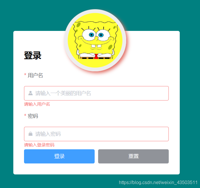
}5.修改前后效果對比:
修改前:

修改后:
、交集(Intersect)和差集(Difference))


—— element-UI的消息顯示時間修改)
)


—— Cookie、LocalStorage和SessionStorage的使用)


—— 在使用ElementUI時點擊同一個路由,頁面報錯)
)
![關于jQuery對象(類數組對象)以及DOM對象相互轉化問題——[object Object]和[object HTMLInputElement]](http://pic.xiahunao.cn/關于jQuery對象(類數組對象)以及DOM對象相互轉化問題——[object Object]和[object HTMLInputElement])
