??????????uniapp中的popup組件可以用于彈出簡單的提示框、操作框、菜單等。它可以通過position屬性控制彈出框的位置,不同的position值會使得彈出框呈現不同的彈出形式
目錄
一、實現思路
二、實現步驟
????①view部分展示
?????②JavaScript 內容
? ? ?③css中樣式展示
三、效果展示
四、小結 + 注意事項
一、實現思路
? ? ? 在需要的標簽綁定了一個點擊事件,點擊按鈕可以控制顯示或隱藏uni-popup組件。
???????uni-popup組件的v-model值與data中定義@close="show = false" @open="show = true"?變量綁定,
???????? uni-popup組件的position屬性設置為"bottom",表示從底部彈出。
?????????uni-popup組件的show屬性設置為true,表示顯示遮罩層。
?????????uni-popup組件的animation屬性設置為pop-up,表示彈出動畫效果為pop-up。
????????uni-popup組件中的內容可以自定義,這里是一個簡單的view標簽,包含一些文字和按鈕。
????????uni-popup組件支持拖曳的功能,默認開啟拖曳的方式為長按拖動或鼠標拖動。
二、實現步驟
????????①view部分展示
<template><view style="margin-top: 300rpx;"><view class="records"><view v-for="(item, index) in tabList" class="getlist" :key="index"><view class="flex-between" style="margin-top: 32rpx;"><!-- 彈出排列 --><view>{{ item.cations }}</view><view class="flex" @click="handleSelectCategroy(index)"><view class="flex"><view style="margin-right: 10rpx;color: #999; font-size: 32rpx;">{{ item.categoryText }}</view><view style="margin-left: 12rpx;"><u-icon name="arrow-right" size="14" color="#666"></u-icon></view></view></view></view></view></view><!-- 彈出層內容 --><u-popup :show="show" mode="bottom" @close="show = false" @open="show = true" closeable="true"><view style="border-bottom: 1rpx solid #E5E5E5;padding:24rpx 0 32rpx; text-align: center;">選擇</view><view class="flex-colomn"><view v-for="(item, index) in arrlist" class="flex-between .ui-font" :key="index" @click="tab(item)"style="border-bottom: 1rpx solid #E5E5E5;padding:32rpx 24rpx; "><view :class="[titleText === item.title ? 'active' : '']">{{ item.title }}</view><view><u-icon name="checkmark" size="15"></u-icon></view></view></view></u-popup></view>
</template>
?????②JavaScript 內容
<script>export default {data() {return {//彈出層show: false,titleText: '巧克力餅干',arrlist: [{id: 1,title: '西紅柿小面包'}, {id: 2,title: '其他'}, {id: 3,title: '其他001'}, {id: 4,title: '小其他'}, {id: 5,title: '大其他'}],tabList: [{cations: "選擇你喜歡的面包",categoryText: "請選擇你喜歡的"}, ]};},methods: {// 彈出選擇值handleSelectCategroy(index) {this.show = true //當前彈出層為truethis.curActiveCategroyIndex = index},valChange(e) {console.log('當前值為: ' + e.value)},tab(item) {this.show = falsethis.titleText = item.titlethis.tabList = this.tabList.map((it, i) => {if (this.curActiveCategroyIndex === i) {it.categoryText = this.titleText}return it})},}}
</script>
????????③css中樣式展示
<style lang="scss" scoped>.records {padding: 24rpx;background: #FFFFFF;border-radius: 16rpx;}.ui-font {font-size: 28rpx;color: #333333;text-align: center;border-bottom: 1rpx solid #E5E5E5;padding: 28rpx 0px;}.active {color: #428AF6}
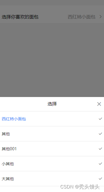
</style>三、效果展示
????????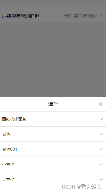 ? ? ? ??
四、小結 + 注意事項
1. u-popup組件盡量與整個的第二層位置,否則會失效
2.常用屬性值:
????????show【控制彈出窗口的顯示與隱藏】
????????????????類型:Boolean
????????????????默認值:false
????????????????。當為 true 時,彈出窗口將顯示;當為 false 時,彈出窗口將隱藏。
????????position 【設置彈出窗口的位置。可選值】
????????????????類型:String
????????????????默認值:center
? ? ? ? ? ? ? ? top: 彈出窗口在頂部顯示。
? ? ? ? ? ? ? ?bottom: 彈出窗口在底部顯示。
? ? ? ? ? ? ? ? left: 彈出窗口在左側顯示。
? ? ? ? ? ? ? ?right: 彈出窗口在右側顯示。
? ? ? ? ? ? ? ?center: 彈出窗口在屏幕中央顯示。


求解23個測試函數(python代碼))


)


