前言
先上圖看右側列 action 的 UI 效果:
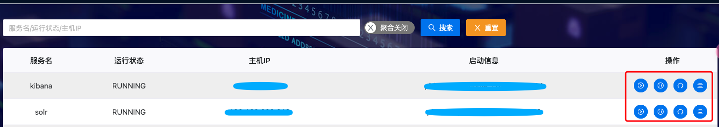
正常來說,如果一個表格的附帶 action 操作,我們一般會放在最右側的列里面實現,這個時候有些UI 框架支持在 SFC 模板里面定義額外的 solt,當然如果不支持,更通用的做法是通過 vue 的 h 函數來實現,純粹用 js 或 ts 組裝組件方式實現,這種方式很靈活,但有一個弊端,當定義的組件很多的時候,比如上圖有4 個Button,還得定義按鈕樣式和點擊事件,代碼就顯的非常亂。
更為優雅的做法是,把這一小塊的功能給單獨定義成一個 vue 組件,可以用 SFC 也可以用 JSX/TSX 實現,然后事件通過回調完成,代碼就顯得非常整潔了。
定義 Action 組件
這里用 tsx 實現:
import { defineComponent, PropType, toRefs } from 'vue'
import { NSpace, NTooltip, NButton, NIcon, NPopconfirm } from 'naive-ui'
import {AreaChartOutlined, DeleteOutlined, EditOutlined,
PlayCircleOutlined,PauseCircleOutlined,RedoOutlined,AlignCenterOutlined} from "@vicons/antd";
import {SolrListActionModel} from "@/service/middleware/types";const props = {row: {type: SolrListActionModel as PropType<SolrListActionModel>}
}export default defineComponent({name: 'SolrTableAction',props,emits: ['start','stop','restart','showLog',],setup(props, ctx) {const handleStartAction = () => {ctx.emit('start')}const handleStopAction = () => {ctx.emit('stop')}const handleRestartAction = () => {ctx.emit('restart')}const handleShowLogAction = () => {ctx.emit('showLog')}return {handleStartAction,handleStopAction,handleRestartAction,handleShowLogAction,...toRefs(props)}},render() {return (<NSpace>{this.row?.start ? <NTooltip trigger={'hover'}>{{default: () => "啟動",trigger: () => (<NButtonsize='small'type='info'tag='div'circleonClick={this.handleStartAction}class='btn-edit'><NIcon><PlayCircleOutlined></PlayCircleOutlined></NIcon></NButton>)}}</NTooltip>:""}{this.row?.stop?<NTooltip trigger={'hover'}>{{default: () => "停止",trigger: () => (<NButtonsize='small'type='info'tag='div'circleonClick={this.handleStopAction}class='btn-edit'><NIcon><PauseCircleOutlined></PauseCircleOutlined></NIcon></NButton>)}}</NTooltip>:""}{this.row?.restart?<NTooltip trigger={'hover'}>{{default: () => "重啟",trigger: () => (<NButtonsize='small'type='info'tag='div'circleonClick={this.handleRestartAction}class='btn-edit'><NIcon><RedoOutlined></RedoOutlined></NIcon></NButton>)}}</NTooltip>:""}{this.row?.showLog?<NTooltip trigger={'hover'}>{{default: () => "日志",trigger: () => (<NButtonsize='small'type='info'tag='div'circleonClick={this.handleShowLogAction}class='btn-edit'><NIcon><AlignCenterOutlined></AlignCenterOutlined></NIcon></NButton>)}}</NTooltip>:""}{this.$slots.extraAction?.()}</NSpace>)}
})
在 Table 列里面引用
定義好之后,在 table 里面引用就非常簡單了,只需要把 props 屬性傳遞一下,然后定義回調處理事件即可:
const columns = [{title: '服務名',key: 'server_name',align: 'center'},{title: '運行狀態',key: 'process_state',align: 'center'},{title: '主機IP',key: 'process_ip',align: 'center'},{title: '啟動信息',key: 'process_description',align: 'center'},{title: '操作',key: 'operation',//列寬自適應...COLUMN_WIDTH_CONFIG['operation'](4),align: 'center',render: (row: SolrList)=>{let model=new SolrListActionModel(row)return h(SolrTableAction, {row: model,onStart: () => {},onStop:()=>{},onRestart:()=>{},onShowLog:()=>{}})}}] as TableColumns<any>列寬自適應工具類
這個是為了該列的寬度,根據實際情況重新分布:
/** Licensed to the Apache Software Foundation (ASF) under one or more* contributor license agreements.  See the NOTICE file distributed with* this work for additional information regarding copyright ownership.* The ASF licenses this file to You under the Apache License, Version 2.0* (the "License"); you may not use this file except in compliance with* the License.  You may obtain a copy of the License at**    http://www.apache.org/licenses/LICENSE-2.0** Unless required by applicable law or agreed to in writing, software* distributed under the License is distributed on an "AS IS" BASIS,* WITHOUT WARRANTIES OR CONDITIONS OF ANY KIND, either express or implied.* See the License for the specific language governing permissions and* limitations under the License.*/import { isNumber, sumBy } from 'lodash'
import type {TableColumns,CommonColumnInfo
} from 'naive-ui/es/data-table/src/interface'export const COLUMN_WIDTH_CONFIG = {selection: {width: 50},index: {width: 50},linkName: {width: 200},linkEllipsis: {style: 'max-width: 180px;line-height: 1.5'},name: {width: 200,ellipsis: {tooltip: true}},state: {width: 120},type: {width: 130},version: {width: 80},time: {width: 180},timeZone: {width: 220},operation: (number: number): CommonColumnInfo => ({fixed: 'right',width: Math.max(30 * number + 12 * (number - 1) + 24, 100)}),userName: {width: 120,ellipsis: {tooltip: true}},ruleType: {width: 120},note: {width: 180,ellipsis: {tooltip: true}},dryRun: {width: 140},times: {width: 120},duration: {width: 120},yesOrNo: {width: 100,ellipsis: {tooltip: true}},size: {width: 100},tag: {width: 160},copy: {width: 50}
}export const calculateTableWidth = (columns: TableColumns) =>sumBy(columns, (column) => (isNumber(column.width) ? column.width : 0))export const DefaultTableWidth = 1800
總結
通用這種單獨定義組件的方式,大大提高了我們代碼的可讀性,并且后續這個組件可以單獨擴展和改變樣式而不影響主列表頁的迭代,最后我們要注意給 h 組件的傳遞 props 的方式,直接使用 props name:value 的形式即可。

”(完美解決)。)


護盾)

框架.creat insert .save區別)


)


