建議先將amis文檔從頭到尾,仔細看一遍。
參考:amis - 低代碼前端框架?
amis 的渲染過程是將?json?轉成對應的 React 組件。先通過?json?的 type 找到對應的?Component,然后把其他屬性作為?props?傳遞過去完成渲染。
import * as React from 'react';
import {Renderer} from 'amis-core';
@Renderer({  // amis-core/src/factory.tsx里的Renderer方法,主要作用識別json格式的type交給對應react組件來處理(現在可以識別{"type": "page", "title": "自定義組件示例"} )。type: 'page'// ... 其他信息隱藏了
})
export class PageRenderer extends React.Component {// ... 其他信息隱藏了render() {const { title, body,  render /*用來渲染孩子節點,如果當前是葉子節點則可以忽略。*/  } = this.props;return (<div className="page"><h1>{title}</h1><div className="body-container">{render('body', body,{// 這里的信息會作為 props 傳遞給子組件,一般情況下都不需要這個}) /*渲染孩子節點*/}</div></div>);}
}
// 如果不支持 Decorators 語法也可以使用如下寫法
export Renderer({type: 'page'
})(class PageRenderer extends React.Component {render() {// ...同上}
})
?
React注冊自定義組件:
1.比如:注冊一個 React 組件,當節點的 type 是?my-renderer?時,交給當前組件來完成渲染。
import * as React from 'react';
import {Renderer} from 'amis';
@Renderer({type: 'my-renderer',autoVar: true // amis 1.8 之后新增的功能,自動解析出參數里的變量
})
class CustomRenderer extends React.Component {render() {const {tip} = this.props;return <div>這是自定義組件:{tip}</div>;}
}
有了以上這段代碼后,就可以這樣使用了:
{"type": "page","title": "自定義組件示例","body": {"type": "my-renderer","tip": "簡單示例"}
}
如果這個組件還能通過?children?屬性添加子節點,則需從props中獲取body, ?render處理(參考上面page組件)。
render(region, node, props)?方法,這個方法就是專門用來渲染子節點的。來看下參數說明:
* region?區域名稱,你有可能有多個區域可以作為容器,請不要重復。
* node?子節點。
* props?可選,可以通過此對象跟子節點通信等。
屬性支持變量
因為配置了?autoVar: true,使得所有組件參數將自動支持變量,在組件內拿到的將是解析后的值(ps: 1.8.0 及以上版本新增配置,之前版本需要調用 amis 里的 resolveVariableAndFilter 方法)
2.表單項FormItem的擴展(amis-core/src/renderes/Item)
以上是普通渲染器的注冊方式,如果是表單項,為了更簡單的擴充,請使用?FormItem?注解,而不是?Renderer。 原因是如果用?FormItem?是不用關心:label 怎么擺,表單驗證器怎么實現,如何適配表單的 3 種展現方式(水平、上下和內聯模式),而只用關心:有了值后如何回顯,響應用戶交互設置新值。
import * as React from 'react';
import {FormItem} from 'amis';
@FormItem({type: 'custom'
})
class MyFormItem extends React.Component {render() {const {value, onChange} = this.props;return (<div><p>這個是個自定義組件</p><p>當前值:{value}</p><aclassName="btn btn-default"onClick={() => onChange(Math.round(Math.random() * 10000))}>隨機修改</a></div>);}
}
有了以上這段代碼后,就可以這樣使用了:
{"type": "page","title": "自定義組件示例","body": {"type": "form","body": [{"type": "custom","label": "隨機值","name": "random"}]}
}
注意: 使用 FormItem 默認是嚴格模式,即只有必要的屬性變化才會重新渲染,有可能滿足不了你的需求,如果忽略性能問題,可以傳入?strictMode:?false?來關閉。
表單項開發主要關心兩件事。
1.呈現當前值。如以上例子,通過?this.props.value?判定如果勾選了則顯示已勾選,否則顯示請勾選。
2.接收用戶交互,通過?this.props.onChange?修改表單項值。如以上例子,當用戶點擊按鈕時,切換當前選中的值。
至于其他功能如:label/description 的展示、表單驗證功能、表單布局(常規、左右或者內聯)等等,只要是通過 FormItem 注冊進去的都無需自己實現。
需要注意,獲取或者修改的是什么值跟配置中?type?并列的?name?屬性有關,也就是說直接關聯某個變量,自定義中直接通過 props 下發了某個指定變量的值和修改的方法。如果你想獲取其他數據,或者設置其他數據可以看下以下說明:
* 獲取其他數據?可以通過?this.props.data?查看,作用域中所有的數據都在這了。
* 設置其他數據?可以通過?this.props.onBulkChange, 比如:?this.props.onBulkChange({a: 1, b: 2})?等于同時設置了兩個值。當做數據填充的時候,這個方法很有用。
3.其它高級定制
——自定義驗證器
如果 amis?自帶的驗證能滿足需求了,則不需要關心。組件可以有自己的驗證邏輯。
@FormItem({  type: 'custom-checkbox' })
export default class CustomCheckbox extends React.Component {validate() {// 通過 this.props.value 可以知道當前值。return isValid ? '' : '不合法,說明不合法原因。';}// ... 其他省略了
}
上面的例子只是簡單說明,另外可以做異步驗證,validate 方法可以返回一個 promise。
——OptionsControl (amis-core/src/renderes/Options)
如果你的表單組件性質和 amis 的 Select、Checkboxes、List 差不多,用戶配置配置 source 可通過 API 拉取選項,你可以用 OptionsControl 取代 FormItem 這個注解。
用法是一樣,功能方面主要多了以下功能。
* 可以配置 options,options 支持配置 visibleOn hiddenOn 等表達式
* 可以配置?source?換成動態拉取 options 的功能,source 中有變量依賴會自動重新拉取。
* 下發了這些 props,可以更方便選項。
????* options?不管是用戶配置的靜態 options 還是配置 source 拉取的,下發到組件已經是最終的選項了。
????* selectedOptions?數組類型,當前用戶選中的選項。
????* loading?當前選項是否在加載
????* onToggle?切換一個選項的值
????* onToggleAll?切換所有選項的值,類似于全選。
4.組件間通信
關于組件間通信,amis 中有個機制就是,把需要被引用的組件設置一個 name 值,然后其他組件就可以通過這個 name 與其通信,比如這個例子。其實內部是依賴于內部的一個 Scoped Context。你的組件希望可以被別的組件引用,你需要把自己注冊進去,默認自定義的非表單類組件并沒有把自己注冊進去,可以參考以下代碼做添加:
import * as React from 'react';
import {Renderer, ScopedContext} from 'amis';
@Renderer({  type: 'my-renderer'})
export class CustomRenderer extends React.Component {static contextType = ScopedContext;constructor() {const scoped = this.context;scoped.registerComponent(this);}componentWillUnmount() {const scoped = this.context;scoped.unRegisterComponent(this);}// 其他部分省略了。
}
把自己注冊進去了,其他組件就能引用到了。同時,如果你想找別的組件,也同樣是通過 scoped 這個 context,如:?scoped.getComponentByName("xxxName")?這樣就能拿到目標組件的實例了(前提是目標組件已經配置了 name 為?xxxName)。
5.自定義組件接入事件動作
需求場景主要是想要自定義組件的內部事件暴露出去,能夠通過對事件的監聽來執行所需動作,并希望自定義組件自身的動作能夠被其他組件調用。接入方法是通過`props.dispatchEvent`派發自身的各種事件,使其具備更靈活的交互設計能力;
通過重寫`doAction`方法實現其他組件對其專屬動作的調用,需要注意的是,此處依賴內部的 `Scoped Context`來實現自身的注冊
amis/src/renderers中不同的組件可重寫自己的doAction方法(實現自己的組件專屬動作)
???可以直接調某一組件的doAction方法:comp.doAction()觸發組件特有動作。 const values = await form.doAction( { type: 'submit' }, form.props.data, true );
???也可以通過onEvent配置組件特有動作(CmptAction)去觸發對應組件的特有動作
自定義的渲染器 props 會下發一個非常有用的 env 對象。這個 env 有以下功能方法:
* env.fetcher?可以用來做 ajax 請求如:?this.props.env.fetcher('xxxAPi', this.props.data).then((result) => console.log(result))
* env.confirm?確認框,返回一個 promise 等待用戶確認如:?this.props.env.confirm('你確定要這么做?').then((confirmed) => console.log(confirmed))
* env.alert?用 Modal 實現的彈框,個人覺得更美觀。
* env.notify?toast 某個消息 如:?this.props.env.notify("error", "出錯了")
* env.jumpTo?頁面跳轉。
大部分組件都是直接繼承 RendererProps,里面包含渲染組件所需的常用屬性. 例如:export interface PageProps extends RendererProps
?amis-editor注冊自定義組件
比如antd按鈕組件:
方法一:這里'amis-widget'的registerAmisEditorPlugin, registerRendererByType分別注冊plugin插件和renderer渲染器。
src/plugins/AntdButton.tsx:
import type {BaseEventContext, RendererPluginEvent} from 'amis-editor-core';
import {getSchemaTpl} from 'amis-editor-core';
import {getEventControlConfig} from 'amis-editor/lib/renderer/event-control/helper';
import {Button, ButtonProps} from 'antd';
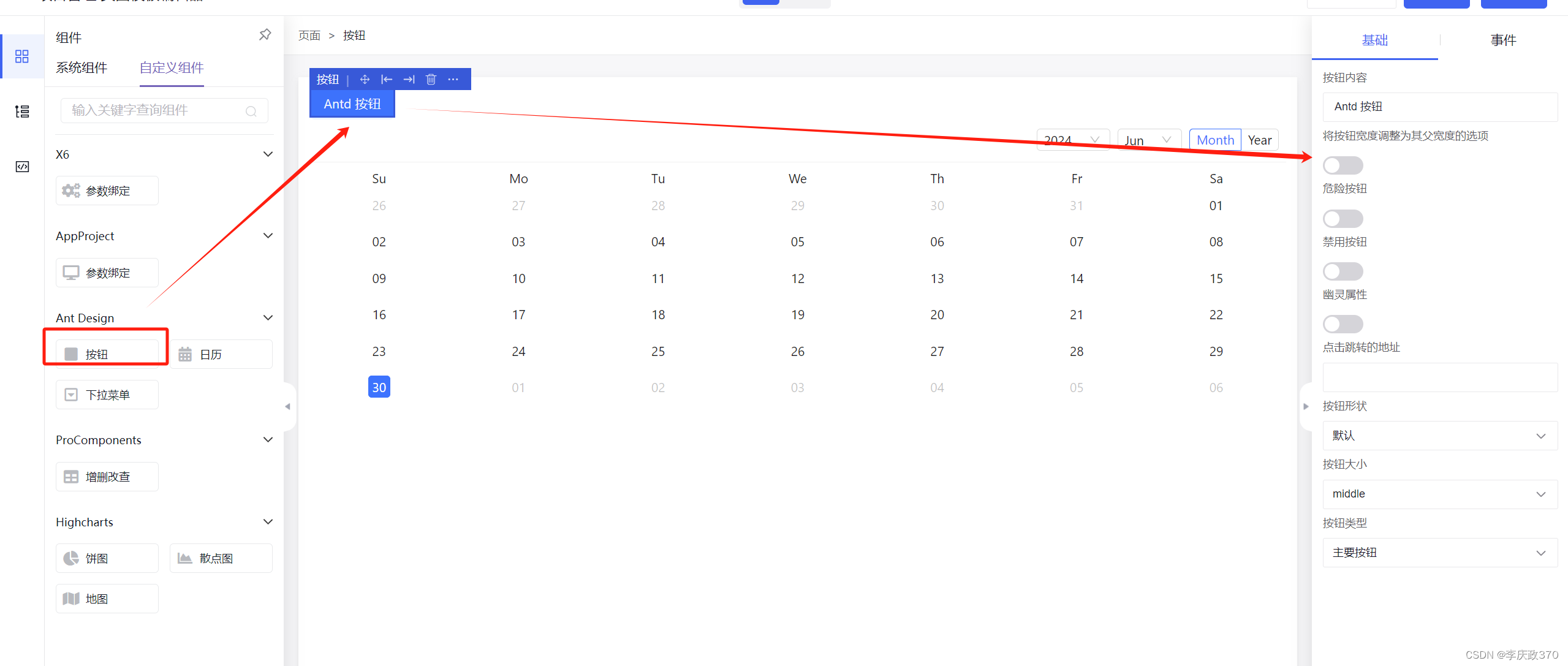
import React from 'react';export class AntdButtonPlugin {rendererName = 'antd-button';$schema = '/schemas/UnkownSchema.json';name = '按鈕';description = 'Ant Design按鈕預設模板';tags = ['Ant Design'];icon = 'fa fa-square';scaffold = {type: 'antd-button',content: 'Antd 按鈕',block: false,danger: false,disabled: false,ghost: false,shape: 'default',size: 'middle',buttonType: 'primary'};previewSchema = {...this.scaffold};panelTitle = '按鈕';events: RendererPluginEvent[] = [{eventName: 'onClick',eventLabel: '按鈕點擊',description: '按鈕點擊時觸發',defaultShow: true}];panelBodyCreator = (context: BaseEventContext) => {const id = context.id;const manager = (window as any).store.editorManager;return getSchemaTpl('tabs', [{title: '基礎',body: [{type: 'input-text',name: 'content',label: '按鈕內容',value: 'Antd 按鈕'},{type: 'switch',name: 'block',label: '將按鈕寬度調整為其父寬度的選項',value: false},{type: 'switch',name: 'danger',label: '危險按鈕',value: false},{type: 'switch',name: 'disabled',label: '禁用按鈕',value: false},{type: 'switch',name: 'ghost',label: '幽靈屬性',value: false},{type: 'input-text',name: 'href',label: '點擊跳轉的地址',value: undefined},{type: 'select',name: 'shape',label: '按鈕形狀',value: 'default',options: [{label: '默認',value: 'default'},{label: '圓形',value: 'circle'},{label: '圓弧',value: 'round'}]},{type: 'select',name: 'size',label: '按鈕大小',value: 'middle',options: [{label: 'large',value: 'large'},{label: 'middle',value: 'middle'},{label: 'small',value: 'small'}]},{type: 'select',name: 'buttonType',label: '按鈕類型',value: 'primary',options: [{label: '主要按鈕',value: 'primary'},{label: '虛線按鈕',value: 'dashed'},{label: '鏈接按鈕',value: 'link'},{label: '文本按鈕',value: 'text'},{label: '默認按鈕',value: 'default'}]}]},{title: '事件',className: 'p-none',body: [getSchemaTpl('eventControl', {name: 'onEvent',...getEventControlConfig(manager, context)})]}]);};
}/**onClick={onClick? e => new Function(`return ${onClick}`)()(e): function onClick(e) {console.log('click');}}*/export function AntdButton({content,block,danger,disabled,ghost,href,shape,size,buttonType,onClick
}: ButtonProps & {buttonType: ButtonProps['type']; onClick: string}) {const type = buttonType;return (<Buttondanger={danger || false}disabled={disabled || false}type={type || 'primary'}block={block || false}ghost={ghost || false}href={href || undefined}shape={shape || 'default'}size={size || 'middle'}>{content || 'Antd 按鈕'}</Button>);
}
src/plugins/index.ts中進行plugin注冊:
//@ts-ignore
import {registerAmisEditorPlugin, registerRendererByType} from 'amis-widget';// import {registerEditorPlugin} from 'amis-editor';
// import {AntdCalendarPlugin, AntdCalendar} from './AntdCalendar';
// registerEditorPlugin(AntdCalendarPlugin)import './AntdCalendar';import {AntdButtonPlugin, AntdButton} from './AntdButton';
import {AntdDropdownPlugin, AntdDropdown} from './AntdDropdown';
import {ProCRUDPlugin, ProCRUD} from './ProCRUD';
import {ChartPiePlugin, ChartPie} from './ChartPie';
import {ChartScatterPlugin, ChartScatter} from './ChartScatter';
import {ChartMapPlugin, ChartMap} from './ChartMap';enum Usage {renderer = 'renderer',formitem = 'formitem',options = 'options'
}
enum Framework {react = 'react',vue2 = 'vue2',vue3 = 'vue3',jquery = 'jquery'
}const plugins = [{type: 'antd-button',plugin: AntdButtonPlugin,component: AntdButton},{type: 'antd-dropdown',plugin: AntdDropdownPlugin,component: AntdDropdown},{type: 'pro-crud',plugin: ProCRUDPlugin,component: ProCRUD},{type: 'chart-pie',plugin: ChartPiePlugin,component: ChartPie},{type: 'chart-scatter',plugin: ChartScatterPlugin,component: ChartScatter},{type: 'chart-map',plugin: ChartMapPlugin,component: ChartMap},
];export default () => {plugins.forEach(({type, plugin, component}) => {registerAmisEditorPlugin(plugin);registerRendererByType(component, {type,usage: Usage.renderer,weight: 99,framework: Framework.react});});
};
方法二:采用amis-editor的registerEditorPlugin注冊plugin插件。 amis的@Renderer 注冊renderer渲染器

src/plugins/AntdCalendar.tsx:
import {Calendar, CalendarProps} from 'antd';
import React from 'react';
import {Renderer, RendererProps} from 'amis';
import {BasePlugin, registerEditorPlugin} from 'amis-editor';export class AntdCalendarPlugin extends BasePlugin{rendererName = 'antd-calendar';$schema = '/schemas/UnkownSchema.json';name = '日歷';description = 'Ant Design日歷預設模板';tags = ['Ant Design'];icon = 'fa fa-calendar';scaffold = {type: 'antd-calendar',fullscreen: false};previewSchema = {...this.scaffold};panelTitle = '日歷';panelControls = [{type: 'switch',name: 'fullscreen',label: '是否全屏',value: false}];
}// @Renderer({
//   type: 'antd-calendar',
//   name: 'antd-calendar',
//   autoVar: true
// })
// export class AntdCalendar extends React.Component<RendererProps> {
//   render() {
//     const {fullscreen} = this.props;
//     return <Calendar fullscreen={fullscreen || false} />;
//   }
// }export function AntdCalendar({fullscreen}: RendererProps) {return <Calendar fullscreen={fullscreen || false} />;
}
Renderer({type: 'antd-calendar',name: 'antd-calendar',autoVar: true
})(AntdCalendar);registerEditorPlugin(AntdCalendarPlugin);


)


)
