在當今數字化時代,AI 助手已成為網站和應用不可或缺的一部分。本文將帶你一步步使用 Tailwind CSS 和 Kooboo 構建一個現代化的 AI 對話界面框。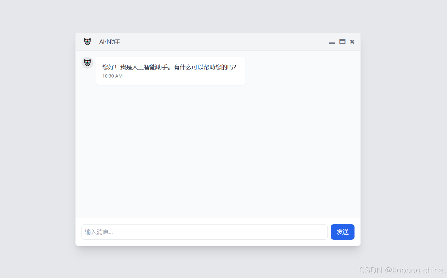
一、選擇 Kooboo平臺 的核心優勢
- 智能提示:在輸入?
class?屬性時,會自動觸發 Tailwind CSS 規則的智能聯想提示,顯著提升開發效率。
- 動態編譯優化:通過啟用樣式設置中的?原子化CSS (UnoCSS)?功能,可實現:
- 按需編譯:僅打包實際使用的 CSS 類,剔除未引用規則,生成輕量且高效的樣式文件。
- 自動集成:編譯后的最小化 CSS 文件會自動注入頁面,無需手動配置引用。
進入站點后 -> 頁面 -> 樣式 -> 設置 -> 選擇原子化css -> 保存

二、HTML 結構
(一)最外層容器:<body>
<body class="bg-gray-200 min-h-screen flex items-center justify-center p-4">- 角色:整個頁面的根容器,控制整體布局和基礎樣式。
- 關鍵屬性:
bg-gray-200:背景色為淺灰色,營造柔和視覺基調。min-h-screen:最小高度為視口高度(100vh),確保內容撐滿屏幕。flex items-center justify-center:使用彈性布局,子元素在垂直和水平方向居中,實現界面居中效果。p-4:內邊距為 4 單位(Tailwind 中默認 1 單位 =?0.25rem,即總內邊距為?1rem),避免內容緊貼瀏覽器邊緣。
(二)主窗口容器:.max-w-3xl
<div class="max-w-3xl w-full bg-white rounded-lg shadow-xl overflow-hidden border border-gray-200">- 角色:模擬桌面應用的窗口外殼,包裹標題欄、消息容器和輸入區域。
- 關鍵屬性:
max-w-3xl:最大寬度為?3xl(Tailwind 預設值,約?48rem/768px),限制窗口寬度,適配不同屏幕。w-full:在小于?3xl?的屏幕上自動占滿可用寬度,保證響應式。bg-white:白色背景,與頁面淺灰背景形成對比,突出窗口主體。rounded-lg shadow-xl:大圓角 + 深陰影,營造立體感和浮窗效果。overflow-hidden border border-gray-200:隱藏溢出內容(防止圓角外的邊框顯示不全),添加淺灰色邊框增強邊界感。
(三)標題欄容器:.bg-gray-100
<div class="bg-gray-100 px-4 py-2 flex items-center justify-between border-b border-gray-200">- 角色:窗口頂部的功能欄,顯示標題和控制按鈕。
- 關鍵屬性:
bg-gray-100:淺灰色背景,與主窗口白色背景區分,形成層級感。px-4 py-2:水平內邊距 4 單位,垂直內邊距 2 單位(總內邊距:水平?1rem,垂直?0.5rem)。flex items-center justify-between:彈性布局,子元素垂直居中,左右內容兩端對齊(標題居左,按鈕居右)。border-b border-gray-200:底部添加淺灰色邊框,分隔標題欄和消息容器。
標題欄子容器 1:左側標題組
<div class="flex items-center"><div class="w-8 h-8 flex items-center justify-center"><span class="text-blue-600">🤖</span></div><span class="ml-4 text-sm font-medium text-gray-700">AI小助手</span>
</div>- 布局:水平排列的圖標和標題。
- 圖標容器:
w-8 h-8:固定尺寸?2rem×2rem(約 32px),圓形背景(通過父級?rounded-full?實現)。flex items-center justify-center:圖標居中顯示。text-blue-600:深藍色圖標,與標題欄淺灰背景形成對比。
- 標題文本:
ml-4:左側邊距 4 單位(1rem),與圖標隔開。text-sm font-medium text-gray-700:小字體、中等字重、深灰色文本,清晰易讀。
- 圖標容器:
標題欄子容器 2:右側控制按鈕組
<div class="flex items-center space-x-3"><button class="text-gray-500 hover:text-gray-700 transition-colors"><i class="fa fa-window-minimize"></i></button><button class="text-gray-500 hover:text-gray-700 transition-colors"><i class="fa fa-window-maximize"></i></button><button class="text-gray-500 hover:text-red-500 transition-colors"><i class="fa fa-times"></i></button></div>- 布局:水平排列的三個按鈕(最小化、最大化、關閉)。
flex items-center space-x-3:按鈕垂直居中,水平間距 3 單位(0.75rem)。- 按鈕樣式:
text-gray-500 hover:text-gray-700:默認淺灰色圖標,懸停時深灰色,關閉按鈕懸停時為紅色(hover:text-red-500)。transition-colors:添加顏色過渡動畫,使交互更平滑。
- 圖標:使用 Font Awesome 圖標(需引入庫),分別為?
fa-window-minimize、fa-window-maximize、fa-times。
(四)消息容器:#messageContainer
<div id="messageContainer" class="h-[60vh] overflow-y-auto p-4 space-y-4 bg-gray-50">- 角色:顯示歷史聊天記錄,支持垂直滾動。
- 關鍵屬性:
h-[60vh]:高度為視口高度的 60%,固定區域大小。overflow-y-auto:內容超出高度時顯示垂直滾動條。p-4 space-y-4:內邊距 4 單位,子消息之間垂直間距 4 單位(1rem),避免消息緊貼。bg-gray-50:淺灰色背景,與主窗口白色背景區分,突出消息氣泡。
消息容器子元素:單條消息(初始 AI 消息)
<!-- 初始消息 --><div class="flex items-start space-x-2"><div class="w-8 h-8 rounded-full bg-gray-200 flex items-center justify-center">🤖</div><div class="max-w-[70%]"><div class="bg-white p-4 rounded-lg rounded-tl-none shadow-sm"><p class="text-gray-800">您好!我是人工智能助手。有什么可以幫助您的嗎?</p><span class="text-xs text-gray-500 mt-1 block">10:30 AM</span></div></div></div>- 布局邏輯:
flex items-start space-x-2:左側圖標與右側消息氣泡水平排列,間距 2 單位(0.5rem),氣泡頂部對齊圖標。- 圖標容器:
rounded-full bg-gray-200:灰色圓形背景,機器人圖標居中。
- 消息氣泡:
max-w-[70%]:最大寬度占容器的 70%,避免長消息撐滿屏幕。bg-white p-4 rounded-lg rounded-tl-none:白色背景,大圓角,左上角無圓角(模擬對話氣泡的指向性)。shadow-sm:輕微陰影,增強立體感。- 文本樣式:
- 消息內容:
text-gray-800?深灰色,易讀性高。 - 時間戳:
text-xs text-gray-500?小字體、淺灰色,位于消息底部。
- 消息內容:
(五)輸入區域容器:.bg-white
<div class="bg-white p-4 border-t border-gray-200">- 角色:用戶輸入消息的區域,位于窗口底部。
- 關鍵屬性:
bg-white:白色背景,與消息容器的淺灰背景區分。p-4 border-t border-gray-200:內邊距 4 單位,頂部添加淺灰色邊框,分隔輸入區域和消息容器。
輸入區域子容器:輸入框與按鈕組
<div class="flex space-x-2"><input id="messageInput"type="text" placeholder="輸入消息..." class="flex-1 p-2 border rounded-lg focus:outline-none focus:ring-2 focus:ring-blue-500"><button id="sendButton" class="px-4 py-2 bg-blue-600 text-white rounded-lg hover:bg-blue-700 transition-colors">發送</button></div></div>- 布局:水平排列的輸入框和發送按鈕。
flex space-x-2:彈性布局,輸入框和按鈕之間水平間距 2 單位(0.5rem)。- 輸入框:
flex-1:占據剩余水平空間,自適應寬度。p-2 border rounded-lg focus:ring-blue-500:內邊距、邊框、圓角,聚焦時藍色高亮環。
- 發送按鈕:
bg-blue-600 text-white hover:bg-blue-700:藍色主色調,懸停時顏色加深,符合操作按鈕視覺規范。px-4 py-2 rounded-lg:內邊距、圓角,按鈕尺寸適中易點擊。
三、設計核心思路
-
層級分明的容器結構:
- 通過不同背景色(白、淺灰、深灰)和邊框分隔容器,增強視覺層次感。
- 彈性布局(
flex)和間距類(space-x、space-y)實現靈活響應式布局。
-
模擬真實交互體驗:
- 標題欄控制按鈕模仿桌面應用視覺習慣,提升用戶熟悉度。
- 消息氣泡通過對齊方式(左對齊 AI,右對齊用戶)和顏色(白 / 藍)清晰區分角色。
-
漸進增強的交互邏輯:
- JavaScript 僅負責動態交互(發送消息、加載狀態、回復邏輯),靜態布局完全由 HTML/CSS 實現,保證基礎功能可用。


——dlib關鍵點定位)


