對于已經擬合好的生存模型,我們一般會直接用ROC去評判一下整體的水平,因為很多時候閾值都是我們人為根據實際情況去設定的,這種微調的細節都是在整體模型的擬合程度確定下來后再做的工作。
ROC曲線可以提供給我們模型對于二分類變量的區分能力,而且還可以看到到底是哪些樣本數據被錯誤分類了,能幫助我們確定哪些數據可能有共線性或迷惑性的特征。
以下是一個例子:
# 加載必要的包
library(pROC)
library(ggplot2)# 生成模擬數據集
set.seed(123)
n <- 1000# 生成兩個正態分布的組
group1 <- rnorm(n, mean = 0, sd = 1)  # 負例
group2 <- rnorm(n, mean = 1.5, sd = 1) # 正例# 創建數據框
data <- data.frame(score = c(group1, group2),class = factor(rep(c(0, 1), each = n))
)# 計算ROC曲線
roc_obj <- roc(data$class, data$score)# 獲取AUC值
auc_value <- auc(roc_obj)
cat("AUC值為:", auc_value, "\n")# 找到最佳閾值(根據Youden指數)
best_threshold <- coords(roc_obj, "best", ret = "threshold", best.method = "youden")# 修正后的閾值輸出方式(提取數值部分)
cat("最佳閾值為:", best_threshold$threshold, "\n")# 或者使用更安全的方式
if(!is.null(best_threshold$threshold)) {cat("最佳閾值為:", best_threshold$threshold, "\n")
} else {cat("無法確定最佳閾值\n")
}# 計算所有閾值下的指標
roc_table <- coords(roc_obj, "all", ret = c("threshold", "specificity", "sensitivity", "accuracy"))
head(roc_table)# 繪制ROC曲線
ggroc(roc_obj, color = "blue", size = 1) +geom_abline(intercept = 1, slope = 1, linetype = "dashed", color = "red") +labs(title = paste0("ROC曲線 (AUC = ", round(auc_value, 3), ")"),x = "假正例率 (FPR)", y = "真正例率 (TPR)") +theme_minimal()
輸出:
AUC值為: 0.858621
最佳閾值為: 0.8868806 0.9051289threshold specificity sensitivity accuracy
1      -Inf       0.000           1   0.5000
2 -2.735349       0.001           1   0.5005
3 -2.652036       0.002           1   0.5010
4 -2.622424       0.003           1   0.5015
5 -2.554809       0.004           1   0.5020
6 -2.486908       0.005           1   0.5025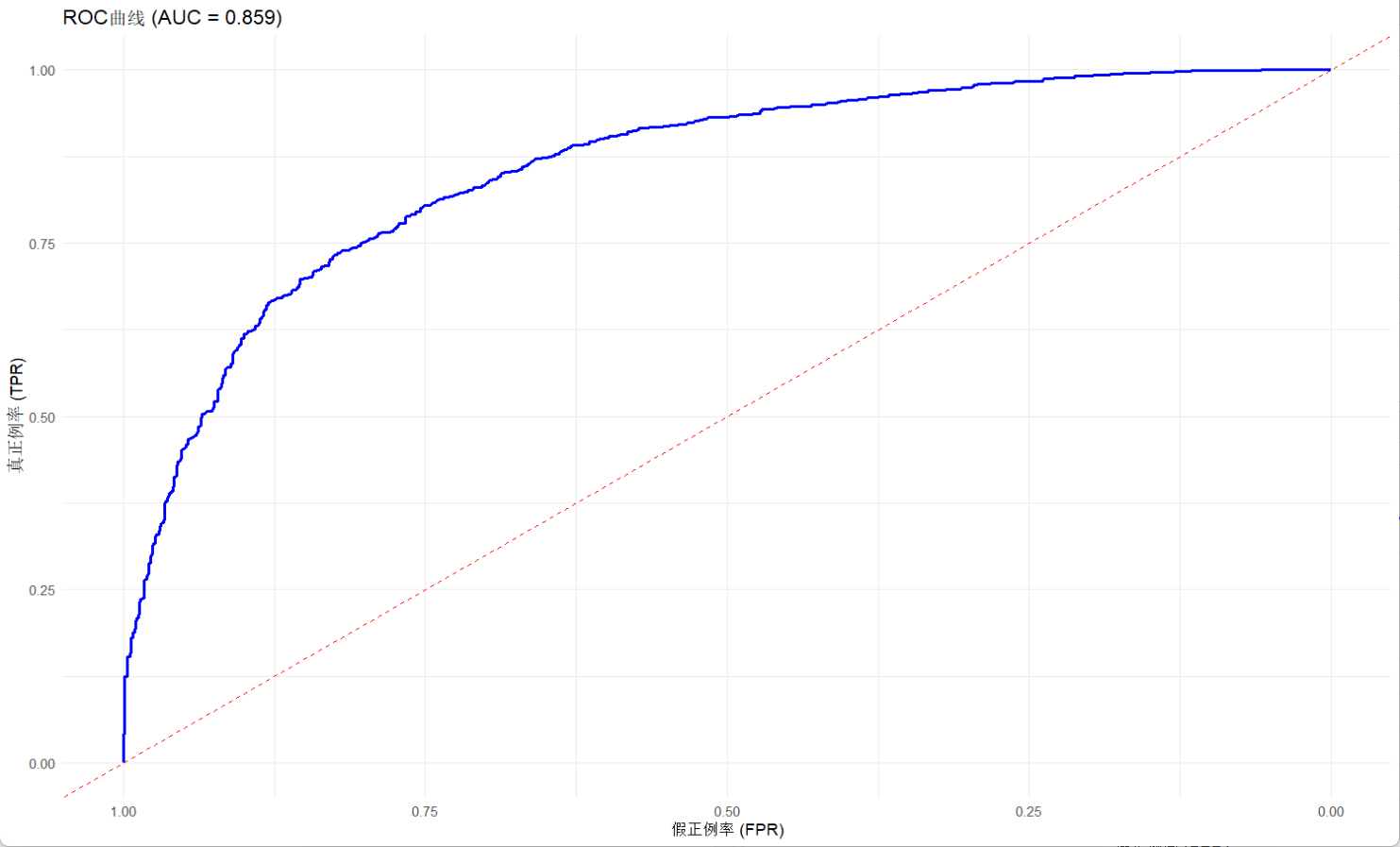
可以看到,曲線整體偏左上角,符合AUC靠近1的事實,說明模型對于二分類的區分能力較好,給出的最佳閾值雖然不一定準確,但是也接近這個范圍,進一步說明其解釋性。


:封裝自定義可復用組件)


:從原理到現代實現演進)


