泰坦尼克號 數據分析
My goal was to get a better understanding of how to work with tabular data so I challenged myself and started with the Titanic -project. I think this was an excellent way to learn the basics of data analysis with python.
我的目標是更好地了解如何使用表格數據,因此我挑戰自我并開始了Titanic項目。 我認為這是學習python數據分析基礎知識的絕佳方法。
You can find the competition here: https://www.kaggle.com/c/titanicI really recommend you to try it yourself if you want to learn how to analyze the data and build machine learning models.
您可以在這里找到比賽: https : //www.kaggle.com/c/titanic如果您想學習如何分析數據和建立機器學習模型,我真的建議您自己嘗試一下。
I started by uploading the packages:
我首先上傳了軟件包:
import pandas as pd import numpy as np
import matplotlib.pyplot as plt
import seaborn as sns
Pandas is a great package for tabular data analysis. Numpy provides a high-performance multidimensional array object and tools for working with these arrays. Matplotlib packages help you to generate plots, histograms, power spectra, bar charts, etc., with just a few lines of code. Seaborn is developed based on the Matplotlib library and it can be used to create attractive and informative statistical graphics.
Pandas是用于表格數據分析的出色軟件包。 Numpy提供了高性能的多維數組對象和用于處理這些數組的工具。 Matplotlib軟件包可幫助您僅用幾行代碼即可生成圖,直方圖,功率譜,條形圖等。 Seaborn是基于Matplotlib庫開發的,可用于創建引人入勝且內容豐富的統計圖形。
After loading these packages I loaded the data:
加載這些軟件包后,我加載了數據:
df=pd.read_csv("train.csv")Then I had a quick look at the data:
然后,我快速瀏覽了一下數據:
df.head()
#This prints you the first 5 rows of the table
#If you want to print 10 rows of the table instead of 5, then use
df.head(10)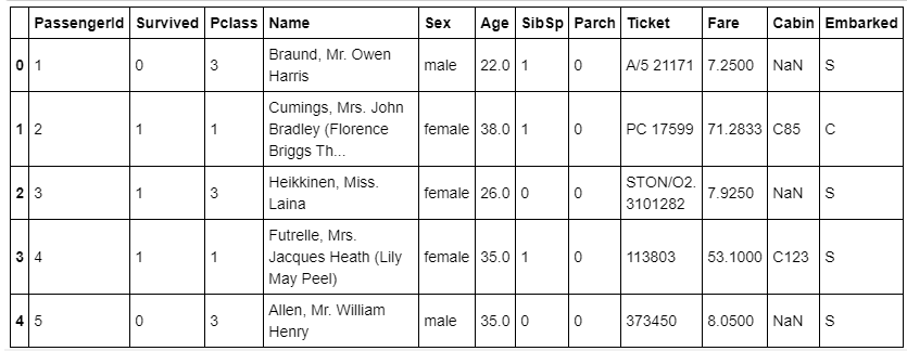
df.tail()
# This prints you out the last five rows of the table
I recommend starting with a look at the data so that you can be sure everything is as it should be. This is how you can avoid stupid mistakes in further analysis.
我建議先查看數據,以確保所有內容都應該是正確的。 這樣可以避免進一步分析中的愚蠢錯誤。
df.shape
#This prints you the number of rows and columns
It is a good habit to print out the shape of the data in the beginning so you can check the number of columns and rows and be sure you haven’t missed any data during the analysis.
在開始時打印出數據的形狀是個好習慣,因此您可以檢查列數和行數,并確保在分析過程中沒有遺漏任何數據。
分析數據 (Analyze the data)
Then I continued to look at the data by counting the values. This gave me a lot of information about the content of the data.
然后,我繼續通過計算值來查看數據。 這給了我很多有關數據內容的信息。
df['Pclass'].value_counts()
# Prints out count of classes values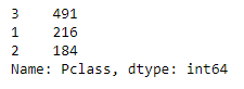
I prefer using percentages to showcase values. It is easier to understand the values in percentages.
我更喜歡使用百分比來展示價值。 更容易理解百分比值。
df['Pclass'].value_counts(normalize=True)
# same as above just that using "normalize=True" value is printed in percentages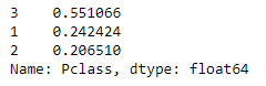
I counted values for each column separately. In the future, I challenge myself to do the function which prints out values but it was not my scope in this project.
我分別計算每列的值。 將來,我會挑戰自己執行輸出值的功能,但這不是我在本項目中的工作范圍。
I wanted to understand also the values of different columns so I used the describe() method for that.
我還想了解不同列的值,因此我使用了describe()方法。
df['Fare'].describe()
# describe() is used to view basic statistical details like count, mean, minimum and maximum values.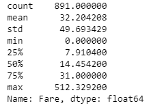
Here you can see for example that the minimum price for the ticket was 0,00 $ and the maximum price was 512,33 $.
例如,在這里您可以看到門票的最低價格為0,00 $,最高價格為512,33 $。
I did several crosstables to understand which were the determinant values for the surviving.
我做了幾個交叉表,以了解哪些是生存的決定性價值。
pd.crosstab(df['Survived'], df['Sex'])
# crosstable number of sex based on surviving.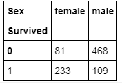
pd.crosstab(df['Survived'], df['Sex'], normalize=True)
# Using "normalize=True", you get values in percentage.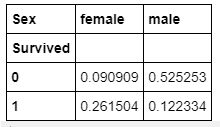
Doing crosstables with different values gives you information about the possible correlations between the variables, for example, sex and surviving. As you can see, 26% of women survived and most of the men, 52%, didn’t survive.
使用不同的值進行交叉表可為您提供有關變量之間可能的相關性的信息,例如性別和存活率。 如您所見,有26%的女性幸存下來,而大多數男性(52%)沒有幸存。
可視化數據 (Visualize the data)
It is nice to have numerical values in tables but it is easier to understand the visualized data, at least for me. This is why I plotted histograms and bar charts. By creating histograms and bar charts I learned how to visualize the data. Here are a few examples:
在表格中有數值很高興,但至少對于我來說,更容易理解可視化數據。 這就是為什么我繪制直方圖和條形圖的原因。 通過創建直方圖和條形圖,我學習了如何可視化數據。 這里有一些例子:
df.hist(column='Age')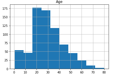
I used seaborn library for the bar charts.
我使用seaborn庫制作條形圖。
sns.countplot(x='Sex', hue='Survived', data=df);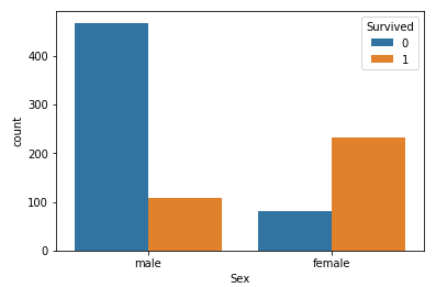
Also, I used a heatmap to see the correlation between different columns.
另外,我使用熱圖來查看不同列之間的相關性。
corrmat = df.corr()
f, ax = plt.subplots(figsize=(12, 9))
sns.heatmap(corrmat, vmax=.8, annot=True, square=True, annot_kws={'size': 15});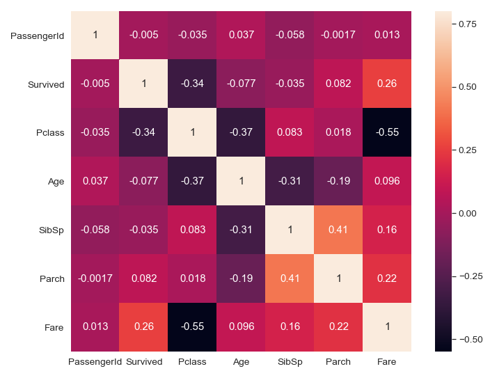
Heatmap shows that there is a strong negative correlation between Fares and Classes, so that when one increases other decreases. It is logical because ticket prices in the 1st class are higher than in the 3rd class.
熱圖顯示,票價和艙位之間有很強的負相關性,因此當票價增加時,其他票價會下降。 這是合乎邏輯的,因為第一類的機票價格高于第三類的機票價格。
If we focus on analyzing the correlations between surviving and other values, we see that there is a strong positive correlation between surviving and fare. The probability to survive is higher when the ticket price has been higher.
如果我們專注于分析幸存值與其他值之間的相關性,我們會發現幸存率和票價之間存在很強的正相關性。 當門票價格較高時,生存的可能性較高。
You can find the project in Github. please feel free to try it yourself and comment if there is something that needs clarifying!
您可以在Github中找到該項目。 請隨時嘗試一下,如果有需要澄清的地方,請發表評論!
Thank you for the highly trained monkey (Risto Hinno) for motivating and inspiring me!
感謝您訓練有素的猴子( Risto Hinno )激勵和啟發我!
翻譯自: https://medium.com/swlh/part-1-titanic-basic-of-data-analysis-ab3025d29f6e
泰坦尼克號 數據分析
本文來自互聯網用戶投稿,該文觀點僅代表作者本人,不代表本站立場。本站僅提供信息存儲空間服務,不擁有所有權,不承擔相關法律責任。 如若轉載,請注明出處:http://www.pswp.cn/news/388150.shtml 繁體地址,請注明出處:http://hk.pswp.cn/news/388150.shtml 英文地址,請注明出處:http://en.pswp.cn/news/388150.shtml
如若內容造成侵權/違法違規/事實不符,請聯系多彩編程網進行投訴反饋email:809451989@qq.com,一經查實,立即刪除!相關文章

Imperva開源域目錄控制器,簡化活動目錄集成
)
2018.10.24 NOIP模擬 小 C 的序列(鏈表+數論)

vba數組dim_NDArray — —一個基于Java的N-Dim數組工具包

Nodejs教程08:同時處理GET/POST請求

關于position的四個標簽

python算法和數據結構_Python中的數據結構和算法

CSS:元素塌陷問題

Celery介紹及常見錯誤

python dash_Dash是Databricks Spark后端的理想基于Python的前端

js里的數據類型轉換

Eclipse 插件開發遇到問題心得總結

/src/applicationContext.xml

在Python中查找子字符串索引的5種方法
![[LeetCode] 3. Longest Substring Without Repeating Characters 題解](http://pic.xiahunao.cn/[LeetCode] 3. Longest Substring Without Repeating Characters 題解)
[LeetCode] 3. Longest Substring Without Repeating Characters 題解

WPF中MVVM模式的 Event 處理

Eclipse 插件開發 向導

線性回歸 假設_線性回歸的假設

ES6模塊與commonJS模塊的差異

