數據可視化 信息可視化
Ggplot is R’s premier data visualization package. Its popularity can likely be attributed to its ease of use — with just a few lines of code you are able to produce great visualizations. This is especially great for beginners who are just beginning their journey into R, as it’s very encouraging that you can create something visual with just two lines of code:
G gplot是R的首要數據可視化軟件包。 它的受歡迎程度可能歸因于它的易用性-只需幾行代碼,您就可以產生出色的可視化效果。 對于剛開始使用R的初學者來說,這尤其有用,因為您可以僅用兩行代碼就可以創建視覺效果,這非常令人鼓舞:
ggplot(data = iris, aes(x = Sepal.Length, y = Sepal.Width)) +
  geom_point()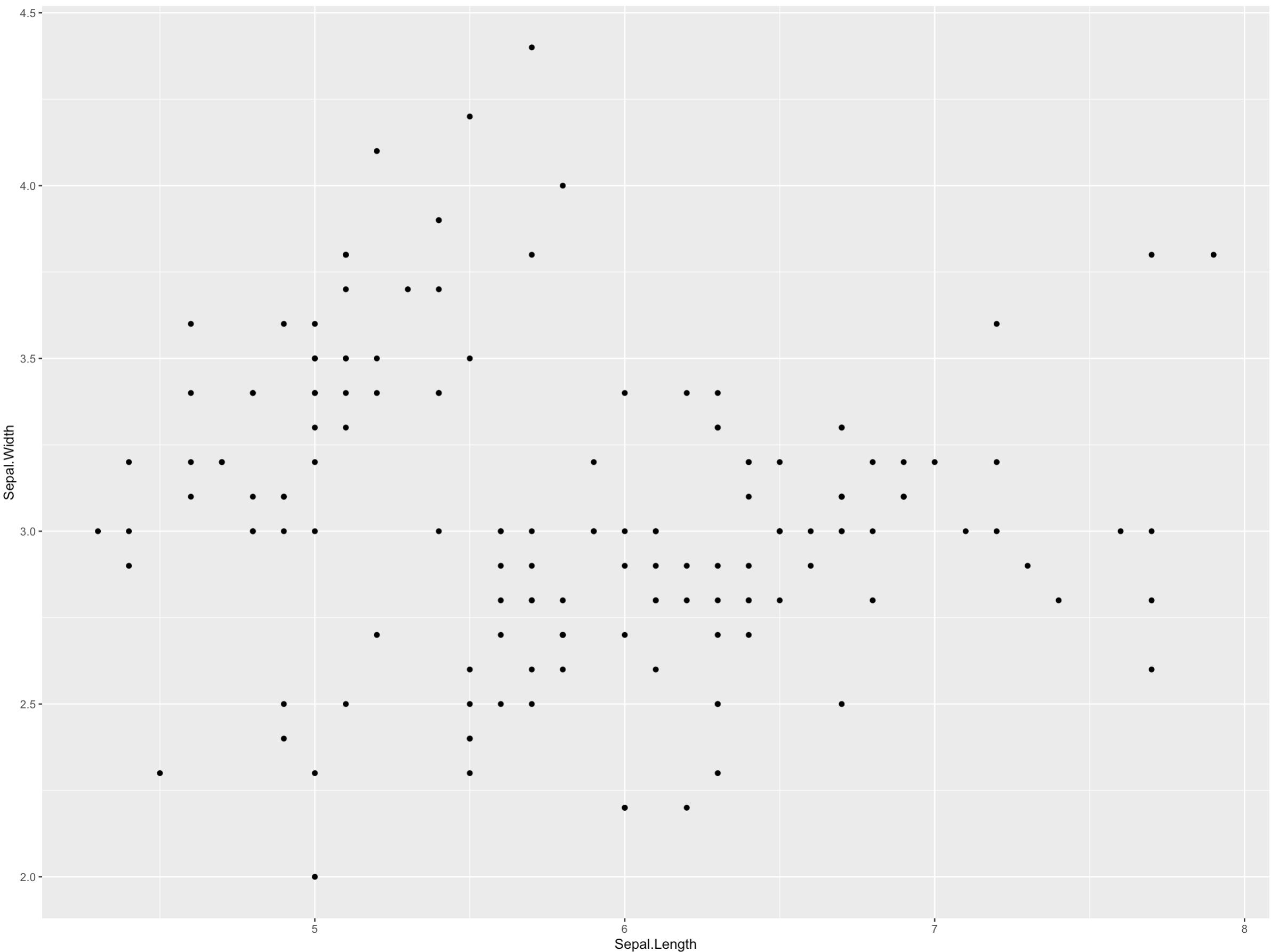
In this article, I want to highlight ggplot’s flexibility and customizability. Alternatives such as Matplotlib and Seaborn (both Python) and Excel are also easy to use, but they are less customizable. In this article, I’ll walk through 8 concrete steps you can do to improve your ggplot.
在本文中,我想強調ggplot的靈活性和可定制性。 Matplotlib和Seaborn(都為Python)和Excel等替代方案也易于使用,但可定制性較低。 在本文中,我將逐步完成改善ggplot的8個具體步驟。
In order to make sure that the advice in this article is practical, I’m going to abide by two themes:
為了確保本文中的建議切實可行,我將遵循兩個主題:
Assume that the reader has some familiarity with ggplot: If you understood the chunk of code above you should be good. If you’re not familiar with ggplot, I’ll try to make the tips as language-agnostic as possible, so if you use base R, Python, or other visualization tools these tips may still be helpful.
假設讀者對ggplot有一定的了解:如果您理解上面的代碼塊,那就應該不錯。 如果您不熟悉ggplot,我將盡量使這些技巧與語言無關,因此,如果您使用基本R,Python或其他可視化工具,則這些技巧可能仍然有用。
Easy to follow along: If you want to run the example code yourself, all you need is R and tidyverse. No external datasets necessary as we will be using the
diamondsdataset, which is included with ggplot.易于遵循:如果您想自己運行示例代碼,則只需要R和tidyverse。 沒有必要的外部數據集,我們將使用
diamonds的數據集,其中包括與ggplot。
1.主題是您最好的朋友 (1. Themes are your best friend)
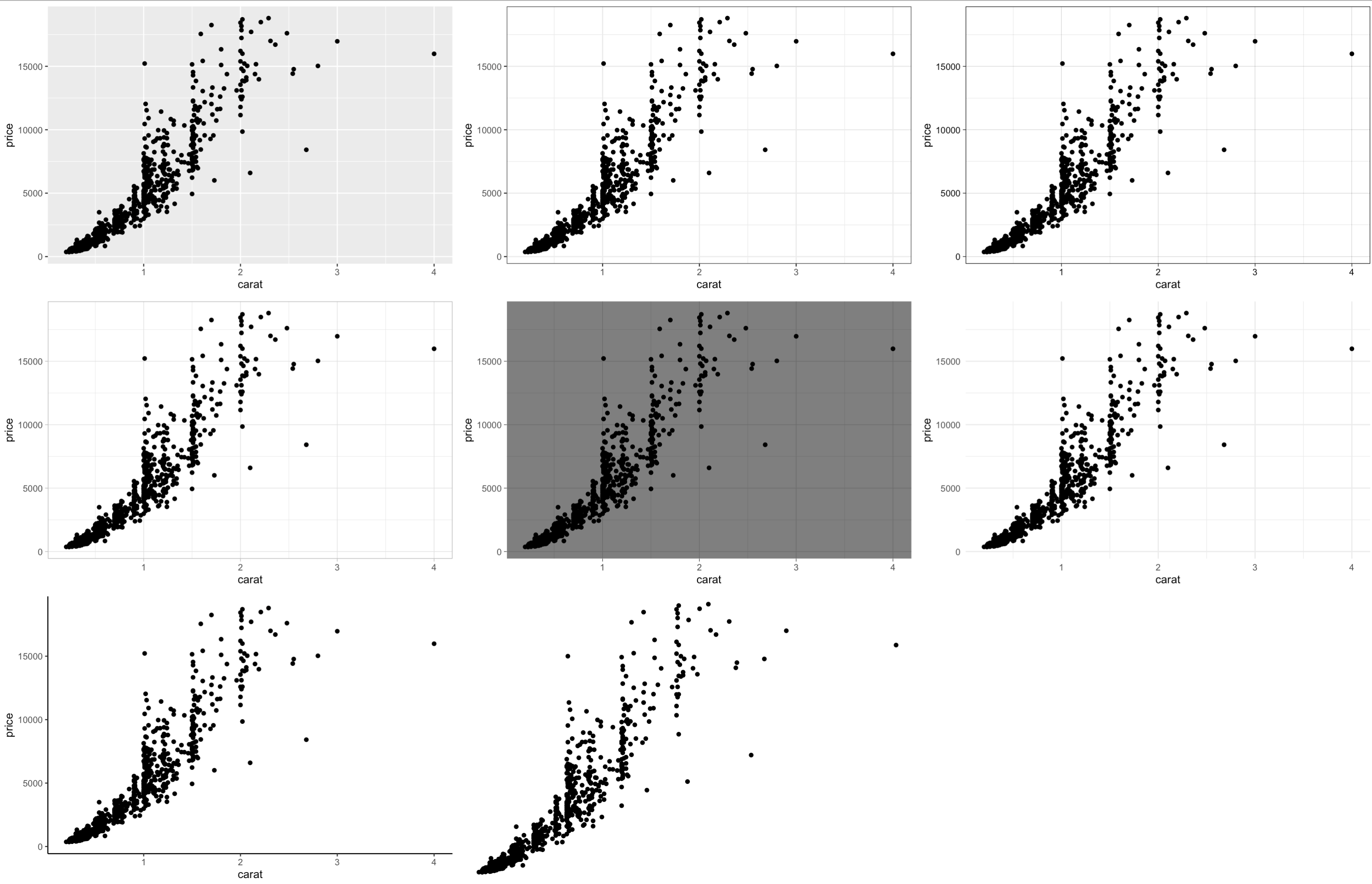
Themes control all non-data display and are an easy way to change the appearance of your graph. It only takes one extra line of code in order to do this, and ggplot already comes with 8 separate themes.
主題控制所有非數據顯示,并且是更改圖形外觀的簡便方法。 這樣做只需要多一行代碼 ,ggplot已經帶有8個獨立的主題。
ggplot(data = diamonds, aes(x = Sepal.Width, y = Sepal.Length)) +
  geom_point() +   theme_bw()
The ggplot themes are simple. They won’t really stand out, but they look great, are easy to read, and get the point across. Also, if you want to use the same theme over and over, you can set a global theme with one line of code and it will apply to all ggplots.
ggplot主題很簡單。 它們并不會真正脫穎而出,但是它們看起來很棒,易于閱讀,而且很清楚。 另外,如果您想一遍又一遍地使用同一主題,則可以用一行代碼設置一個全局主題,它將應用于所有ggplots。
# Set global themetheme_set(theme_bw())For full details on the 8 themes you can visit this link.
有關這8個主題的完整詳細信息,您可以訪問 此鏈接 。
Themes are also super customizable. Beyond the 8 themes that come with ggplot, you can also make your own theme but more importantly use themes that others have created already. In the few companies I’ve worked at, we’ve all had internal ggplot themes. For example, I helped create theme_fb() at Facebook which with input from designers at the company.
主題也是超級可定制的。 除了ggplot隨附的8個主題外,您還可以創建自己的主題,但更重要的是使用其他人已經創建的主題。 在我工作過的幾家公司中,我們都有內部ggplot主題。 例如,我在Facebook上幫助創建了theme_fb() ,并得到了公司設計師的幫助。
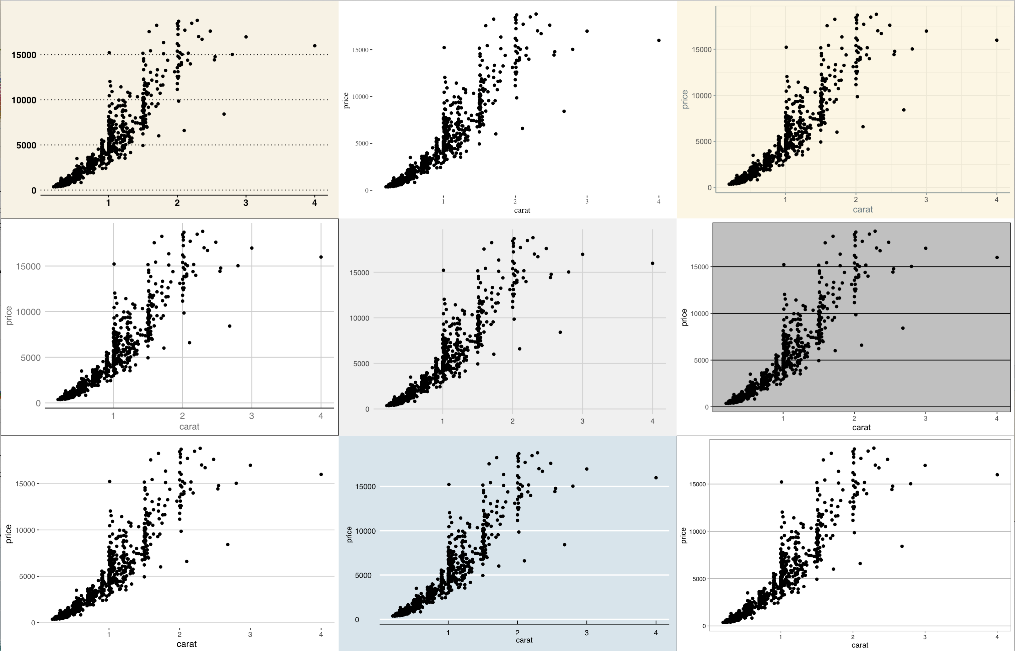
If you wanted to use some other themes outside of ggplot, the most popular package is ggthemes which has some interesting options such as theme_fivethirtyeight(), theme_wsj(), and theme_economist(). A sample of these themes are below, but I definitely recommend checking out this link to learn more.
如果要在ggplot之外使用其他主題,最受歡迎的軟件包是ggthemes,它具有一些有趣的選項,例如theme_fivethirtyeight(), theme_wsj(), and theme_economist() 。 以下是這些主題的樣本,但我絕對建議您查看此鏈接 了解更多。
2.方面是超級大國 (2. Facets are a superpower)
When visualizing data, one thing you always want to think about is how many dimensions of data you want to display. A majority of graphs will typically only need 1–2 dimensions of data to get a point across, for example:
可視化數據時,您始終要考慮的一件事就是要顯示多少個維度。 大多數圖形通常只需要1-2維的數據即可得出一個點,例如:
- Height x weight of basketball players on a scatter plot 散點圖中身高x籃球運動員的體重
- Heights of players on the Los Angeles Lakers on a bar graph 條形圖上洛杉磯湖人隊的球員身高
As you increase the number of dimensions, a single graph is going to get more cluttered, which makes it harder to get a point across. For example:
隨著維數的增加,單個圖形將變得更加混亂,這將使跨點分布變得更加困難。 例如:
Height x weight of basketball players on a scatter plot, but different color dots for each of the 30 teams. This will be hard to read because you’ll need 30 separate colors to represent the different teams, and a legend to list out all of the team names.
散點圖中籃球運動員的身高x體重, 但30支球隊中的每支球隊都有不同的色點 。 這將很難理解,因為您將需要30種不同的顏色來代表不同的團隊,并使用圖例列出所有團隊名稱。
This is where the magic of faceting shines. What if we don’t have to limit ourselves to one graph? My hypothesis for why a lot of us think this way is because we are used to visualizing data in Excel, where we are constrained to a single graph. In ggplot, we can break this mode of thinking, and all it takes is a single line of code to do so. Facets allow us to easily add up to two additional dimensions our visualizations.
這是刻面魔術的光芒。 如果我們不必將自己限制在一張圖中怎么辦? 我的假設是,為什么我們很多人會這樣認為,是因為我們習慣于在Excel中可視化數據,而我們只能將其約束為單個圖形。 在ggplot中,我們可以打破這種思維方式,只需要一行代碼即可做到。 構面使我們可以輕松地將可視化效果添加到另外兩個維度。
Let’s explore how we can use facets to visualize diamonds data.
讓我們探討如何使用刻面來可視化鉆石數據。
At a basic level, we can view the relationship between the carat of a diamond and its price, which is the main purpose of this dataset:
在基本層面上,我們可以查看鉆石的克拉與其價格之間的關系,這是此數據集的主要目的:
ex2 <-
  diamonds %>%
  sample_n(5000) %>%
  ggplot(aes(x = carat, y = price)) +
  geom_point()ex2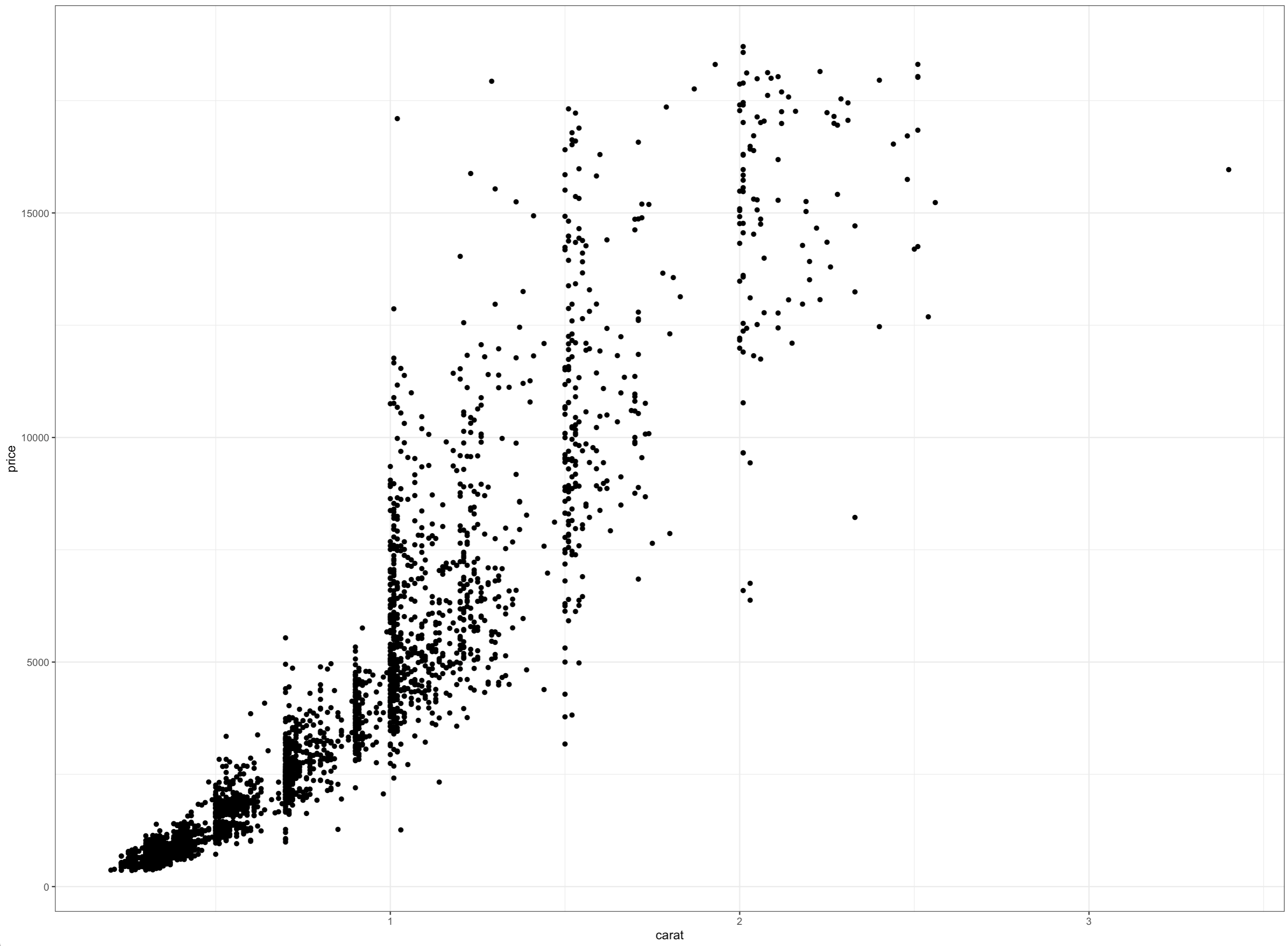
This graph only shows two dimensions of data, but there are a few others are also important. The cut, color, and clarity of the diamond — all of these could are related to the price of the diamond. One way to bring these dimensions in is to have the dots be different colors or use different dot shapes, but let’s give faceting a try instead.
該圖僅顯示了數據的兩個維度,但其他一些維度也很重要。 鉆石的切割,顏色和凈度-所有這些都可能與鉆石的價格有關。 引入這些尺寸的一種方法是使點具有不同的顏色或使用不同的點形狀,但讓我們嘗試一下。
Use facet_wrap() if you only want to break out the graph by a single dimension:
如果只想按一個維分解圖,則使用facet_wrap() :
ex2 +
  facet_wrap(~cut)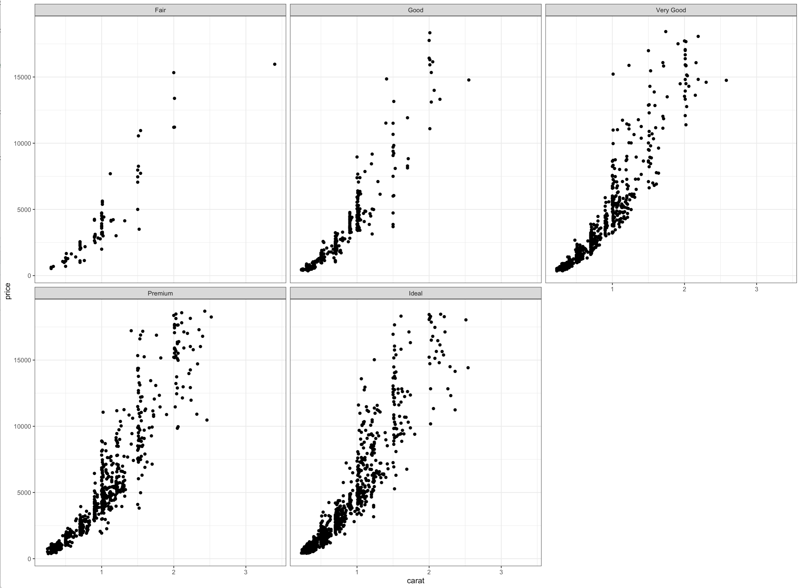
Use facet_grid() if you want to break out the graph by two dimensions:
如果要按 二維分解圖,請使用facet_grid() :
ex2 +
  facet_grid(color~cut)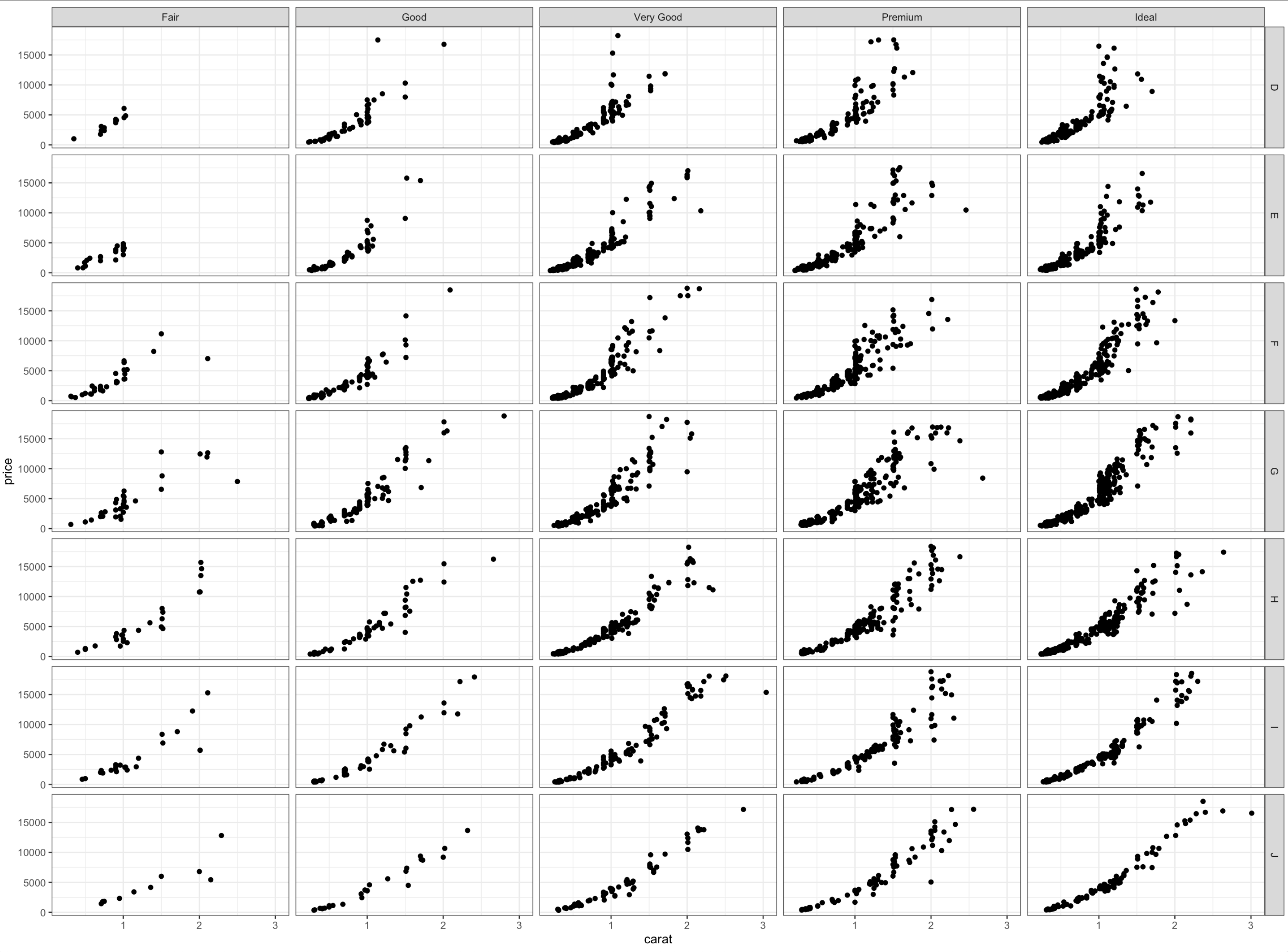
These are just two examples of how you can use facet_wrap() and facet_grid() , but the key takeaway from this section is that with ggplot, you are not constrained to thinking about visualizations in a single graph.
這些只是如何使用facet_wrap()和facet_grid()兩個示例,但是本節的重點是,對于ggplot, 您不必考慮在單個圖形中考慮可視化。
3.顏色! (3. Colors!)
Colors serve two key purposes in data visualization:
顏色在數據可視化中有兩個主要目的:
- Makes a visualization more appealing 使可視化更具吸引力
- Represents an additional dimension of data 代表數據的附加維度
There are many ways to color your ggplots, but for simplicity this section focuses on Viridis palettes, which are my personal favorite as they are:
有多種方法可以為ggplots著色,但為簡單起見,本節重點介紹Viridis調色板 ,因為它們是我個人最喜歡的調色板 :
Colorful: spanning as wide a palette as possible so as to make differences easy to see
色彩豐富:盡可能廣泛地顯示調色板,以使差異易于看到
Perceptually uniform: meaning that values close to each other have similar-appearing colors and values far away from each other have more different-appearing colors, consistently across the range of values
感知上一致:表示彼此接近的值具有相似的外觀顏色,而彼此遠離的值具有更多不同的外觀顏色,并且在值的范圍內保持一致
Robust to colorblindness: so that the above properties hold true for people with common forms of colorblindness, as well as in grey scale printing
色盲的魯棒性:因此上述屬性對于具有常見色盲形式的人以及在灰度打印中適用
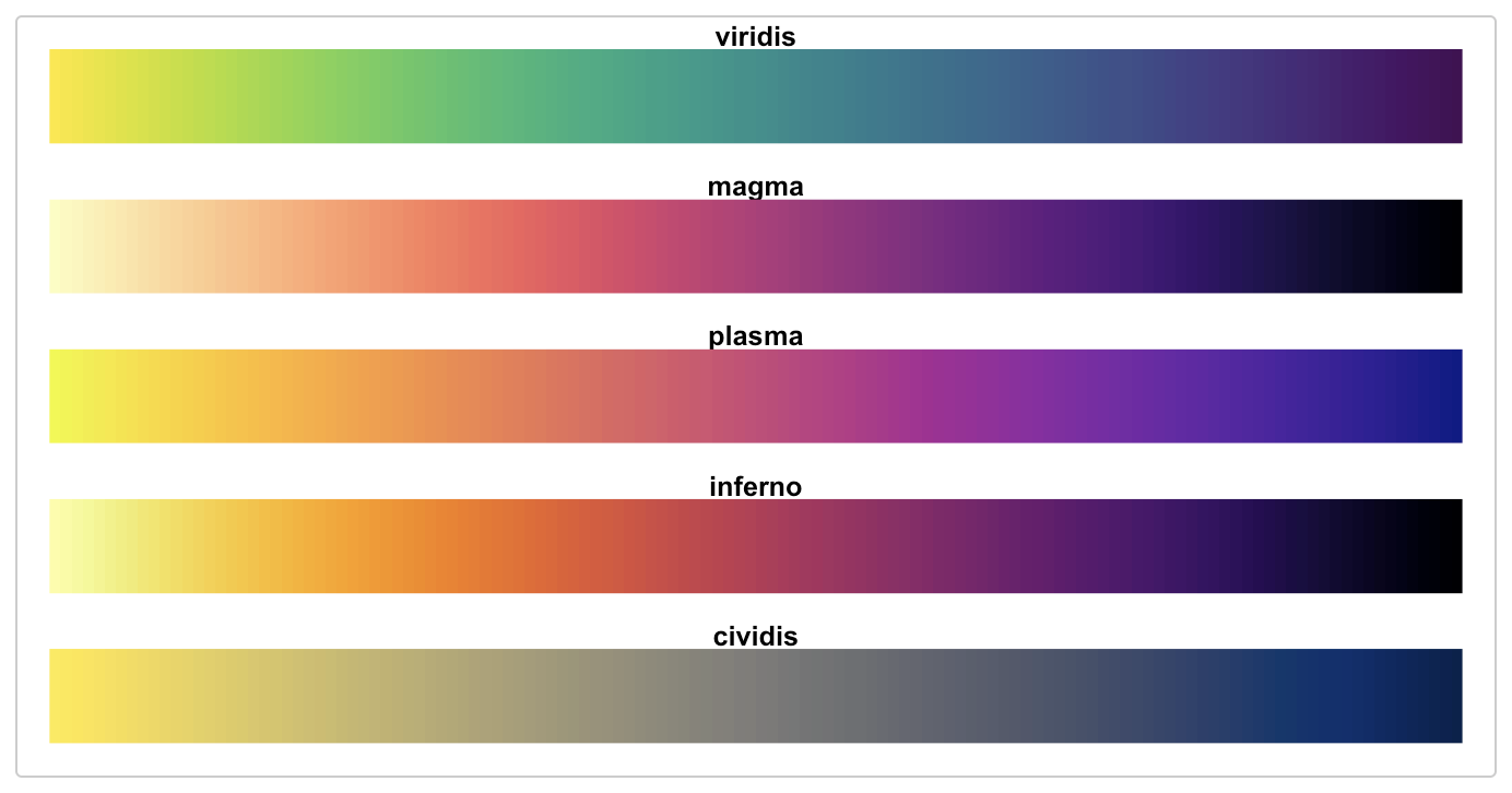
You can read more theory behind the colors above here, but this section focuses on 4 key functions which allows you to use these colors:
你可以的理論上面的顏色背后這里 ,但是這部分的重點,它允許您使用這些顏色4個關鍵功能:
scale_color_viridis_d()&scale_fill_viridis_d(): Add this statement to your ggplot in order to color / fill your graph on a discrete/categorical variable. (Notice the “d” at the end of the function)scale_color_viridis_d()和scale_fill_viridis_d():將此語句添加到ggplot中,以便為離散/類別變量上的圖形著色/填充。 (請注意函數末尾的“ d”)scale_color_viridis_c()&scale_fill_viridis_c(): Add this statement to your ggplot in order to color / fill your graph on a continuous variable. (Notice the “c” at the end of the function)scale_color_viridis_c()和scale_fill_viridis_c():將此語句添加到ggplot中,以便在連續變量上為圖形著色/填充。 (請注意函數末尾的“ c”)
# Discrete
ggplot(data = diamonds %>% sample_n(1e3),
         aes(x = carat, y = price,
             color = cut)) +
  geom_point() +  scale_color_viridis_d()
# Continuous
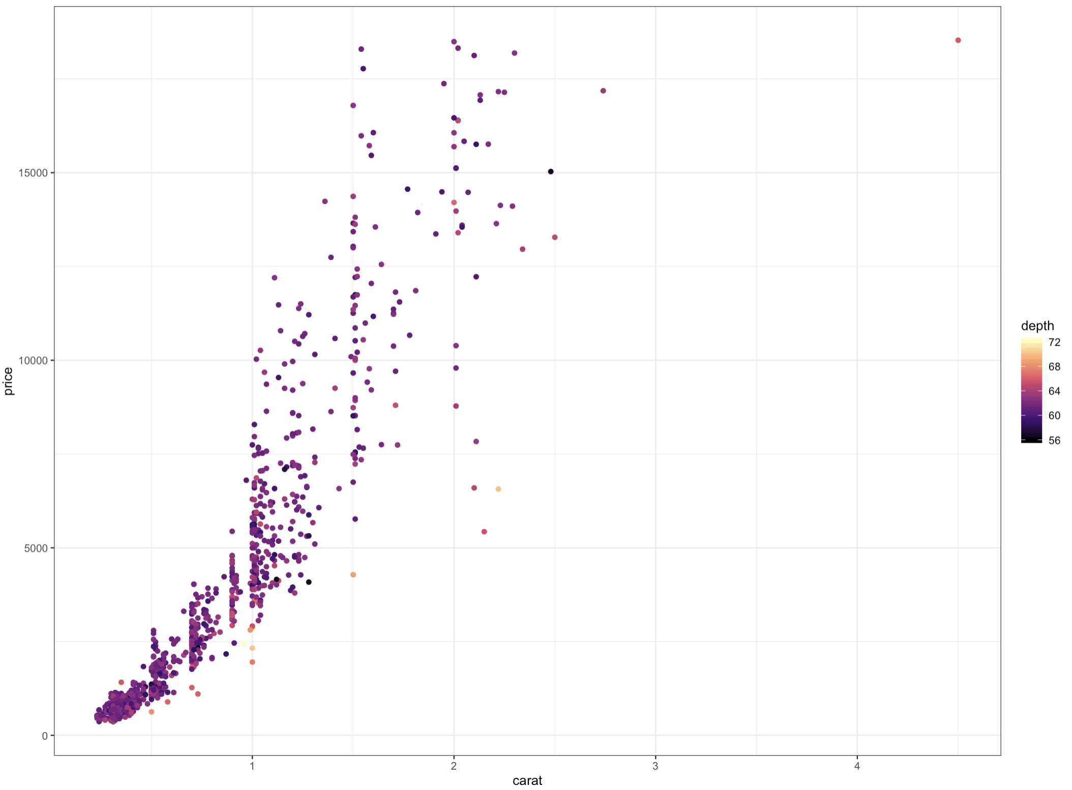
ggplot(data = diamonds %>% sample_n(1e3),
aes(x = carat, y = price,
color = depth)) +
geom_point() + scale_color_viridis_c(option = 'A')Protip: Here, I’m using the option parameter to change the color palette within viridis. You can switch between options A-E which reflect the different color schemes in above.
Protip:在這里,我正在使用option參數來更改viridis中的調色板。 您可以在反映上述不同配色方案的選項AE之間進行切換。
4.顏色與填充:了解差異 (4. Color vs. fill: Know the difference)
I introduced this in the last section, but I wanted to address it more explicitly because it can be confusing when you first use ggplot. To color a ggplot, you’ll either use color or fill , and this depends on the graph type.
我在上一節中對此進行了介紹,但是我想更明確地解決它,因為當您第一次使用ggplot時可能會造成混淆。 要為ggplot著色,您可以使用color或fill ,這取決于圖形類型。
So what's the difference? Generally, fill defines the color with which a geom is filled (i.e. geom_bar()), whereas color defines the color with which a geom is outlined (i.e. geom_point()).
那有什么區別呢? 通常, fill定義填充 geom_bar()的顏色(即geom_bar() ),而color定義geom_point() 輪廓顏色(即geom_point() )。
ggplot(data = diamonds, aes(x = price)) +
  geom_histogram(color = 'blue',
                 fill = 'red')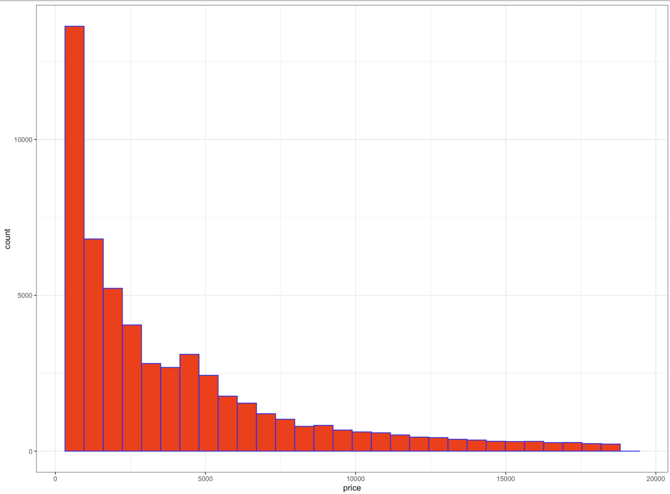
So the takeaway here is that if you try to color a graph and it appears that nothing has changed, simply switch color to fill or vice versa.
因此,這里的要點是,如果您嘗試給圖形著色,但似乎沒有任何變化,只需將color切換為fill ,反之亦然。
Read more on StackOverflow
關于StackOverflow
5.在上面貼上標簽 (5. Put a label on it)
Good visualizations have concise and descriptive labels. They help readers understand what they are seeing, and this especially important if you expect your visualization to be shared. Luckily it’s super easy to label in ggplot.
良好的可視化效果應具有簡潔和描述性的標簽。 它們可以幫助讀者理解他們所看到的內容,如果您希望共享可視化內容,這尤其重要。 幸運的是,在ggplot中標記非常容易。
Below are ggplot’s most useful labelling functionalities, listed in how often they should probably be used. You can pick and choose which labels you want to use — for example, if you only want to add a title, you only need to enter the title parameter in labs() .
以下是ggplot最有用的標記功能,列出了它們應該使用的頻率。 您可以選擇要使用的標簽,例如,如果只想添加標題,則只需在labs()輸入title參數。
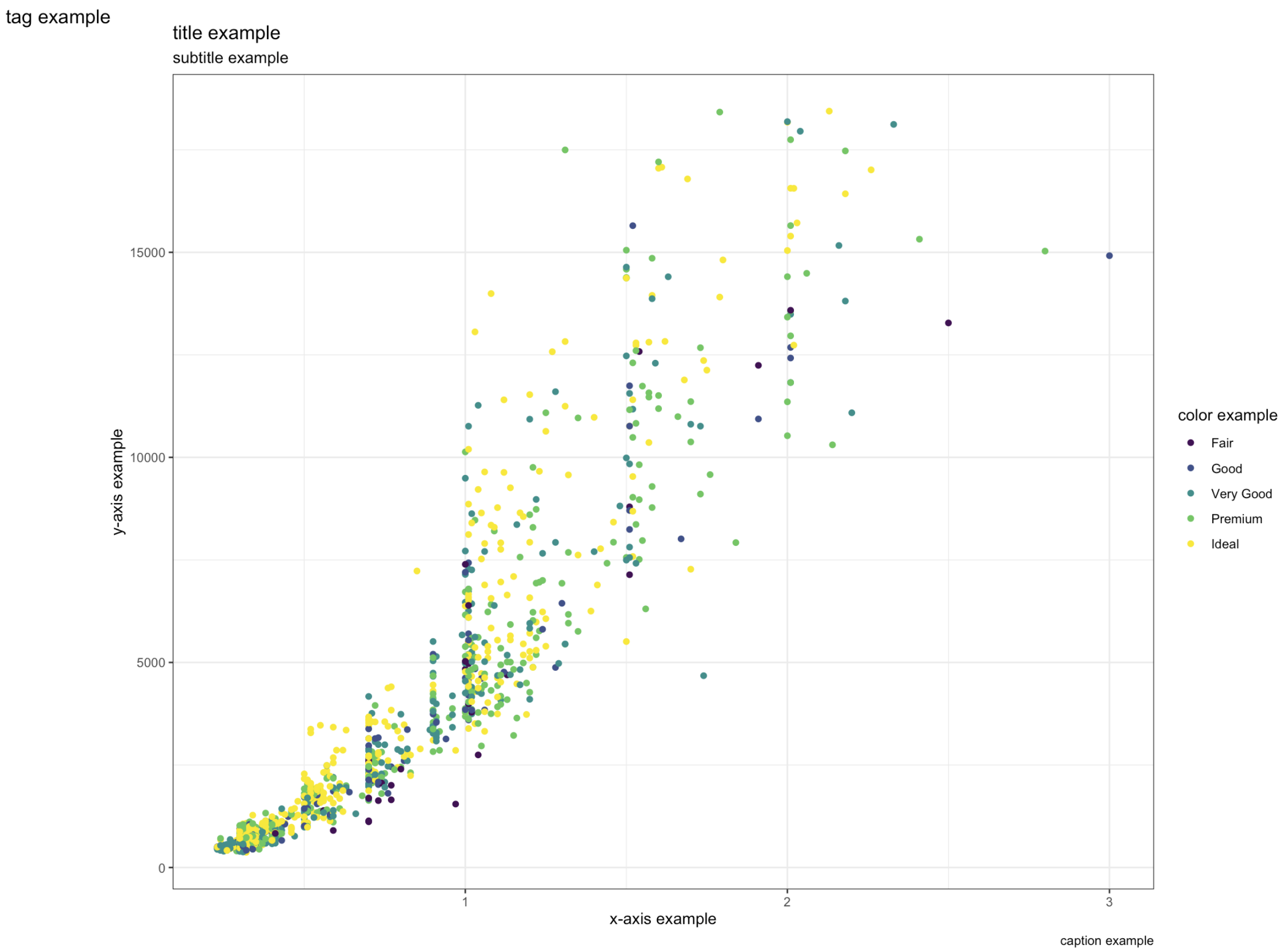
ggplot(data = diamonds %>% sample_n(1e3),
       aes(x = carat, y = price, color = cut)) +
  geom_point() +  labs(title = 'title example',
       x = 'x-axis example',
       y = 'y-axis example',
       color = 'color example',
       subtitle = 'subtitle example',
       caption = 'caption example',
       tag = 'tag example')
Note: The color field is only accessible if you have a color as an aesthetic in your ggplot. This labelling method will also work whether you use fill, color, size, alpha, etc.
注意: 僅當您在ggplot中具有某種美感的顏色時,才可以訪問色域。 無論您使用填充,顏色,大小,alpha等,此標記方法也將起作用。
6.線注釋 (6. Line annotations)
On the theme of telling a story with your visualization, line annotations are a very useful tool. Some examples that I’ve personally used include:
以可視化講故事為主題,行注釋是一個非常有用的工具。 我個人使用的一些示例包括:
- Marking a before/after period on a line graph 在折線圖上標記之前/之后的期間
- Plotting the mean of an x or y value on a scatter plot 在散點圖上繪制x或y值的平均值
- Annotating a goal metric that we want to hit 注釋我們要達到的目標指標
Whatever the use case, having a line annotation helps communicate an important point to those who will be viewing your visualization. To add a line to your ggplot, you’ll use either:
無論用例如何,都有行注釋都可以幫助將重要點傳達給將要查看您的可視化內容的人員。 要將行添加到ggplot中,請使用以下任一方法:
geom_hline(): Adds a horizontal line (has a y intercept)
geom_hline():添加一條水平線(具有ay截距)
geom_vline(): Adds a vertical line (has an x intercept)
geom_vline():添加垂直線(具有x截距)
The example below will show both of these in action:
下面的示例將展示這兩種功能:
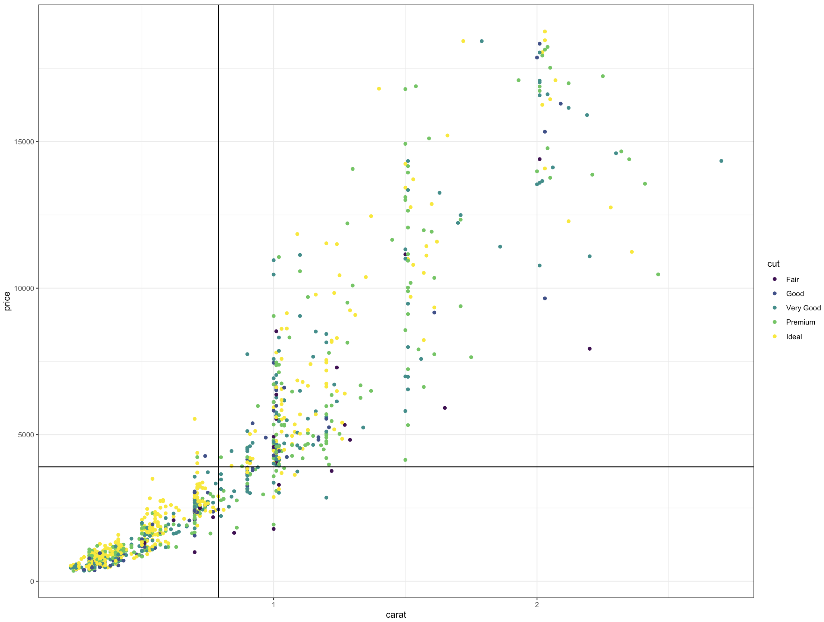
ggplot(data = diamonds %>% sample_n(1e3),
       aes(x = carat, y = price, color = cut)) +
  geom_point() +  geom_hline(data = . %>% summarise(y = mean(price)),
             aes(yintercept = y)) +
  geom_vline(data = . %>% summarise(x = mean(carat)),
             aes(xintercept = x))
Note that the above code may look a little more complicated than some of the other ggplot code in this article. I’ll try to explain what’s going on there. In order to get the average carat and price, a more straightforward way to get these values is to calculate them before your ggplot code. However, because I am lazy and like reducing the number of variables that I have, I instead pipe the data (diamonds %>% sample_n(1e3)) directly into the geom_line() statements, which work just as well.
請注意,上面的代碼可能看起來比本文中的其他其他ggplot代碼更復雜。 我將盡力解釋那里發生了什么。 為了獲得平均克拉和價格,獲取這些值的一種更直接的方法是在ggplot代碼之前計算它們。 但是,因為我很懶,并且喜歡減少變量的數量,所以我將數據( diamonds %>% sample_n(1e3) )直接管道傳輸到geom_line()語句中,該語句同樣有效。
7.文字注釋 (7. Text annotations)
In addition to lines, it is always useful to have some sort of data labelling in your graphs. However, it’s only going to be useful if your data labels are easy to read. For example, if you blindly apply the text geom, you’ll end up with a really ugly graph:
除了線條外,在圖形中具有某種數據標簽也總是有用的。 但是,只有您的數據標簽易于閱讀時,它才有用。 例如,如果您盲目地應用文本幾何,那么您將得到一個非常丑陋的圖形:
p <-
  ggplot(data = diamonds %>% sample_n(1e3),
       aes(x = carat, y = price, color = cut)) +
  geom_point()p +   geom_text(aes(label = price))
In this section, I’ll talk about three key tips for using geom_text() effectively.
在本節中,我將討論有效使用geom_text()三個關鍵技巧。
Filtering which labels are shown: You can get creative with this, but the goal of doing this is to only show relevant data labels. In the case below, I only want to show the prices of high-carat diamonds:
過濾顯示的標簽:您可以以此為創意,但是這樣做的目的是僅顯示相關的數據標簽。 在以下情況下,我只想顯示高克拉鉆石的價格:
p +   geom_text(data = . %>% filter(carat >= 2.25),
            aes(label = price))
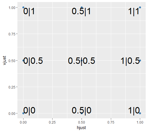
2. hjust + vjust
2.調整+調整
In the above graph, you’ll see that the text completely overlaps the point, which looks ugly. You can easily fix this by aligning your text within geom_text(). The way that I think of this is similar to left and right align in Microsoft Word.
在上圖中,您將看到文本與該點完全重疊,這看起來很難看。 您可以通過在geom_text()中對齊文本來輕松解決此問題。 我想到的方式類似于Microsoft Word中的左對齊和右對齊。
Generally, you’ll have vjust and hjust range from [0,1] but it also takes on negative values and values greater than one (it will just move your label further in the specified direction). The graph below shows how text will be aligned based on your hjust and vjust values:
通常,您可以在[0,1]范圍內調整范圍,但也可以采用負值和大于1的值(它將沿指定方向進一步移動標簽)。 下圖顯示了如何根據您的hjust和vjust值對齊文本:
p +
  geom_text(data = . %>% filter(carat >= 2.25),
            aes(label = price),
            hjust = 0,
            vjust = 0)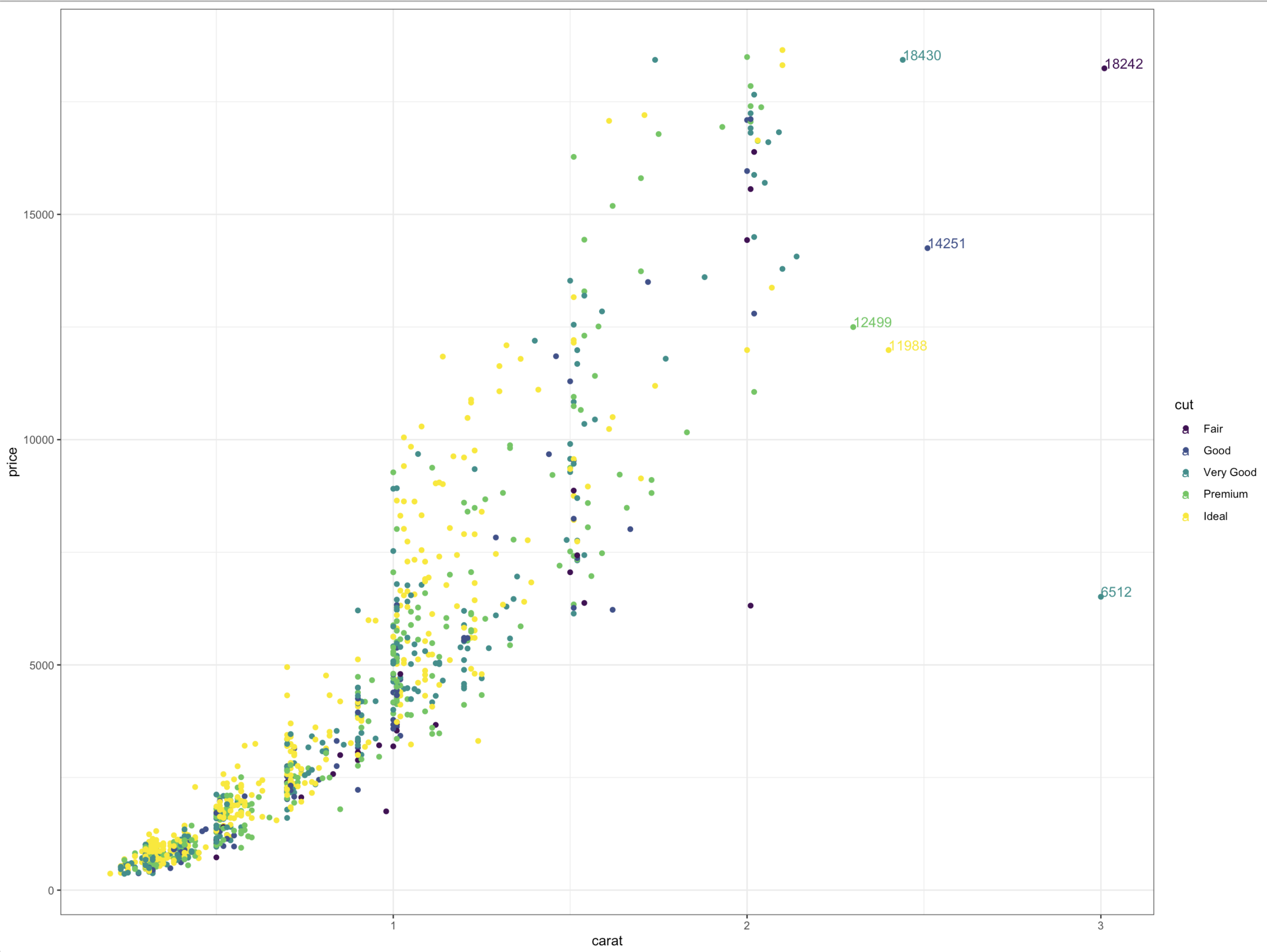
3. color
3.顏色
This is more of a preference, but know that you can change the color of your text. You generally want to have your text contrast as much with the background as possible, as this makes it the most legible. This is important if you have some lighter colors (i.e. yellow) that may be hard to read:
這更多是一個首選項,但是您知道可以更改文本的顏色。 通常,您希望文本與背景的對比度盡可能大 ,因為這使文字更清晰。 如果您有一些較淺的顏色(即黃色)可能難以閱讀,則這一點很重要:
p +
  geom_text(data = . %>% filter(carat >= 2.25),
            aes(label = price),
            hjust = 0,
            vjust = 0,
            color = 'black')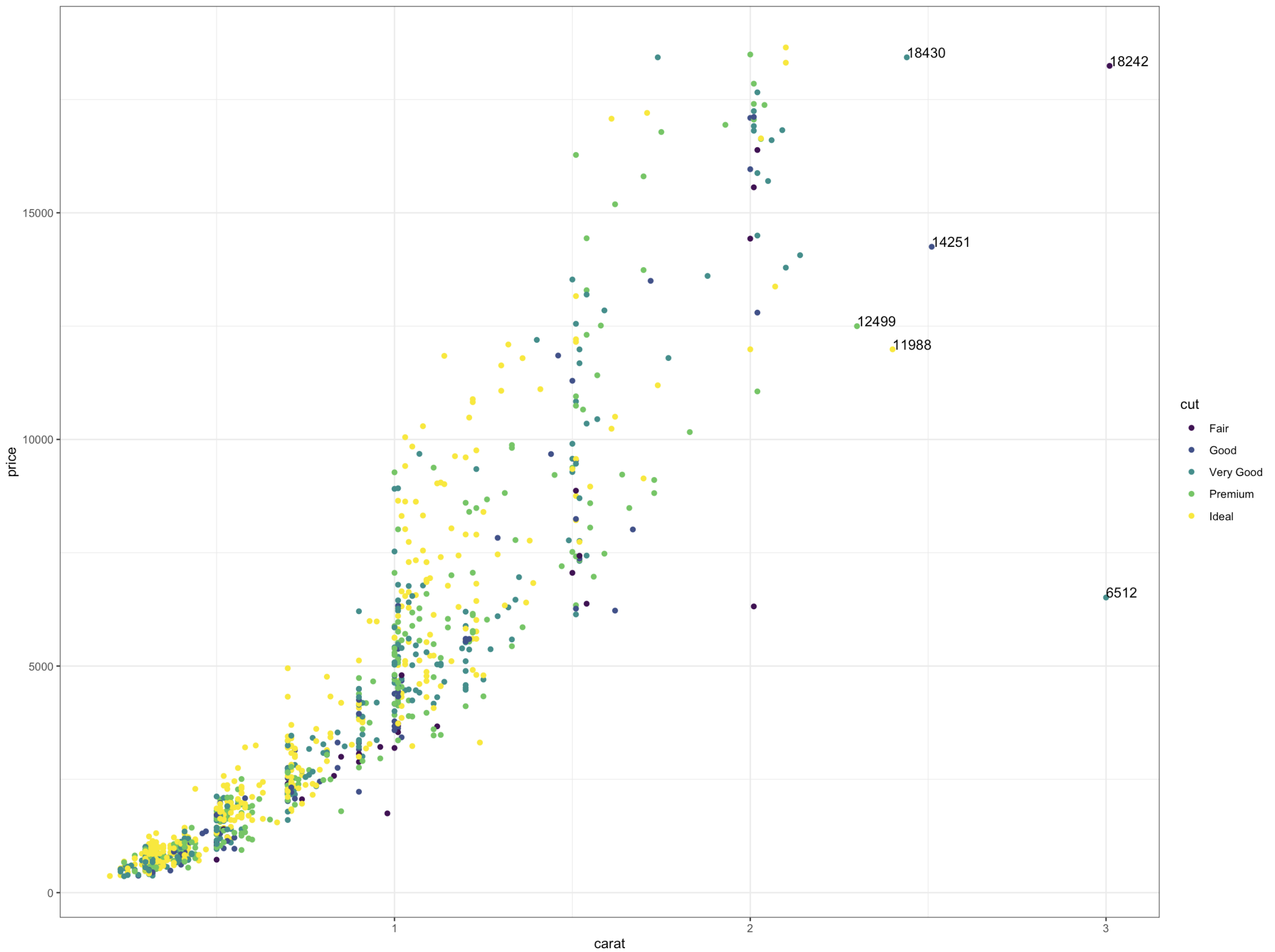
# Another example where we add contrastdiamonds %>%
  group_by(clarity) %>%
  summarise(price = mean(price)) %>%
  ggplot(aes(x = clarity, y = price)) +
  geom_bar(stat = 'identity') +
  geom_text(aes(label = round(price, 2)),
            vjust = 1.25,
            color = 'white')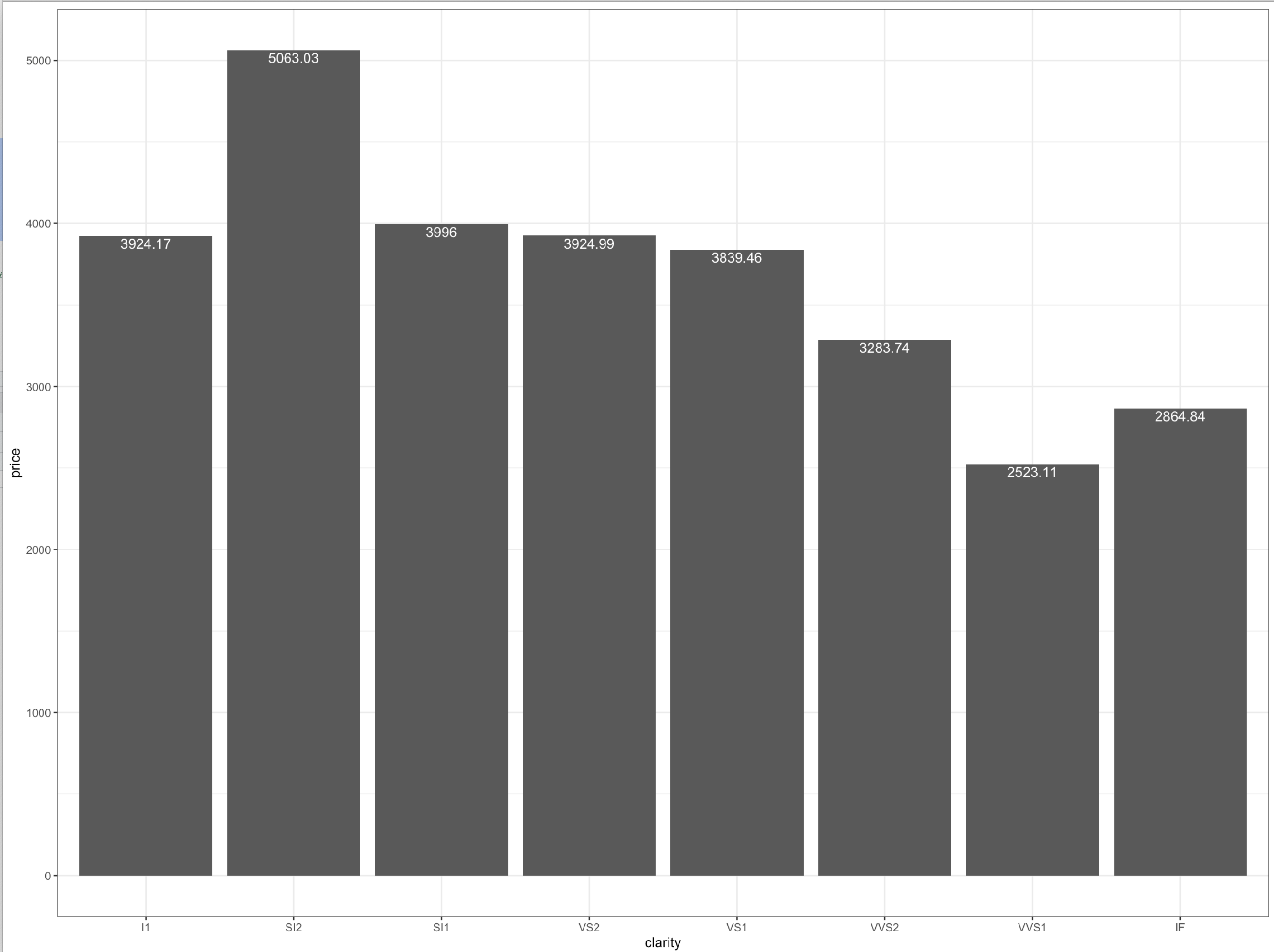
8.訂購,訂購,訂購! (8. Order, order, order!)
Lastly, ordering your graph can make it easier to read, and this is especially useful for bar graphs. All you have to do is use fct_reorder() on the x value such that it’s sorted by the y-value:
最后,對圖形進行排序可以使其更易于閱讀,這對于條形圖尤其有用。 您所要做的就是在x值上使用fct_reorder() ,使其按y值排序:
# By default, ggplot will order by the x valuediamonds %>%
  group_by(clarity) %>%
  summarise(price = mean(price)) %>%
  ggplot(aes(x = clarity, y = price)) +
  geom_bar(stat = 'identity')
# Reordered:diamonds %>%
  group_by(clarity) %>%
  summarise(price = mean(price)) %>%
  ggplot(aes(x = fct_reorder(clarity, price), y = price)) +
  geom_bar(stat = 'identity')
結論思想 (Concluding Thoughts)
I had a tough time deciding what different topics I wanted to cover in this article. I ended up focusing on topics that were initially confusing to me, and that I wish I understood more when I first started learning ggplot. Hopefully, this article gives you some concrete ideas on how to improve your visualizations or demystifies some of the more confusing/hidden aspects of ggplot.
我很難決定本文要涵蓋的主題。 我最終將精力集中在最初讓我感到困惑的主題上,希望我第一次開始學習ggplot時能了解更多。 希望本文為您提供一些有關如何改善可視化效果或使ggplot更加令人困惑/隱藏的方面變得神秘的具體想法。
翻譯自: https://towardsdatascience.com/8-tips-for-better-data-visualization-2f7118e8a9f4
數據可視化 信息可視化
本文來自互聯網用戶投稿,該文觀點僅代表作者本人,不代表本站立場。本站僅提供信息存儲空間服務,不擁有所有權,不承擔相關法律責任。 如若轉載,請注明出處:http://www.pswp.cn/news/388115.shtml 繁體地址,請注明出處:http://hk.pswp.cn/news/388115.shtml 英文地址,請注明出處:http://en.pswp.cn/news/388115.shtml
如若內容造成侵權/違法違規/事實不符,請聯系多彩編程網進行投訴反饋email:809451989@qq.com,一經查實,立即刪除!相關文章

分布式定時任務框架Elastic-Job的使用

Memcached和Redis

第4章 springboot熱部署 4-1 SpringBoot 使用devtools進行熱部署

border-radius 漲知識的寫法

ibm python db_使用IBM HR Analytics數據集中的示例的Python獨立性卡方檢驗

Oracle優化檢查表
)
spring分布式事務學習筆記(2)

sql 左聯接 全聯接_通過了解自我聯接將您SQL技能提升到一個新的水平

如何查看linux中文件打開情況

hadoop windows

Ocelot中文文檔入門

科學價值 社交關系 大數據_服務的價值:數據科學和用戶體驗研究美好生活

在Ubuntu下創建hadoop組和hadoop用戶

day06 hashlib模塊

vs azure web_在Azure中遷移和自動化Chrome Web爬網程序的指南。

hadoop eclipse windows


netstat 在windows下和Linux下查看網絡連接和端口占用

