寫在前面
1、基于2022級計算機大類實驗指導書
2、代碼僅提供參考,前端變化比較大,按照要求,只能做到像,不能做到一模一樣
3、圖片和文字僅為示例,需要自行替換
4、如果代碼不滿足你的要求,請尋求其他的途徑
運行環境
window11家庭版
WebStorm 2023.2.2
實驗要求、源代碼和運行結果
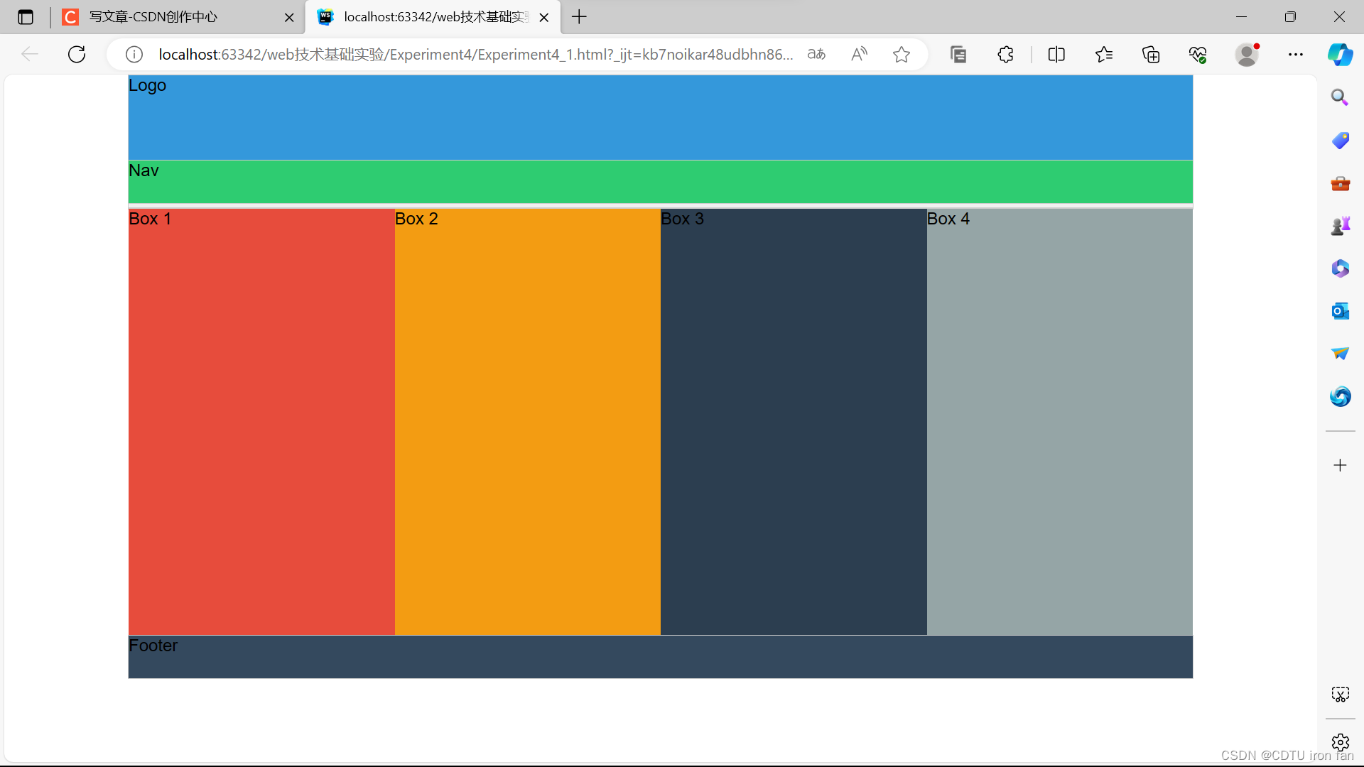
1、使用HBuilder編寫代碼,實現圖4-1所示布局效果,要求:
① 采用絕對定位、相對定位、浮動定位等方式完成頁面布局。
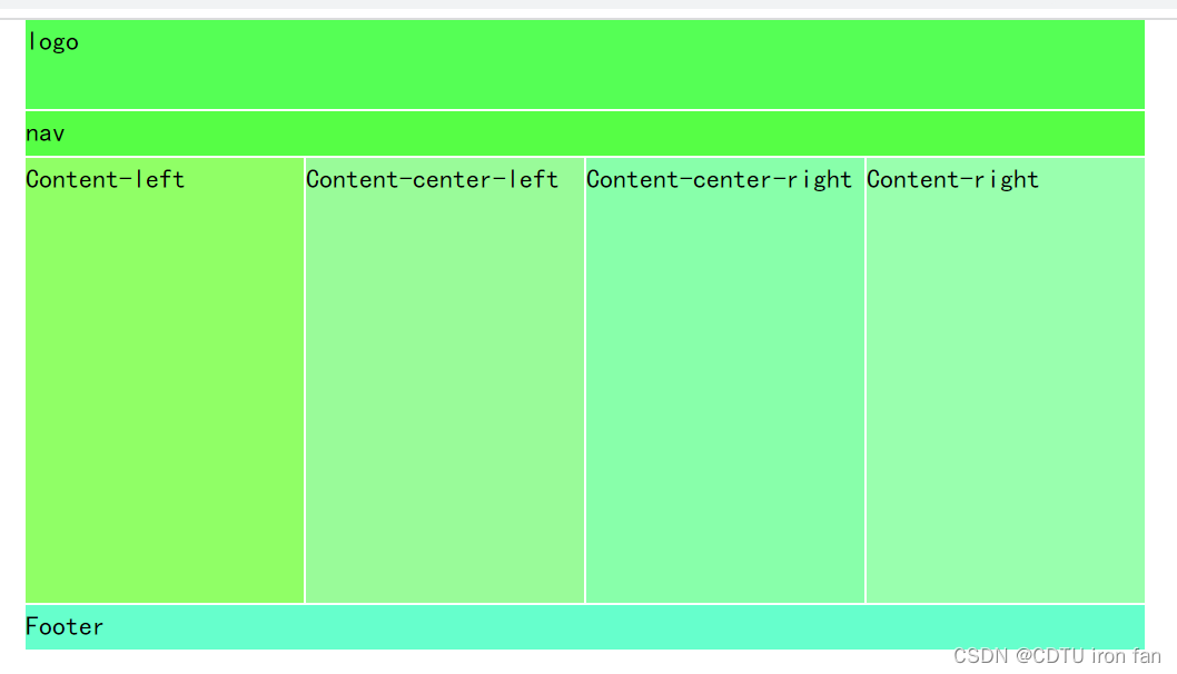
圖4-1實驗內容效果示意圖?
(1)新建html文檔、CSS文件。
(2)采用定位屬性完成圖4-1式布局效果。
(3)每個圖層顏色logo、nav等,由學生自擬。
(4)整個寬度為1000px;高度header:124px;logo:80px;nav:40px,第3個區域4個圖層的寬度為250px、高度為400px;高度footer:40px。
Experiment4_1.html
<!DOCTYPE html>
<html lang="en">
<head><meta charset="UTF-8"><link rel="stylesheet" href="Experiment4_1.css"><title></title>
</head>
<body>
<div class="wrapper"><div class="header">Header</div><div class="logo">Logo</div><div class="nav">Nav</div><div class="content"><div class="box1">Box 1</div><div class="box2">Box 2</div><div class="box3">Box 3</div><div class="box4">Box 4</div></div><div class="footer">Footer</div>
</div>
</body>
</html>
Experiment4_4.css
body {margin: 0;font-family: Arial, sans-serif;
}.wrapper {width: 1000px;margin: 0 auto;position: relative;
}.header, .logo, .nav, .content, .footer {border: 1px solid #ccc;
}.header {height: 124px;background-color: #f0f0f0;position: relative;
}.logo {height: 80px;background-color: #3498db;position: absolute;top: 0;left: 0;right: 0;
}.nav {height: 40px;background-color: #2ecc71;position: absolute;top: 80px;left: 0;right: 0;
}.content {position: relative;
}.box1, .box2, .box3, .box4 {width: 25%;height: 400px;float: left;
}.box1 {background-color: #e74c3c;
}.box2 {background-color: #f39c12;
}.box3 {background-color: #2c3e50;
}.box4 {background-color: #95a5a6;
}.footer {height: 40px;background-color: #34495e;clear: both;
}
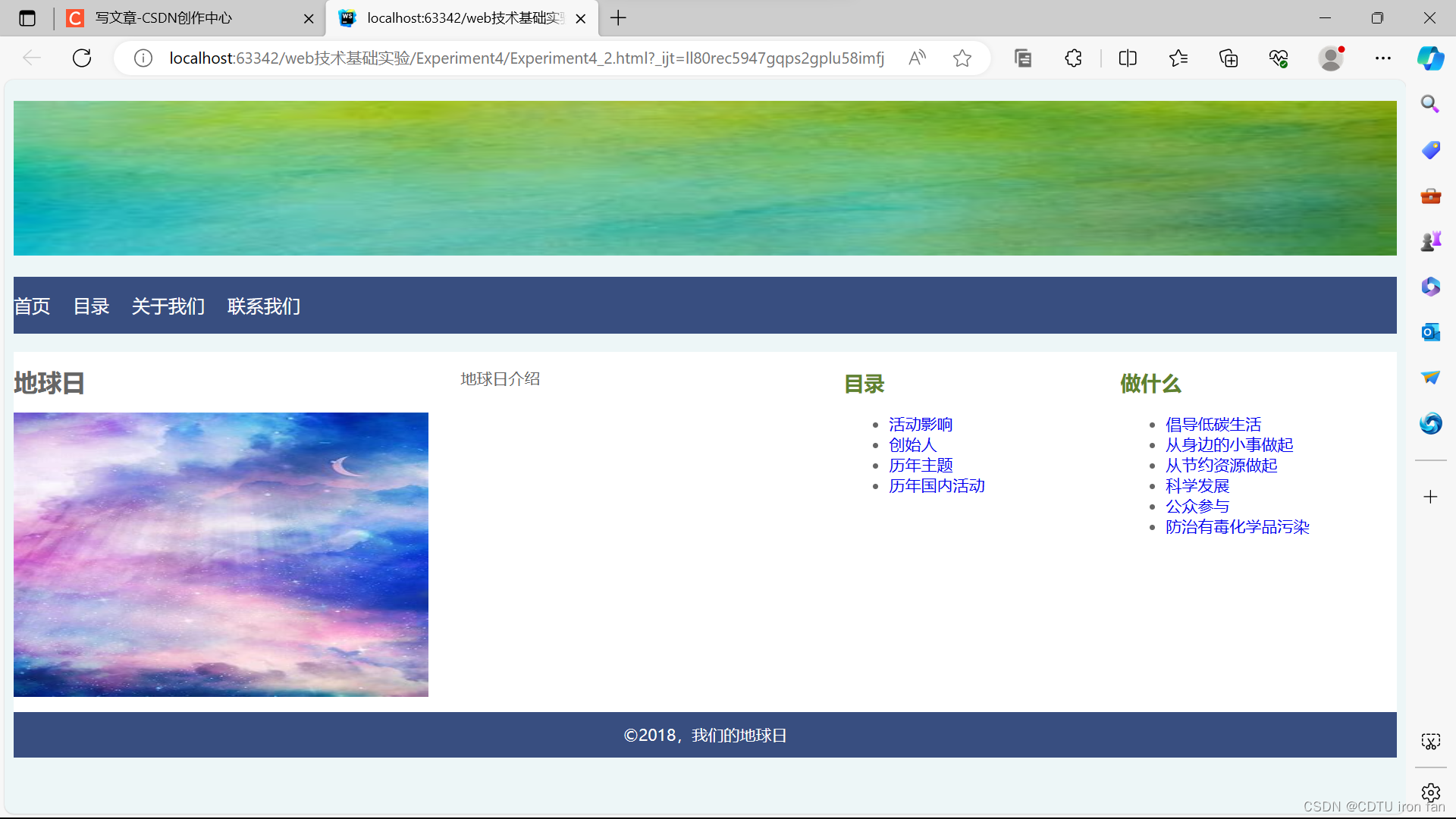
2、CSS綜合應用:編寫代碼,實現圖4-2所示的頁面效果,要求:
① 結構和樣式相分離(html和CSS相分離)。
② 頁面從上到下四個區域,在上面區域為圖片展示區,整體居中顯示(素材由實驗老師提供)。
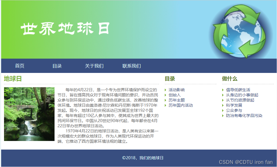
??圖4-2 CSS綜合實例頁面效果示意圖
(1)新建html文檔、CSS文件。采用<link>標簽將CSS文件導入html文檔。
(2)頁面body從上到下依次為<header>、<nav>、<main>、<footer>,以下為已知屬性:
?body?{
??? background: #EDF6F7;
??? font-family: "微軟雅黑", "Times New Roman", serif;
??? color: #666;
??? font-size: 14px;
??? line-height: 18px;}
.flex {//<header>、<nav>、<main>、<footer>都會引用
??? width: 100%;
??? width: 960px;
??? margin: 0 auto;
}
(3)<header>部分,在<h1>標簽中插入圖片。
(4)<nav>部分background: #384E80;導航欄使用ul實現height: 50px,display:flex,font-size: 16px;
(5)<main>部分采取左中右布局:<artice>、<aside>、<aside>。
??????? 1、<main>: background: #FFF; padding-bottom:10px;
??????? 2、<artice>:<h2>標簽插入“地球日”,外下邊距和內下邊距為10px,
點狀橫線:border-bottom: 2px dotted?#ddd;
????????????????? <section>標簽內插入圖片和文字,圖片高度height: 188px;
<p>標簽插入文字:text-indent: 2em;
3、<aside>:padding:10px;<h3>插入標題color:#5F822F;font-size:18px;
使用無序列表和<a>實現各列表項,<li>寬度為180px高度為18px。
(6)<footer>部分:background: #384E80; height:40px; padding-top:20px;
<p>?2018,我們的地球日</p>。
Experiment4_2.html
<!DOCTYPE html>
<html lang="en">
<head><meta charset="UTF-8"><link rel="stylesheet" href="Experiment4_2.css"><title></title>
</head>
<body>
<header><h1 style="width: 100%"><img src="../4.jpg" style="width: 100%;height:136px"></h1>
</header>
<nav><ul><li><a href="#">首頁</a></li><li><a href="#">目錄</a></li><li><a href="#">關于我們</a></li><li><a href="#">聯系我們</a></li></ul>
</nav>
<main><div class="flex"><article><h2>地球日</h2><div><img src="../1.jpg" style="width:100%;height:250px"></div></article><article><div><section><p style="text-indent: 2em;">地球日介紹</p></section></div></article><aside><div><h3>目錄</h3><ul><li><a href="#">活動影響</a></li><li><a href="#">創始人</a></li><li><a href="#">歷年主題</a></li><li><a href="#">歷年國內活動</a></li></ul></div></aside><aside><div><h3>做什么</h3><ul><li><a href="#">倡導低碳生活</a></li><li><a href="#">從身邊的小事做起</a></li><li><a href="#">從節約資源做起</a></li><li><a href="#">科學發展</a></li><li><a href="#">公眾參與</a></li><li><a href="#">防治有毒化學品污染</a></li></ul></div></aside></div>
</main>
<footer><p>?2018,我們的地球日</p>
</footer>
</body>
</html>
Experiment4_2.css
body {background: #EDF6F7;font-family: "微軟雅黑", "Times New Roman", serif;color: #666;font-size: 14px;line-height: 18px;
}.flex {width: 100%;margin: 0 auto;display: flex;
}nav {background: #384E80;flex-basis: 20%;
}nav ul {height: 50px;display: flex;align-items: center;justify-content: flex-start;font-size: 16px;list-style: none;padding: 0;
}nav ul li a {margin-right: 20px;color: white;
}article {flex-basis: 30%;
}aside {flex-basis: 20%;
}aside h3 {color: #5F822F;font-size: 18px;
}aside ul li {width: 180px;height: 18px;
}main {background: #FFF;padding-bottom: 10px;display: flex;
}footer {background: #384E80;height: 40px;flex-basis: 100%;display: flex;align-items: center;justify-content: center;
}footer p {color: white;margin: 0;
}a {text-decoration: none;
}.article, .aside {box-sizing: border-box;
}article, aside {margin: 0;padding: 0;
}
 修改文本位置(label) 南丁格爾圖(roseType))


—ndarray屬性》)


方法的傳參和使用)


)


