具體的適配問題
公司的項目需要將游戲導出WebGL 發布到Web平臺 本以為是個很簡單的事情 誰知道卻被個橫豎屏適配搞的頭暈 畢竟只有大學淺淺的學了下HTML這門語言 出來工作后基本上都是在跟C# Lua打交道 言歸正傳 看看具體問題吧
游戲如果從橫屏進入 基本上不會有什么適配問題
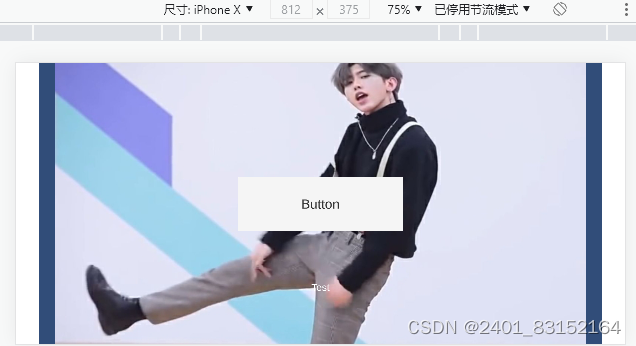
但是現在人大多數手機都是開著 鎖定屏幕方向 這就導致大部分人其實是以豎屏進入游戲的
像這樣:
這樣顯然是不符合用戶體驗的 要用戶先把屏幕鎖定關了 在旋轉成橫屏 這一操作在游戲引流里都可以直接勸退一波用戶了
解決方案
理論方案
理論上解決很簡單 只需在index里進入時判斷手機方向并監聽手機旋轉事件
<script>var orientation = window.orientation;if(orientation == 180 || orientation == 0 || orientation == -180){//豎屏}else{//橫屏 orientation = 90 或者 orientation = -90 }window.onorientationchange = function () {//監聽手機旋轉事件if(orientation == 180 || orientation == 0 || orientation == -180){//豎屏 旋轉-90度}else{//橫屏 旋轉90度}};
</script>
改變
<canvas id="unity-canvas"></canvas>或者其他嵌套unity-container的標簽通過CSS的旋轉屬性旋轉90度就搞定了
transform: rotate(90deg)但是實際上并沒有那么快樂 經過你不斷的努力調整標簽終于實現了你就會發現
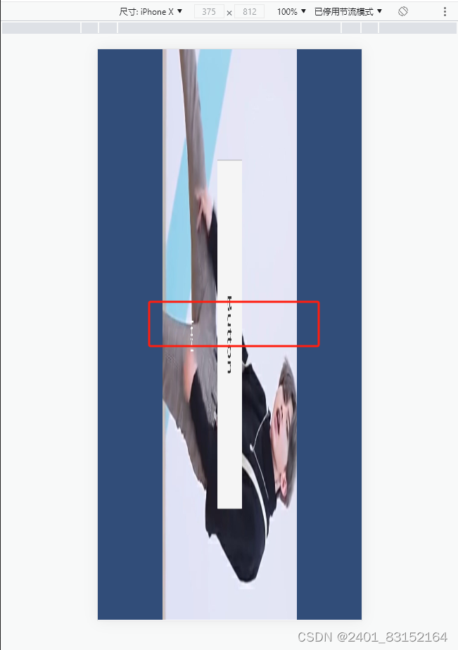
先不說比例問題 最致命的問題是 旋轉后 按鈕的碰撞監聽并沒有旋轉?按鈕的實際監聽范圍還是紅框 這一下子就犯了難 研究許久后發現需要使用HTML中的<iframe>標簽來解決
<iframe src="game.html"></iframe>實際解決
新建一個新的index.html ?將原本的index重命名為game 通過iframe標簽引入到新的index里面
同時在新的index里面監聽手機旋轉事件 通過添加刪除類來旋轉頁面
代碼如下
<style>.landscape-screen{transform-origin: top left;transform: rotate(90deg) translateY(-100%)}
</style>
<iframe id="Frame" style="Frame"  src="game.html"></iframe>
<script>var orientation = window.orientation;//開始時調用var Frame = document.getElementById("Frame");if(orientation == 180 || orientation == 0 || orientation == -180){//注意豎屏時要把 iframe的寬設置為當前窗口的高度 高設置為當前窗口的寬度Frame.height = window.innerWidth;Frame.width = window.innerHeight;//通過css樣式旋轉90度Frame.classList.add("landscape-screen");}else{//橫屏時則正常Frame.height = window.innerHeight;Frame.width = window.innerWidth;//通過移除類去掉css樣式Frame.classList.remove("landscape-screen");}//監聽手機旋轉事件 根據旋轉狀態設置旋轉的css樣式window.onorientationchange = function () {if(orientation == 180 || orientation == 0 || orientation == -180){Frame.classList.add("landscape-screen");}else{Frame.classList.remove("landscape-screen");}};
</script>
?而我們的game.html(原本U3D導出的index.html) 只需要做好全屏適配即可
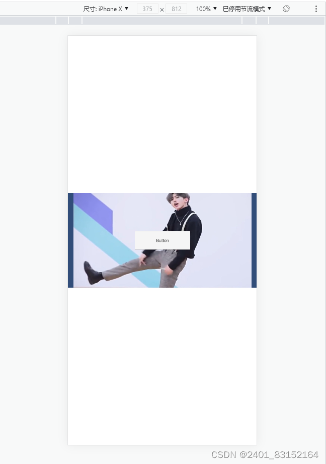
運行效果如下
豎屏進入→轉橫屏
橫屏進入→轉豎屏
至此適配方案結束
演示DEMO鏈接
GitHub - Wyleee/UnityWebGLMobileAdapter: 演示Unity導出的WebGL項目在手機上的橫豎屏適配


![[leetcode]文件組合](http://pic.xiahunao.cn/[leetcode]文件組合)
)


理論指南(1))
——數據類型轉換)


