目錄
1.?Popup組件介紹
2. 使用
上一章內容完成了音樂播放器程序的基本界面框架設計。本小節完成一個簡單的功能。單擊該播放器頂部菜單欄的“關于”按鈕,彈出該程序的相關版本信息。我們將使用Qt Quick的Popup組件來實現。
1.?Popup組件介紹
Qt 中的 Popup 組件用于在應用程序界面上臨時彈出一個窗口,它常作為上下文菜單、提示框或信息展示區域使用。Popup 窗口通常依附于某個父控件,在特定事件(如鼠標點擊、懸停)觸發時顯示,能提供額外的操作選項或信息,且不影響主窗口的布局。在用戶與 Popup 交互完成或觸發特定條件(如點擊外部區域)時,它會自動隱藏。
2. 使用
修改LayoutHeaderView.qml文件,在ToolBar中添加Popup組件(緊跟RowLayout):
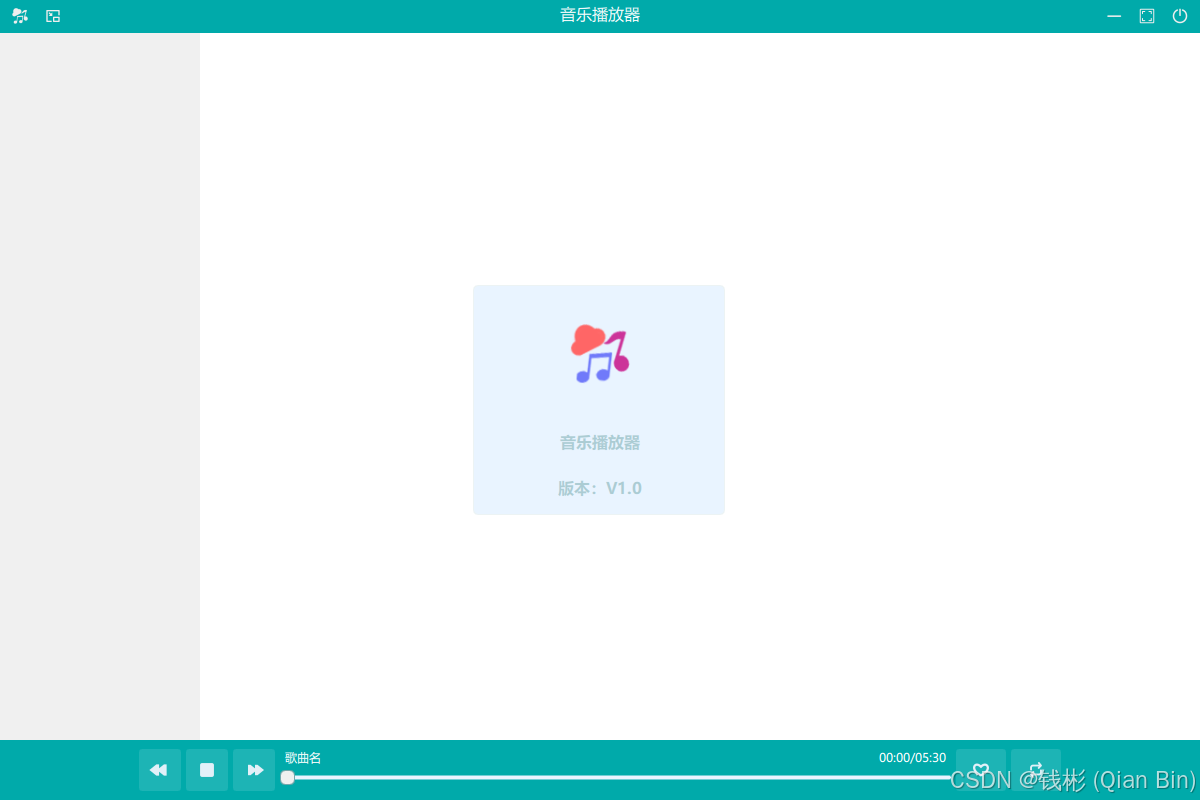
Popup{id:aboutPoptopInset: 0leftInset: -2rightInset: 0bottomInset: 0parent: Overlay.overlayx:(parent.width-width)/2y:(parent.height-height)/2width: 250height: 230background: Rectangle{color:"#e9f4ff"radius: 5border.color: "#2273a7ab"}contentItem: ColumnLayout{width: parent.widthheight: parent.heightLayout.alignment: Qt.AlignHCenterImage{Layout.preferredHeight: 60source: "qrc:/images/music"Layout.fillWidth:truefillMode: Image.PreserveAspectFit}Text {text: qsTr("音樂播放器")Layout.fillWidth: truehorizontalAlignment: Text.AlignHCenterfont.pixelSize: 16color: "#8573a7ab"font.family: window.mFONT_FAMILYfont.bold: true}Text {text: qsTr("版本:V1.0")Layout.fillWidth: truehorizontalAlignment: Text.AlignHCenterfont.pixelSize: 16color: "#8573a7ab"font.family: window.mFONT_FAMILYfont.bold: true}}}上述代碼使用 Qt Quick 的 Popup 組件創建了一個名為aboutPop的彈出窗口。設置了內外邊距,使其位于覆蓋層中心,尺寸為寬 250、高 230。背景是帶圓角和邊框的矩形,顏色為淺藍。內容部分用 ColumnLayout 垂直排列元素,包含一個展示音樂圖片的 Image 組件和兩個 Text 組件,分別顯示 “音樂播放器” 和 “版本:V1.0”,字體使用window.mFONT_FAMILY,顏色為淡藍色,字號 16 且加粗。
然后修改RowLayout組件中的相關代碼如下:
MusicToolButton{icon.source: "qrc:/images/music.png"toolTip: "關于"onClicked: {aboutPop.open()}}上述代碼在原來的基礎上添加了onClicked事件。當按鈕被點擊時,執行aboutPop.open(),即打開之前定義的aboutPop彈出窗口,用于展示相關信息。
運行程序,單擊頂部菜單欄“關于”按鈕,最終效果如下圖所示:
上一章:QT Quick(C++)跨平臺應用程序項目實戰教程 5 — 界面設計-CSDN博客
下一章:


通用數據集-剪刀石頭布手勢檢測數據集】)


和cv2.polylines())


